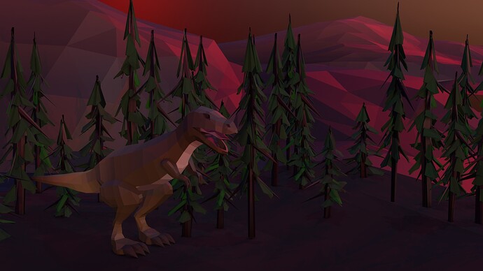
i decided to go with a higher detail/less of a low poly look and add in a sunset HDRI :33 let me know your thoughts!
I’m pretty bad at lighting - while I understand the basic concepts… ehh… “conceptually,” most of the nuance in actually doing it is lost on me. I’ve started looking for case studies that might shore this up a little, and this looks like a great reference! The red highlights on the mountain look really nice, even more so because the ground is very dull by comparison (which is good; brings everything else out more). Nice job!
aww i really appreciate it! <3 i create within many different mediums, and what has helped me the most is the value of experimentation. while it can be helpful to study and follow “rules” within art/music, i think taking yourself less seriously, messing up, placing less value on being “correct” or “good” is the most rewarding part of learning and creating. :33 like jazz, learn the rules just so you can break them. i’m honored that you would use this as a reference!!
This looks great. Love the detailed trees. And the shading on the dino’s body.
Absolutely; very much agree with that sentiment of learning the rules so you can break them, and I definitely know what it feels like to nail that. For anybody else who happens to be reading this, I think that’s great advice for anything with an art component to it.
With lighting, I’m still at the whole “learning the rules” phase, but I’ll get there, haha ; )

