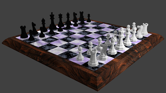
This is my final Chess scene. I need tips in Lighting. Please help! 
Comments and feedback if any please do share!

This is my final Chess scene. I need tips in Lighting. Please help! 
Comments and feedback if any please do share!
Looks OK. What exactly is the matter?
Have you looked at what others have done in the final chess scene topic?
https://community.gamedev.tv/t/finished-lowpoly-chess/14790/101
Oh great. It looks dramatic. I have that texturing problem the third pic texturing was perfect. How to adjust that? In the lectures they didn’t show that part
It is interesting to quickly look at old works, it’s always where ideas are, and for yourself you can take something out.
Not only work with lighting and texturing but composition and story, for fun.
Sorry, can you be a bit more specific? What third pic are we talking about?

This picture i was mentioning. Chess board texture is applied perfectly. I want to know how to do it.