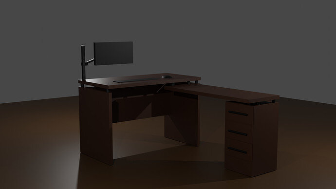
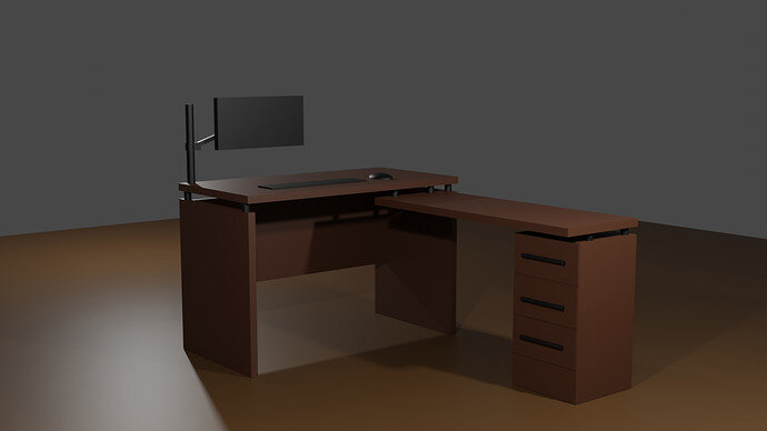
Just modeled the first thing I saw in front of me 
Very good model.
Increase overall light power a bit.
It is dark scene on my monitor.
Great work on your 2nd render man  definitely much better now you can see it with the light. Really good design of the desk.
Did you render this in Evee or Cycles? If you haven’t rendered it in cycles, I would highly recommend it as it will give you the best results in terms of light/shadow calculation etc. Evee is great for a quick impression of the render but I personally, prefer to use Cycles with GPU support and set the denoising on the render properties to use OpenImageDenoise. If you’ve already used cycles for this then please ignore me 
Of course, once Blender 3 is out, we’ll be graced with Cycles X which is a real game changer and will increase render times significantly, 2-7 times faster than Cycles I believe 
Great work man and welcome to the group! 

Very nicely done, and the second render’s better lighting really helps show it off. Welcome to the community.
Thanks , yes I used Cycles . I quess this model is simple enough so it only took few seconds anyway but I’m not sure if I used OpenImageDenoise . I’ll have a look after I get back home.
Thank you I’m glad to be here.
I was hesitant at first with how much light I should put there because I only applied basic material color and it started looking a bit cartoony with more light .
Welcome to this site.
Fine office desk set up scene.


