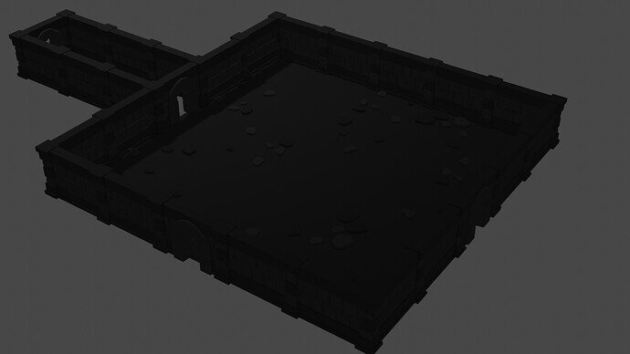
I wanted to share this idea I had for materials in mine. I ended up making three different materials for grey - light, medium, and dark. I textured the floors with medium and alternated light and dark randomly for the tiles which I think helps to break up things risking looking repetitive.
I think the outcome is pretty fun!
It may do but it is all black in the image, which may be in part the compression. Or it may be just too darkly lit.
Oh - interesting! I can see the colors on my end - dark but not completely covered in shadow. Maybe it has something to do with different screen settings as well? I’ll have to keep that in mind for the final render - thank you for letting me know!
I can see the differenz, but some lightsources would help to get it 
I guess it would be cool if you spread the randomness over the walls, pillars and the doorway too!
The pillars looks a bit to uniform for me.
Oh for sure! I think I took this render before getting to the lighting part so I just kind of hastily positioned a light overhead 
That’s a great idea! I’ll have to mess around with it and see if I can find a pattern that I like - adding variation without ruining cohesion.
Very nice DARK dungeon. I like it!. Nice work. Adding a little randomness to the walls and pillars like @Malachanis said will make it more realistic. Looking forward to seeing your finished dungeon with the lighting. Have fun dude!

