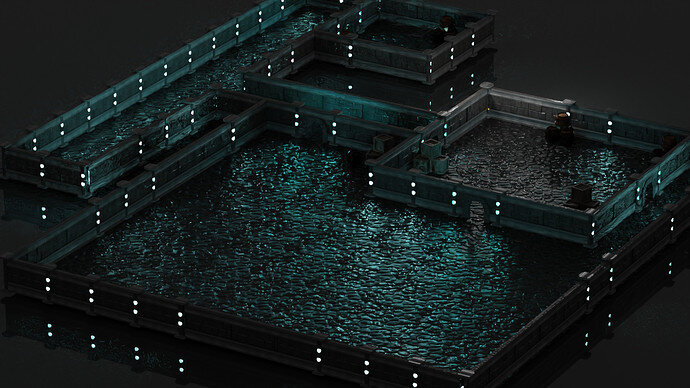
Still, a great render. But it needs more variance. Too much scify blue.
I like that the floor looks wet. It makes me imagine dripping stalactites above
Actually to me, the floor looks like it’s actually underwater. I will say, however, it’s a very nice setup of the water. 
I think it’s a beautiful water face, but it didn’t come off as a floor to me.
I like the layout and colors - it’s a pleasure to look at!
Good modular build.
I first saw it as some sea harbour walls. Put little boats in there!
Ohhh, there you go! That’s exactly what I’m seeing when I look at it again now.
Thankyou i never thought of it as that, actually these were muddy dungeon floor textures that i downloaded for free but the blue light is kind of giving it watery vibes😂
I’ll experiment by adding some extra assets like boats and chests etc to see how it looks
Yupp looks like a wet rock floor to me. Dont really see a harbour or that its underwater but some boats outside would be cool 


