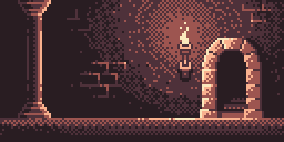
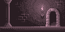
Correct palette:

Incorrect palette:

Correct palette:

Incorrect palette:

Wow!
Did you dither by yourself or to GIF conversion?
Thanks, it was all hand-made. 
Double wow!
So much details, a great effort!
Double thanks, Pete. 
And here’s a little video of the process:
Really amazing!
You have a great feel on how the lighting process works.
Made me think about the old days of gaming CBM64 …
Absolutely stunning! I’m lost for words!
How did you make your “bad color” version (which I honestly think also looks really good, more like a different style than an actual mistake)? Did you just use the fill tool with contiguous turned off?
Thanks, glad you like it. 
As for the bad color version, I just kept the same darkest color from the good version and started to change the values only by going upward vertically on the big palette square, on the bottom left of Aseprite window.
While it’s recommended (from the instructor) to get closer to the warm yellow colors the more you add light to your scenery.
And yes, I turned off contiguous to quickly swap colors. 