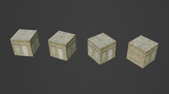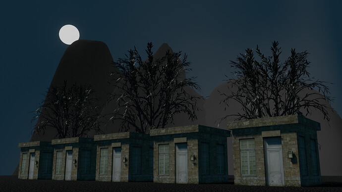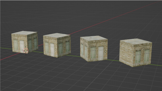
Different Texture for the House, But Really Fun!

image


Going outside of my bnpr style for this one, but you could just as easily do a comic book, I suppose.

Took my time and actually sliced up the faces with some loop cuts to get more out of the material and avoid certain elements showing up. For the back I used the same bit of wall and just reflected it. Would be nice if there was a blend feature like there is when you use Box instead of Flat, but ah well.

2 Likes

Looks great in my eyes, I especially love the textures and how well the colors blend!

1 Like

Looks good building houses by cube blocks!

1 Like

Thanks I actually did some extra stuff for a few more minutes just to play around.

3 Likes

The crates actually look a lot better up close. The background compliments the scene as well.

Hahaha, hopefully they don’t totally look like crates, but thank you. Hahaha.

1 Like

Oh lol, they just kinda n looked like crates in the first picture, not now lol, sorry for confusing you, is say they look more like a tiny home or a shed right now

1 Like

Privacy & Terms