
Health Bar
4 Likes
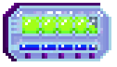
I always recommend trying out different color palettes and putting them side by side to compare. I didn’t notice the darker blue bar for a minute. Working with these colors, potentially darkening either the outlines or the color of the ‘metal’ or light blue box as it muddies the colors too much. The bright green, light blue, and dark blue are too bright and neutral so the three together don’t feel like they work great. Since this would be a smaller symbol on a game screen, it should be as clear as possible in color as well.
The design itself looks great, the details are nice but subtle and work great for the small symbol on the screen that it would be.
2 Likes
Yes, that’s where im having difficulties with, the colors. Thank you so much I appreciate the advise. Ill try to incorporate it on the next one. Thank you so much again!
2 Likes