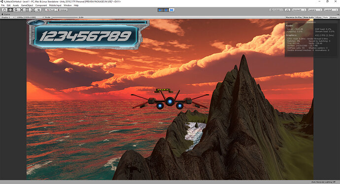
Went with the NFS font, thought it fitted perfectly. Also I wanted a background for the score because it was difficult to read with the sky and all that, so I managed to find a background that has colours similar to NFS Underground 2, which also complements the font quite well.
Looking good!
Thanks Heath, how are you progressing with your RPG game so far? I’ve seen quite a few posts of yours in this course, I am soon going to dive in it too. Any feedback?
It’s a great course. A few things made me stop and do some googling because some lectures assume you know what Sam is talking about, but overall, I’m happy with the results so far…
check out my videos on www.mrheathclose.com
I checked your link, I am very pleased with what I saw.
I believe it is a great advantage in slowly getting into Game Design as a Sound Designer, you just have the tools to give the game this extra edge it needs. I’ll definitely check your FMOD series when I have a little more time in my hands, I would gladly spend my time learning how to implement it in the future.

