Not to confident with the first palette’s choices.
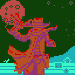
But my headache lets me know the second one is terrible.
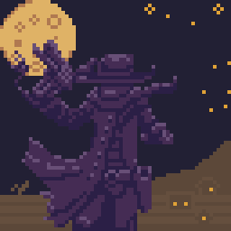

Not to confident with the first palette’s choices.
But my headache lets me know the second one is terrible.
Yes, the last one looks unexpected.
But still, I like it. The moon color should be different.
In the first one? Or the second one?
I was attempting to make it painfully obtuse to look at with the second at least.
What should I do to adjust?
I mean the last one, the moon color is the same as the figure.
Wow, that first one looks good to me! Amazing how only 3 shades of purple in the figure can portray a complicated, detailed shape the way it does.
And yeah, that 2nd one sure demonstrates how changing the palette to something incompatible and clashing can totally undo and nullify an otherwise sharp-looking graphic!
Nice job, great example.
In the first one? Or the second one?
I think the second one.