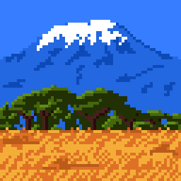
Hi. For this challenge, I wanted some subject with a natural and warm contrast. Mount Fuji was already used in the background of a previous challenge, so I preferred to choose the Mount Kilimandjaro 
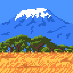
It was not so easy for me to try to do “bad” versions of my illustration, as I was formed to try not too  So here, my comment to share is that the contrast and brightness should be subtle, otherwise you burn out your image (with too much brigthness) or wash out details (with too much contrast). The balance between colors is the point
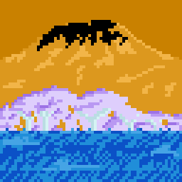
And just for fun: a negative version of the image