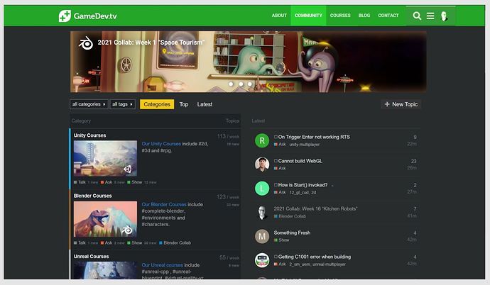
I think also we (as a user) do not use the site options very well. Or the defaults are wrong!?
If you are on the community level (top page, tab ‘Community’).
The ‘Category details’ are shown by default. This is handy for some of us as an index to navigate from. To search for new forum items and questions (ask channel). But there are other views available, overlooked by most of us (including me). Or as a newcomer, overwhelmed by the size of information and navigation (problems). Where to post my first work …
Besides the Yellow button ‘Categories’, there are also the options for ‘Top’, ‘Latest’ and ‘Unread()’. I can imagine that the styles of these options are not inviting people to click on. And if they do they confuse the user. Because the new view is overwhelming, and the active filter (show popular work over a year period) does not help either because it is hard to beat the student with a piece of good work.
Changing the filter is lost by the user (viewer) because they see great work and click on an item, losing context. They will also mark this project as favorite (heart symbol). Which makes it even harder to beat this already top marked project.
A solution could be to change the default filter from a year to a weak, two weeks. (it depends on the flow of new work published). This is a task for the forum ‘disclosure’ system administrator. This will produce a more actual presentation of recent work and giving all students (beginners and advanced) a podium to show their progress.
See for yourself, click on the following link and change the filter.
The latest option shows a different view with a different thumbnail. Which is by default the first image in the thread. This is handy if a forum thread has one topic. Like for example a Work In Progress (WIP). But if students place work in the same thread, only the first poster, gets a thumbnail by default.Other entries will not be seen as a thumb.
As a moderator, I can change the thumbnail, but it is a lot of work and I’m not a gamedev member. Just a student like you. I do this for the Blender Collab.
A solution could be to show the last image posted in a thread or randomize (also not such a great solution, it will confuse people).
https://community.gamedev.tv/latest
My advice would also be
- to change the appearance of those yellow ‘Catories’, ‘Top’ buttons. Or explain clearly what they can do for the user,
- Change the default filter from a year to two weeks.


