
beacuse of not being underground? 
1 Like
Picky! 
1 Like
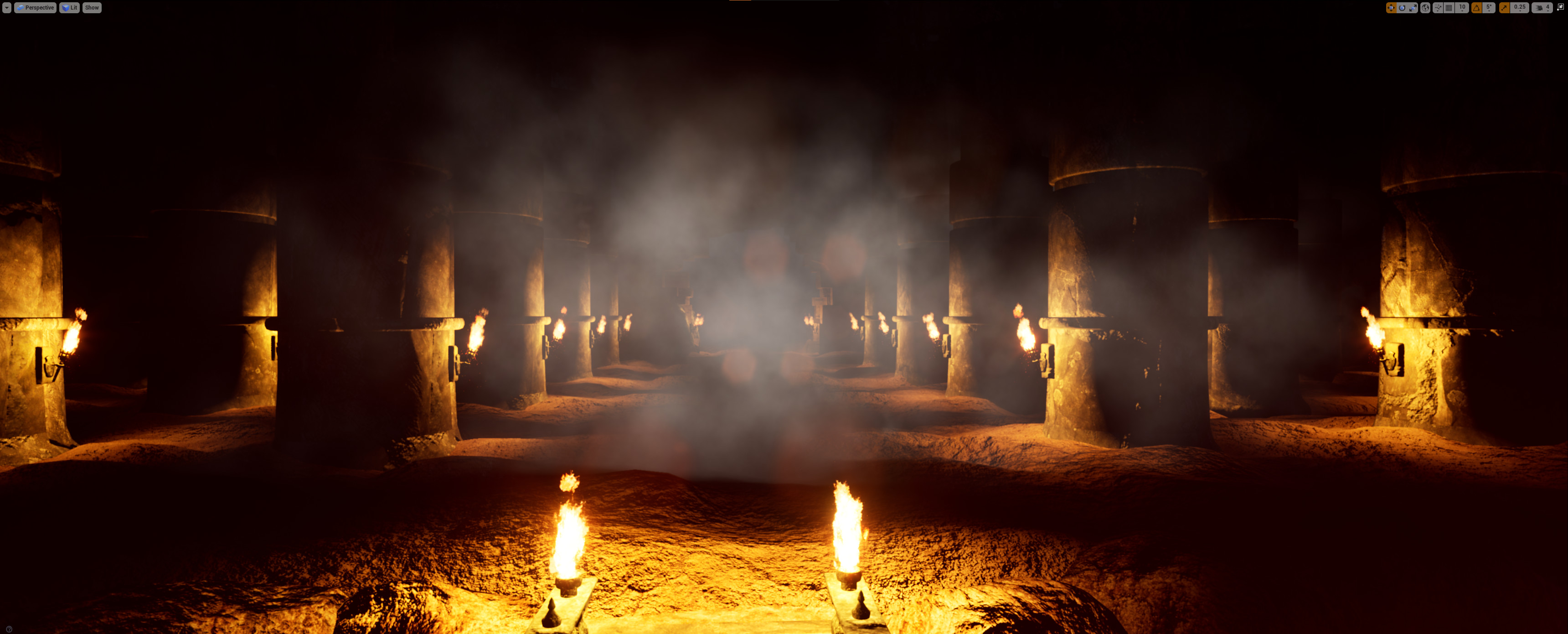
Changing scene but still keeping the theme:
(at least for now  )
)

Use Both. Blue-ish light from nature, mixed with lava glow from the bottom. Will make a good contrast between warm and cold.
2 Likes
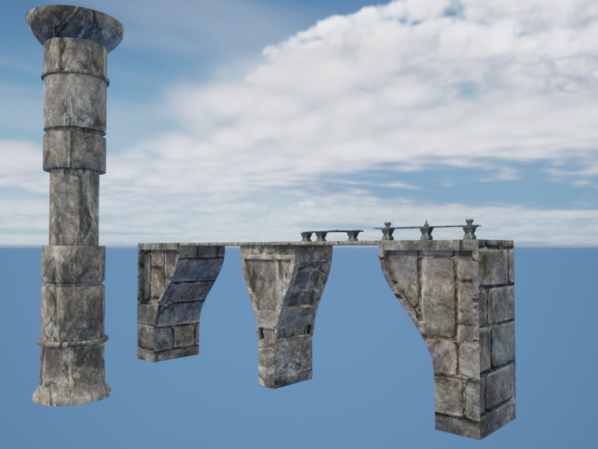
Some modular pieces for a bridge:
time is short, so will probably not sculpt details. Hopefully textures + low lighting level will hide lack of details… And will model much less than I wanted… for sure I’ll model the columns, maybe an axe for Gurukk (nothing as fancy as the FedPet’s recent axe though) and the rest I will probably need to use some assets…
1 Like
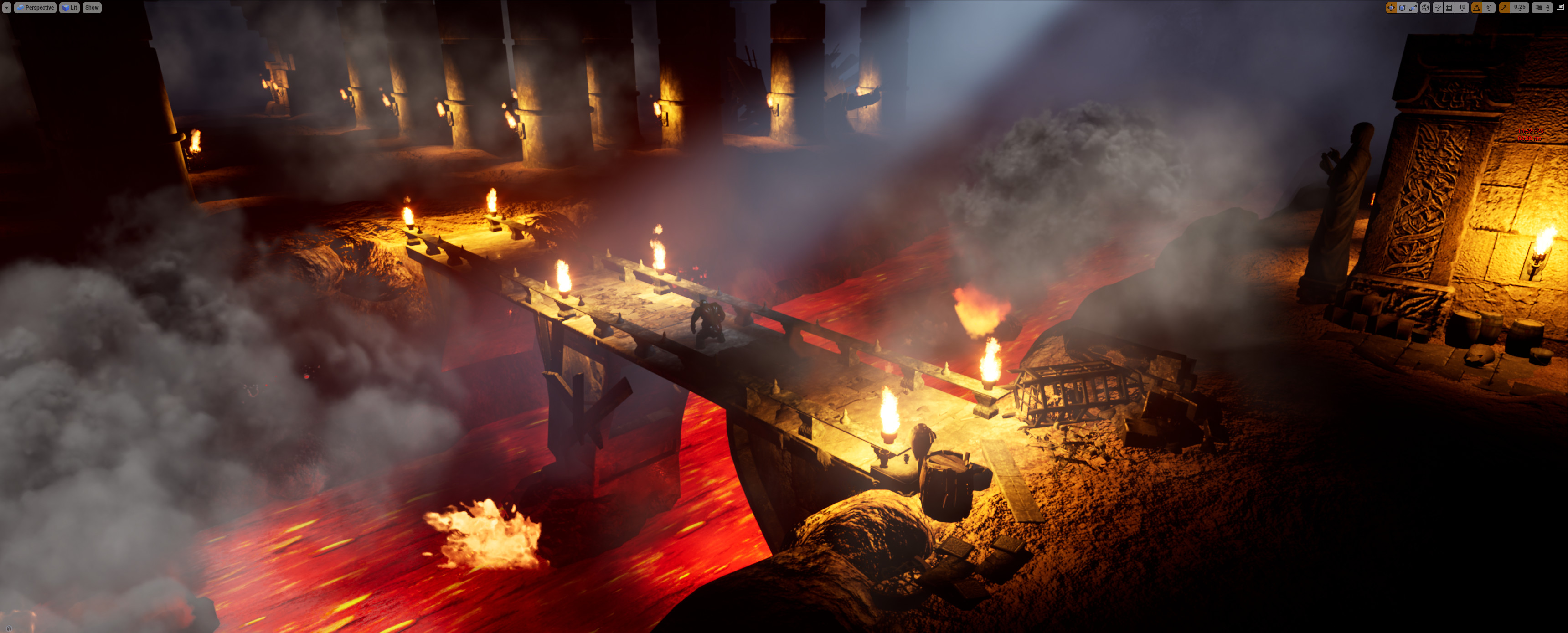
Progress update for today:
Overall shot:
Building on the right:

Entrance:

The other side of the bridge…
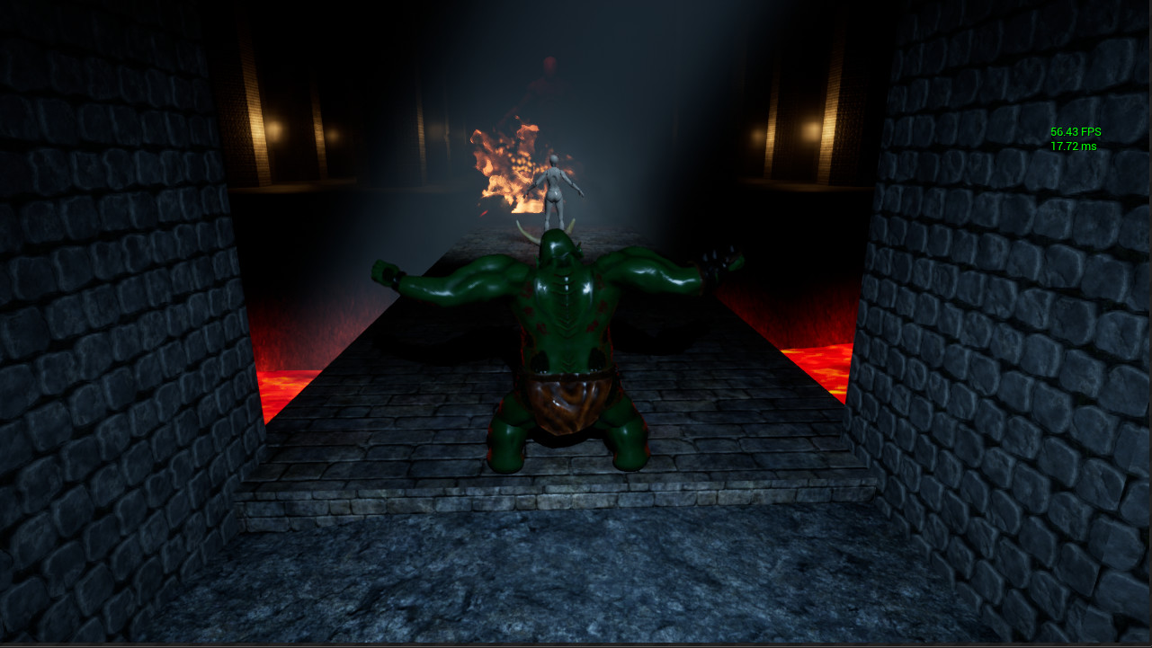
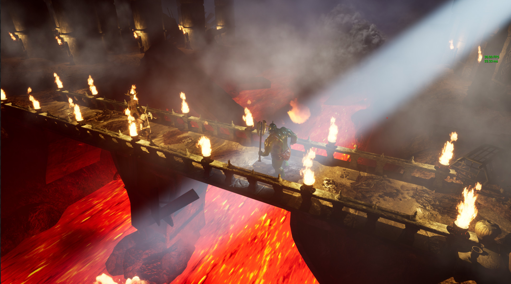
And the main action area - bridge:

I might have overdone the details
7 Likes
This is coming along so well, I really can’t wait to see it finished. 
2 Likes
Good progress! 
2 Likes
Thanks for the input! Doing that! 
Thank you!
Thank you!
Thanks! That’s part of the cost I pay when I get excited by the progress . Yesterday I noticed way past 3am that I’m working on this instead of getting some sleep…
1 Like
keep healthy … !
1 Like
My humble input.
On your bridge:
- Make (hourglass shape) support pillars thinner (X&Y axis) and spread more of them. Since it’s the same asset it won\t affect the performance much.
- The Rail looks more like a table. make it thicker (Z axis)and narrower. It needs to overlap the pillar.
- Decor detail would look better if alighed with the pillar, as if it’s a part of it. Consider to replace it with single sphere.( Less pointy).
*Burn some shadows. Even non-dynamic shadows will add great sense of depth.
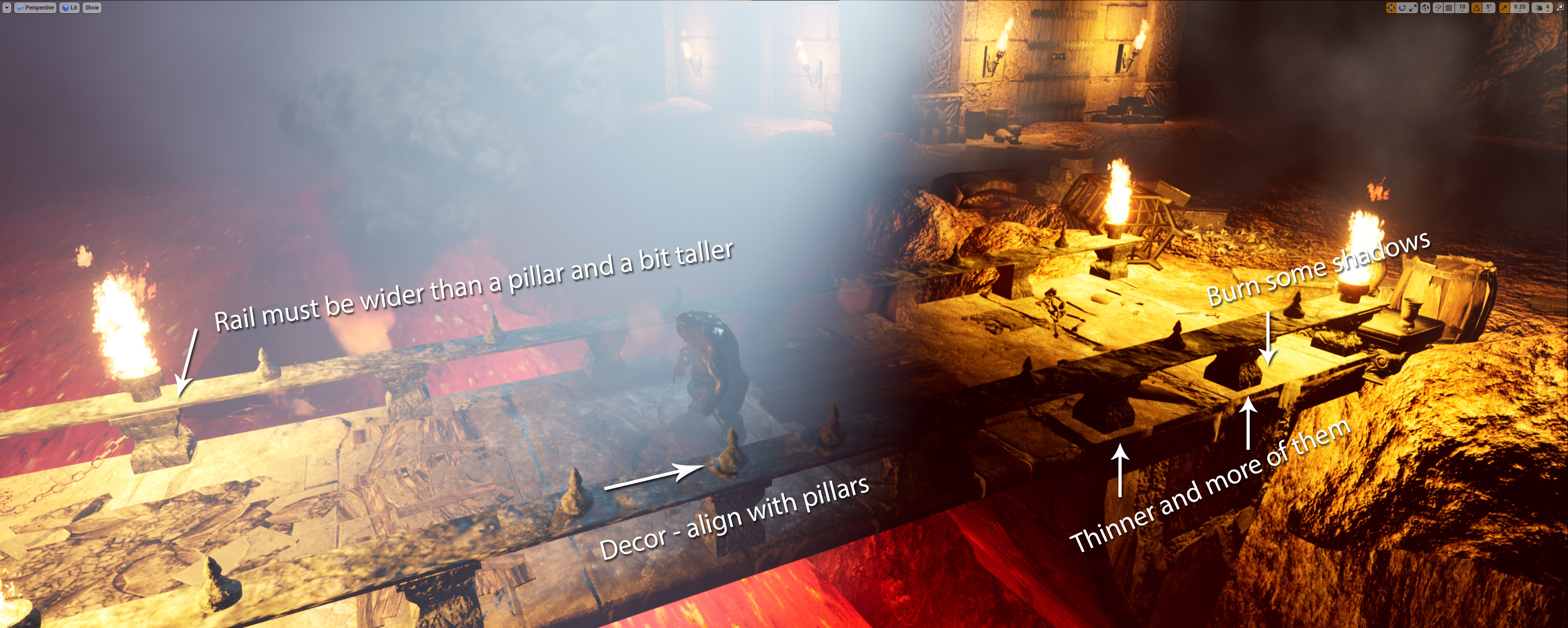
Keep up a good work.
2 Likes
Thank you! Some great suggestions!
1 Like
Once again - thank you! I couldn’t wrap my head around why the lighting look so flat… and thanks to your feedback I’ve noticed that I’ve must have accidentally turn off shadows on torches lights!
If the lava shows in your final shot, You might want to enhance the lava effectively more lumpy and black bits that I feel looks better. While yes some lava images can look fully red.
More details less sleep!
1 Like
Yes, you are right. I’m really dissatisfied with the lava and how it flows. Those are just simple moving textures on a flat surface. I wish to fix it, but making a nice shader that deforms the surface, etc might be too much for just couple of hours left till the end of the collab 
2 Likes
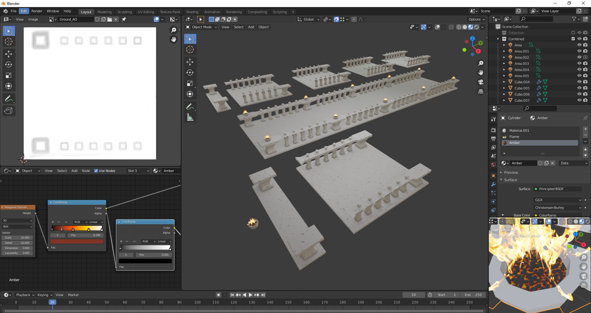
Looks great.
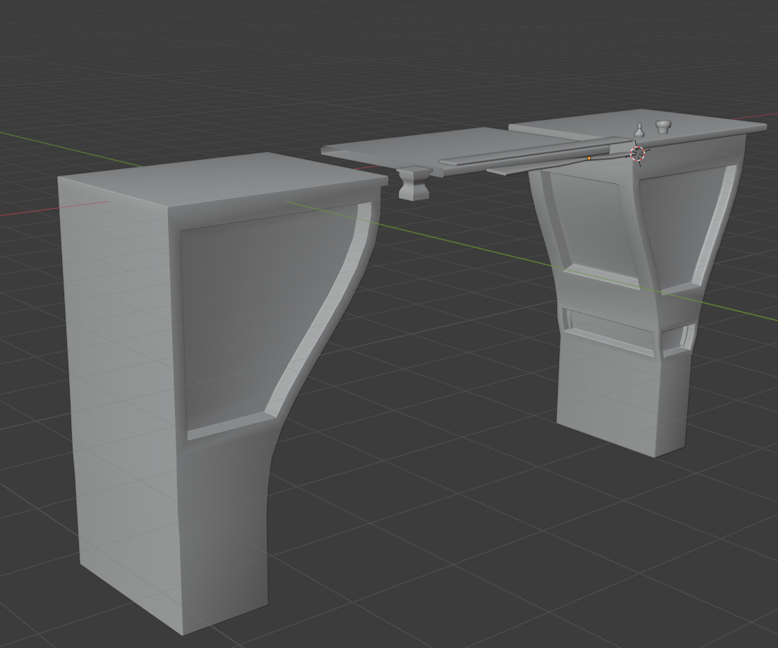
Not sure how you created your assets, but may I recommend making into modular components like in my image.
I’ve also show color gama of mustgrave that is close to lava.bottom irght shows the results with a bit of bump applied. You can apply it on the plane, then render albedo/Diffused and Normals and fix tiling in photoshop with horizontal/vertical offsets or there is a handy tool that would do it for free.
Don’t forget to check reverse green channel in unreal for normal texure (blender-OpenGL normals, UE4-DirectX) https://boundingboxsoftware.com/materialize/.
3 Likes