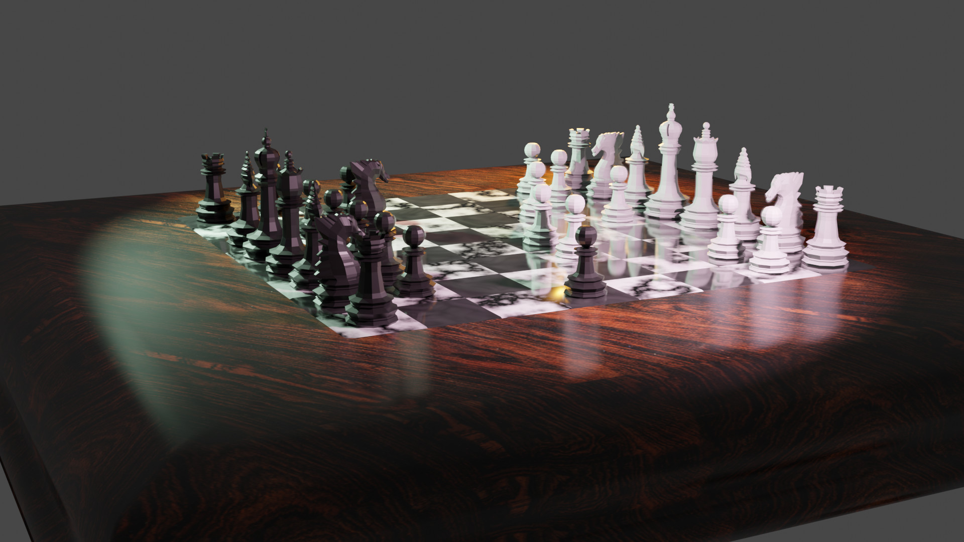
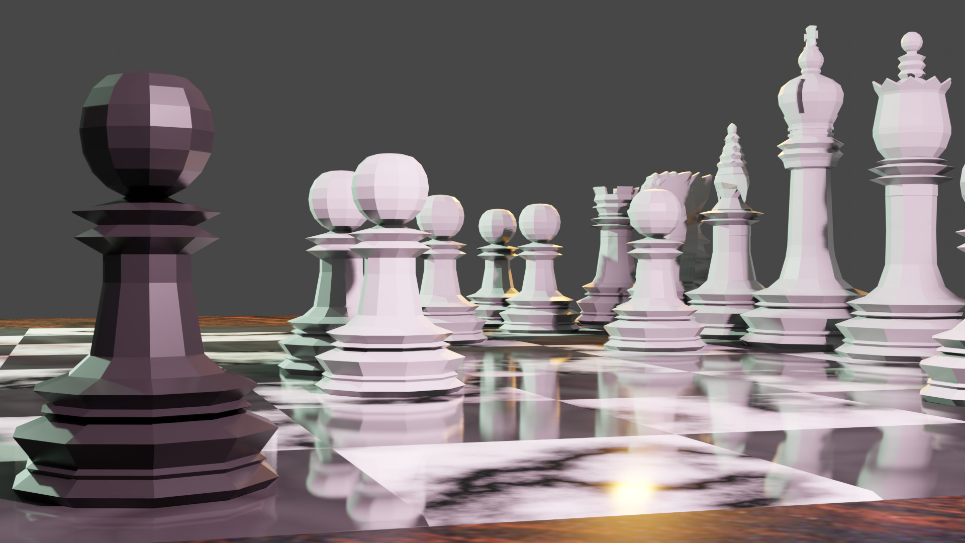
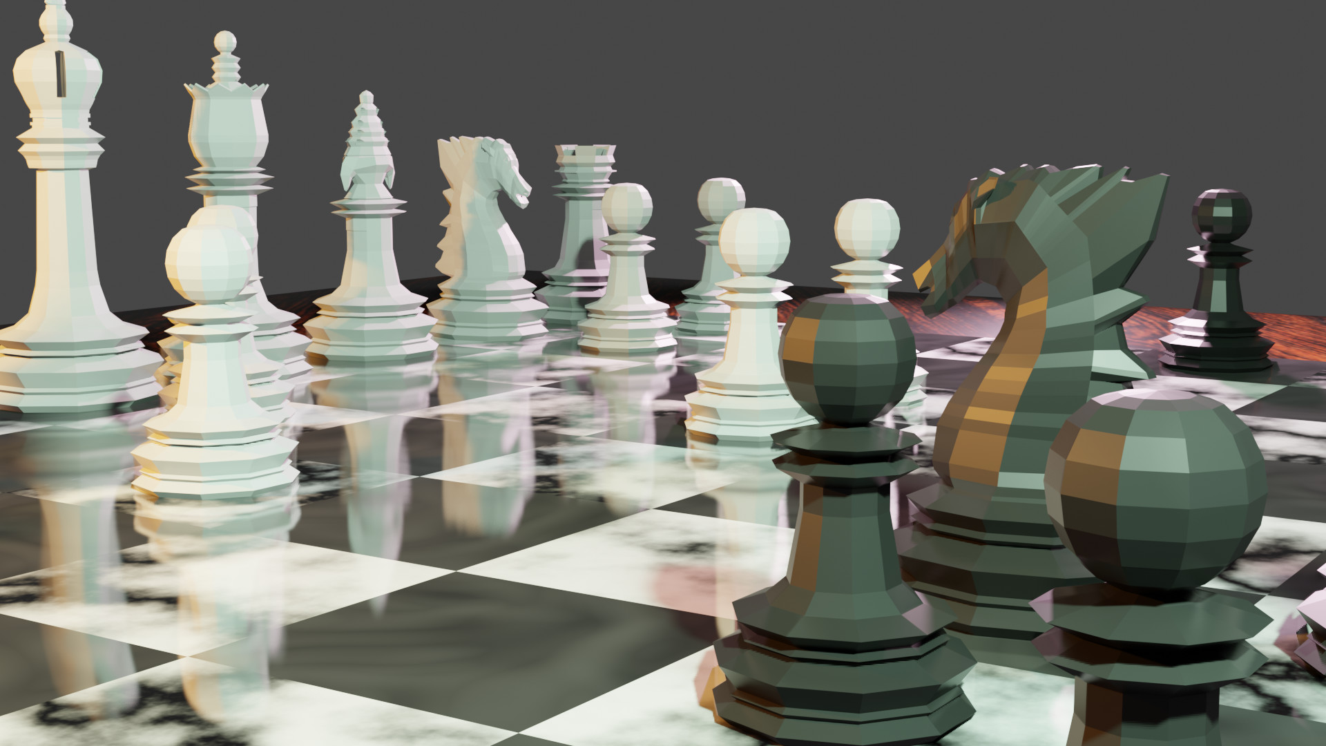
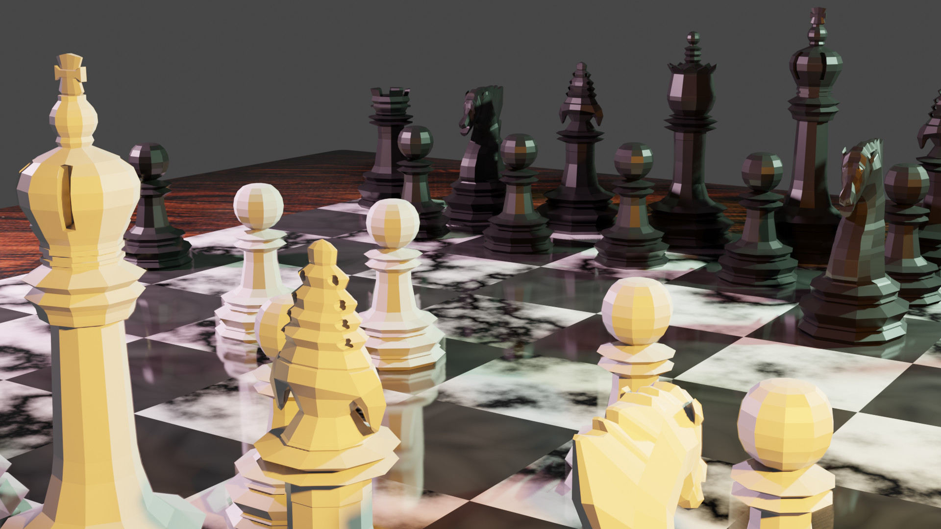
Here are my different renders! Pretty pleased with how everything turned out 
Would love to hear any suggestions for improvement!

Here are my different renders! Pretty pleased with how everything turned out
Would love to hear any suggestions for improvement!
Good eye for dramatic angles! Splendidly beautiful chess pieces.
I am no pro, so take my advise with a grain (or a bag) of salt.
I feel like the right half of your first picture has a lot of white and gets blurry to me. Now when I look at it closely, I see that pieces have some matt finish to it, and you did different sources of lighting and you did everything very well.
I feel like maybe making the board less reflective would make picture more readable. Or having white chess pieces of more woody color. Or play with dramatic light so that it would color sides/back a bit more. The rest of the pictures, that don’t have much of the glossy board in it seem great and I can easily tell one piece from another.
Again, I think you’ve done fantastic job, and I am excited to see more of your work!
Thanks so much!
I did actually get the sense of a lot of white as well when I first rendered out the images, but may have gotten used to it by the end. I did fiddle with the reflections and render settings a lot and this was one of the clearer results. That said, I like the idea of changing the white pieces to a wood colour! That’s an option I hadn’t considered. I also wonder if just changing the camera angle a bit would help.
Thanks again for the suggestions!
Very nice set and board.
A touch less reflection on the squares perhaps would help.
I love your models, they have a really interesting style - the dragon / knight is excellent.