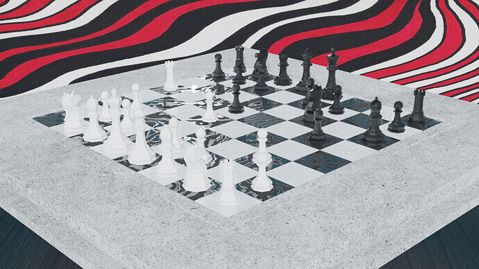
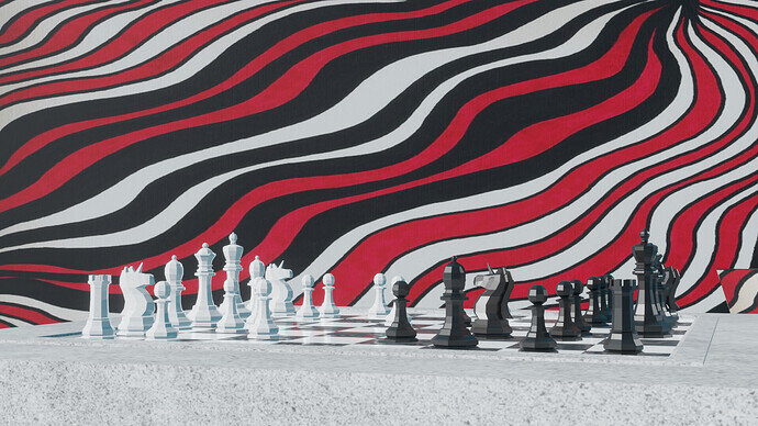
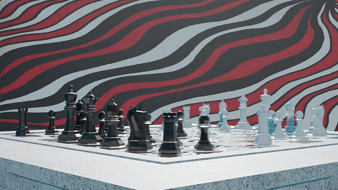
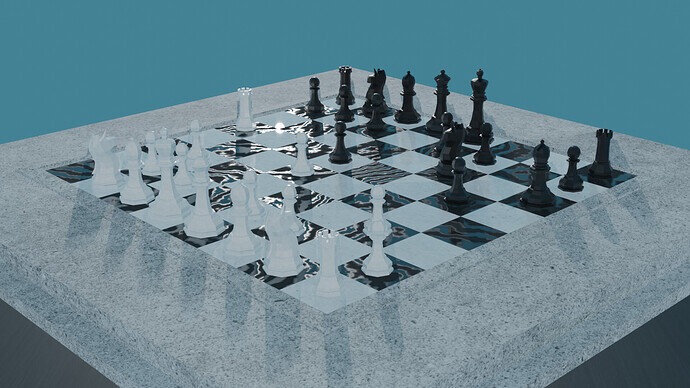
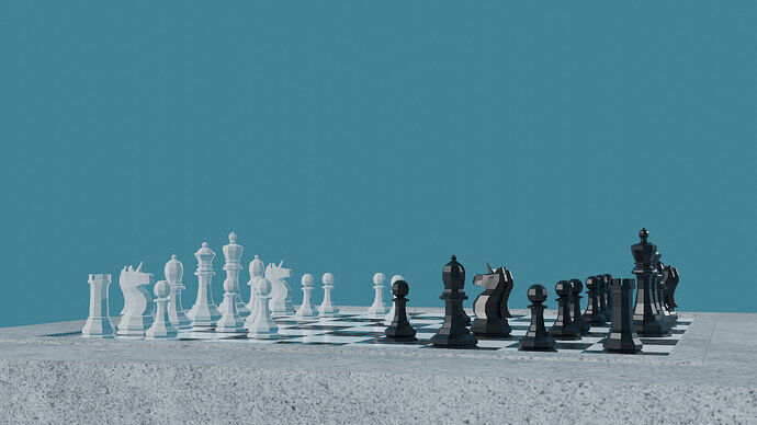
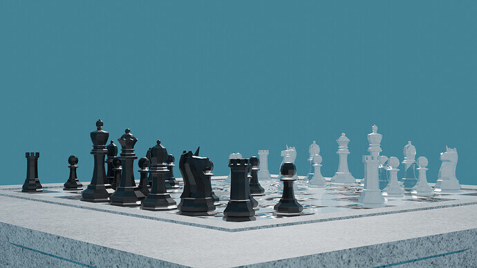
Here’s how my three camera angles came out! 
4 Likes
Looking good. Perhaps a bit too much light on it all?
1 Like
I agree, though I’m finding the background image more distracting.
2 Likes
I took yours and @Miss_B 's advice and implemented both critiques, less light, and a less distracting background. I still do enjoy the first background, but I can definitely see how it was a bit busy 
4 Likes
