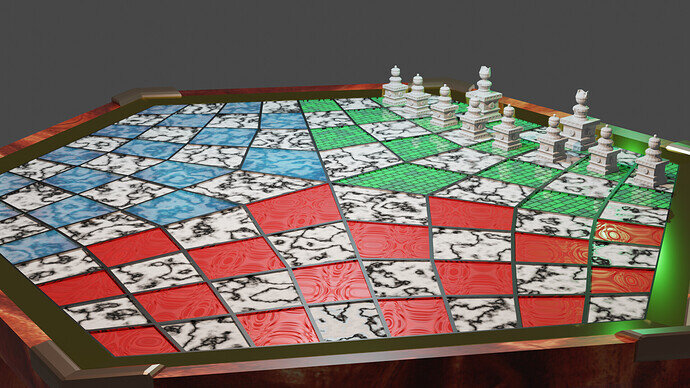
I played around with the generated textures and came up with a few I like for the tiles but I cant decide on which one is my favourite, currently leaning more towards the blue marble, also want to fiddle with the white marble a bit more and make the change from black to white more diffused. also think I should probably make the lining inside the tiles black like the borders between tiles are.
They are all very fancy.
However IMO, you want a s plain and unfancy a board as possible as it only distract from the main subject.
It is fun, especially if the first time using procedural effects, but they are best used subtly.
Oh, and the textures are going up the inside edges of the square’s dividing rims which is an ‘odd’ look.
yeah I noticed that too, will change it to being black like the tile borders going forward and I also see your point about the board being a bit to busy, will tone things down in a later version I think
Nice work with the textures. I like the blue one more. NP5 is right about distracting from the main subject though.
But I can’t judge you because I have the habit of experimenting and having fun with every new thing I learn in blender  .But I managed to squish that habit
  so that I will only do that after completing each section exactly as in the course. That way I will have a better understanding of the things and techniques taught in the course and will reduce errors
  . You will understand what I mean if you check out my works
  .
.
So like NP5 said it will always be better if you follow the course first and then experiment.
Anyway great job. Have fun!
thanks for the feedback, it really is hard fighting the urge to just go hog wild experimenting and before I realised i’ve spent the best part of the day fiddling around with stuff that I wasn’t even suppose to be trying yet 
Good job experimenting with different possibilities. I agree with previous statements, sometimes less is more! Those pieces you spent a lot of time on should be the focus of attention.
