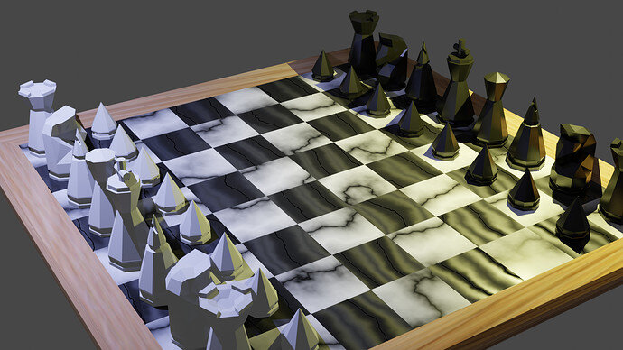
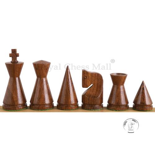
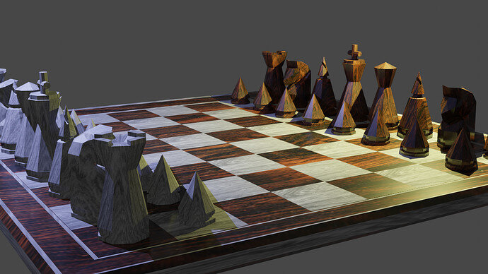
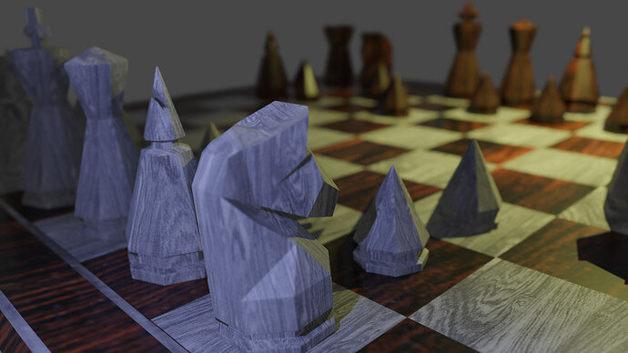
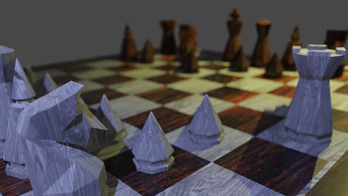
I used a set I found on Etsy as inspiration (pic below) , though I did take some artistic license.
Well done!
Maybe also wooden textures ?
Nicely done different style set.
Yeah I was thinking about that! Same with the board squares, too. Probably gonna play around with the different wood textures and see what happens 
Thank you!
I like this wooden theme. Well done!
Now try to improve the lighting.
Left blueish color is too harsh (for wood texturing).
- Show complete board
- increase lamp size for softer shadows.
- And maybe, set lamp further away and increase wattage for more evenly lit light. This helps on the left white pieces side. With bright and dark white pieces.
lighting and camera angles are definitely not intuitive for me. I can never seem to make it look render worthy.
Blender uses real metrics.
So a lamp close by needs less WATT power to shine on things.
But then the light diminishes fade away strongly.
Not giving the same light to all pieces in the scene.
Grey knight strongly lit, king is dark.
Set the lamp further away, give more power. scene is evenly lit.
Increase lamp size for softer shadows.
BUT, for Eevee you need to tweak shadow properties.
thts a different but beautiful chess pieces
Really like the design! It goes so well with wooden texture! Very inspirational.

