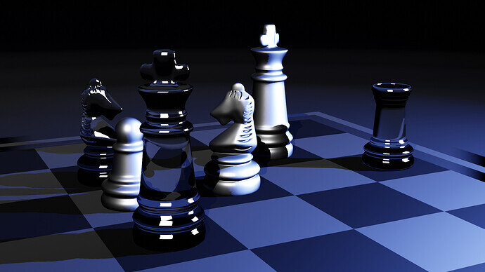
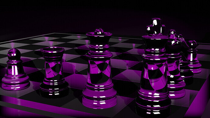
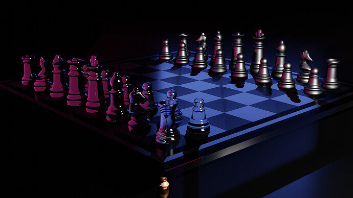
Hi there. This is my first project 
7 Likes
Very nice.
The glass highlights are a bit harsh (using square area lights?)
2 Likes
I really like the details on the knights - a different take on showing the mane.
2 Likes
Yes, it’s square area. May be it should play with light more
2 Likes
I like the curvy checkered lense through the glass. I kinda of think the white pieces should be a frosted glass instead of the metallic. But I guess that’s an artistic choice. Overall like the colors and great job
2 Likes


