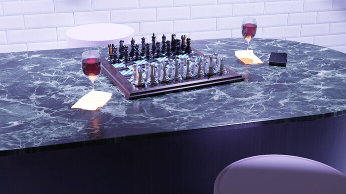
Look good, with a lot of details. But what is the white circle?
- I think also the white is too bright, too much light
- Working with textures, is fun, but it makes the scene very ‘busy’ (white chess pieces barely visible).
I was wondering that as well, but when I clicked on the render to get it to full size, I realized it’s the same chair/stool as the one at the bottom of the scene. It’s just showing up so much more because the light is glaring down on it.
When I got in closer, I could see it wasn’t “floating” over the chess board, but actually another piece of furniture.
Looks great.Lots of details.Nice job.
Nice work. That back circle could do with a duplicate of the foreground stool top put in there instead. The glass feet and stems are lost in the bright whiteness, perhaps a different colour might work better?
Marble table top is very nice.
Looks good, need more cheese!
Noticed it immediately, I figured it was another stool.
Quick recommendation for scene:
If you spotlight the scene so that most of the light is focused on the board and its pieces, and everything else is in a bit a shadow you will accomplish both a nice focus and atmosphere to this otherwise decent render.
Good job and keep on trucking!
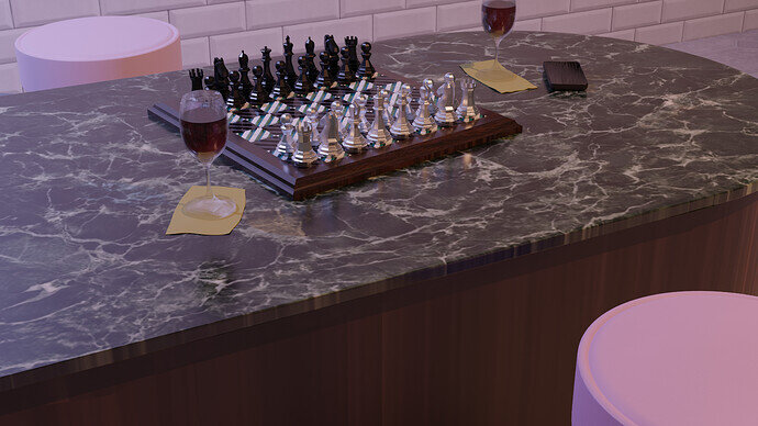
Thank you all for the feedback, tried a couple of blue 50w spot lights but it does look indeed to bright. I’ll change it to a warmer setup and fix the second stool.
… I rarely zoom in … but it looks like a lost cylinder.
Much better. Now the second stool, and the bottoms of the wine glasses, are more easily seen. 
Good changes things are standing out better now.
This is a great example of how much impact you can get from some small changes. The first render looked really good, but the last one is so much better.
I do not want to nitpick. But the stools are a bit too high.
I understand that is part of the current composition and lowering will make it disappear.
But then you need to change the view or find an other solution.
All part of the design process.


