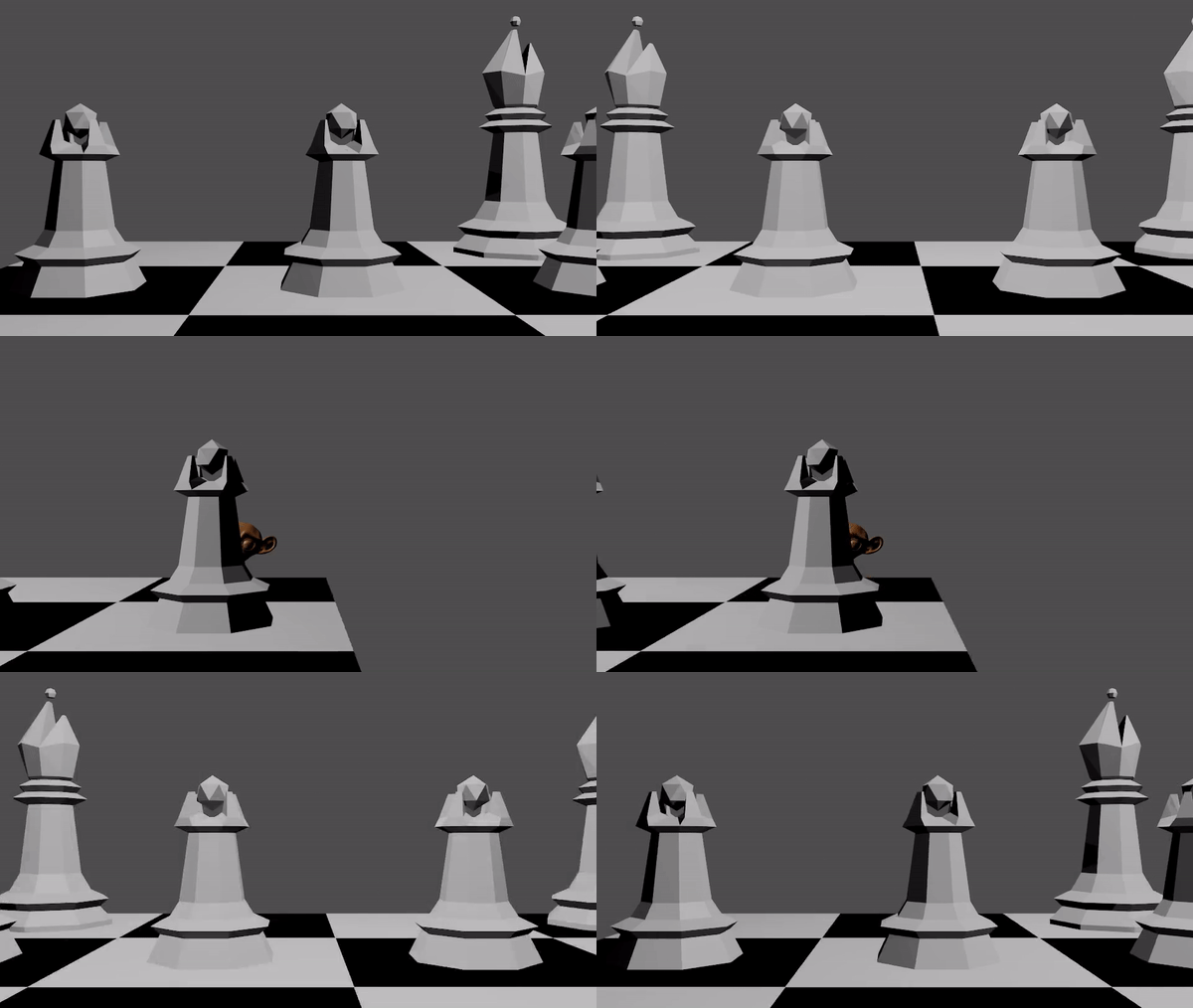
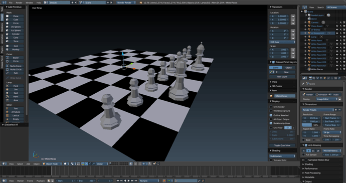
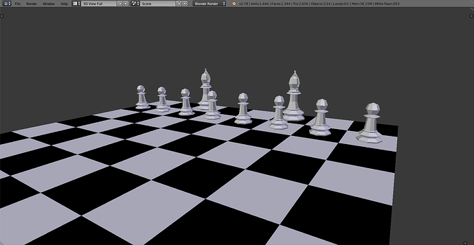
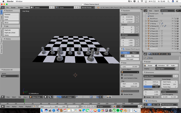
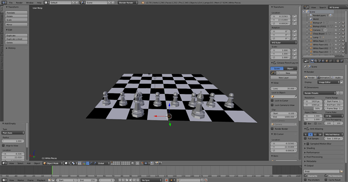
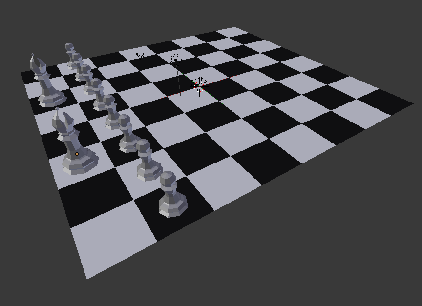
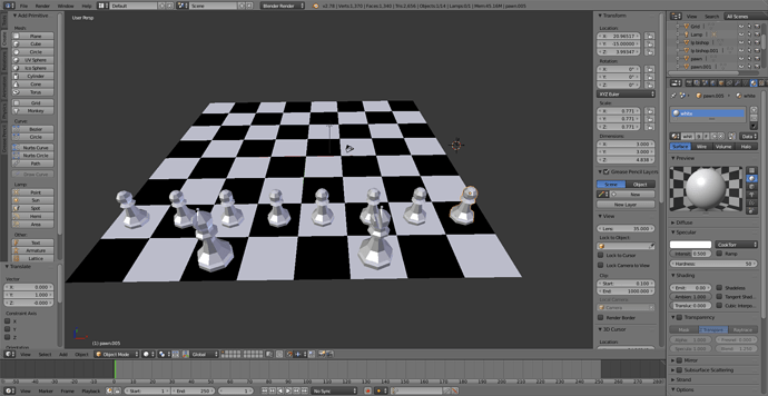
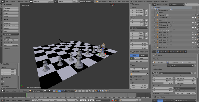
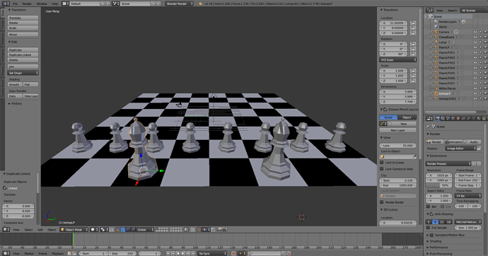
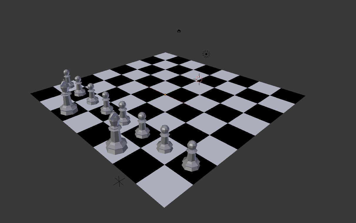
How did you make the background look like that? and what do you think of mine?
I plan to re-make it the way we originally made the pawn (not low-poly) after the end of this section, unless he shows us that anyways
Hi, if you are talking about the viewport background, it’s just because i have a different theme set-up.
you can chose among different themes in the user preference.
it looks nice, you can always just click on smooth if you want it to look a bit less low poly. i think in the end i also applied a subdivision surface.
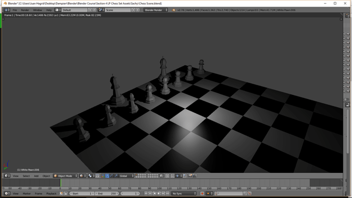
Nice, it’s a bit dark tough (unless that’s what you going for ;)).
Yeah, it will be brighter in the future 
Oh nice, that’s the “Science Lab” theme for Blender. I like it more than the default grey generic looking one. -.-
User Preferences > Theme > Presets > Science Lab
It will only change the colors of UI layout and background color in 3D view.
You can change all that manually too in that same area.
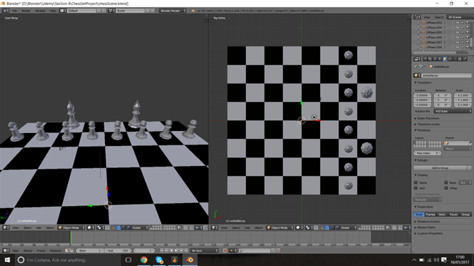
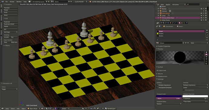
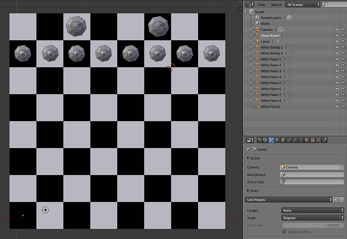
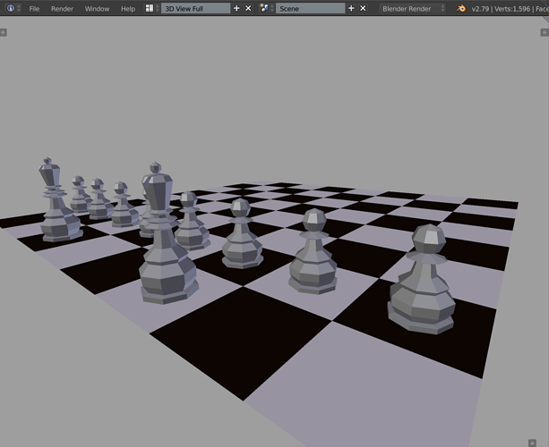
 Here is my Chess scene so far! Thanks for pointing out the correct grid position for the white position; had to rotate the chessboard to get it right!

