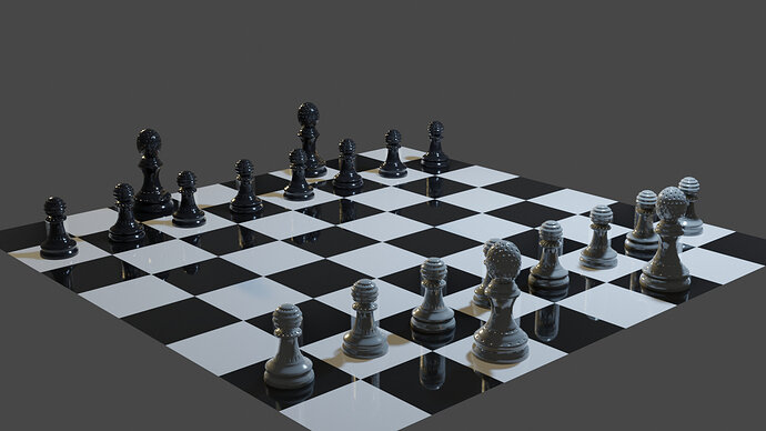
I liked the more reflective look on the black squares and pieces and decided to go in the same direction with the white pieces, however getting the reflection with white was a bit harder to achieve so i ended out giving it a slightly metallic look also. how’s she look?
Looks good! Interesting top design on the pieces. Very cool and unique. The white pawns seem to have some kind of a ghost around them. I don’t know how else to describe it. Is that intentional?
edit: On closer inspection, it seems to be around all the pieces. Kind of a semi-transparent white artifact. Not saying it looks bad, it’s just confusing me a bit.
Yeah I noticed that myself shortly after uploading the image, not entirely sure as to why it’s happening just trying to decide for myself at the minute if it’s worthwhile chopping and changing the materials to figure out where it’s gone wrong, it probably would be beneficial but seems like a long arduous process
Yeah maybe not worth it then. Set is looking good! I’m interested to see how you’ll do the other pieces and keep with the design theme.
Thanks I really appreciate the feedback (maybe if I get lucky a future edit will fix the ghosting issue and I’ll tag you again) lol hopefully it ends out looking as well finished as it is now!
Looking good.
That ghosting, is it somehow caused by a directly overhead light? It is on the black pieces too, most obviously on the pawns.
I thought that myself but had retired for the night after getting to that point, hopefully today will hold more answers! I’ll look into it and see what I can do.


