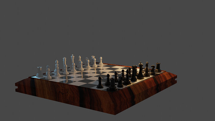
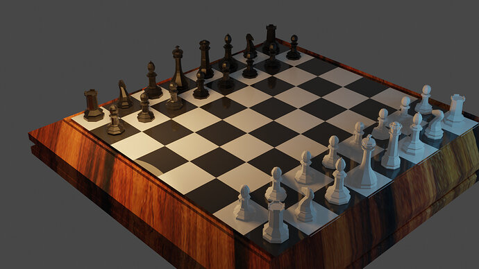
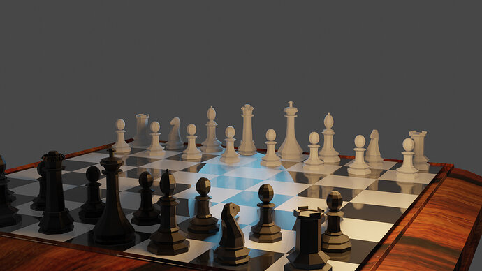
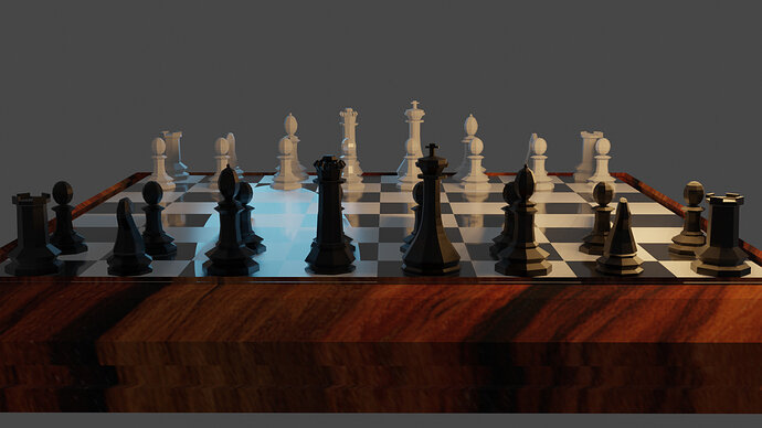
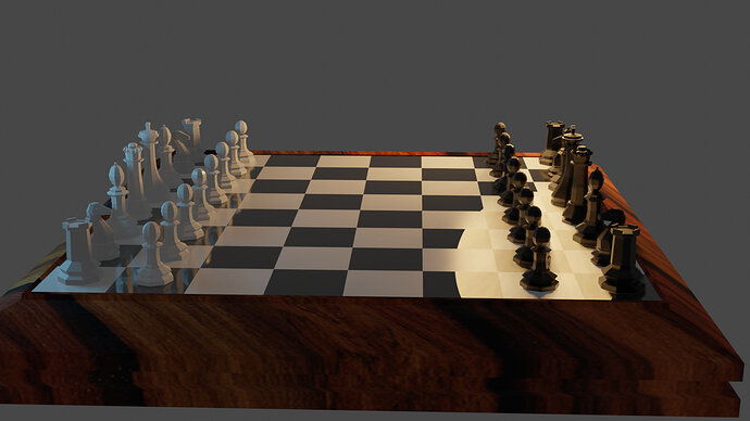
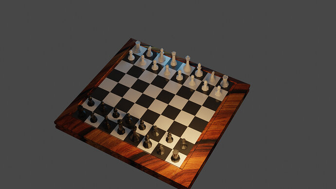
These are my final renders. Appreciate some feedback so I can improve the work.
What’s the glow in the 3rd , 4th ,and 5th images, that’s all I see wrong with it. Otherwise it’s a good solid chess set, with nice textures and pawns. 

Good basic starting point.
Ears for the knight?
Some texture to the squares.
Textures for the chessmen.
Bevel all sharp edges of the board, very slightly.
Not sure if at that stage of the course if you should have been shown how to line the wood grain up along the lengths as it would be in reality of manufacture.
Smooth shading also an option.
edit. Oh and even your bishops have no notch. This is a long long way from a ‘final’ render as in a finished scene.
Beautiful!
It’s the size of the point lamp reflecting.
I forgot how to remove them or even if it’s possible.
Some say, move the lamp to an other position, other say make a tiny lamp size. But that reduces shadow softness. It think there is an option, but I forgot how.
Thank you for the feedback

