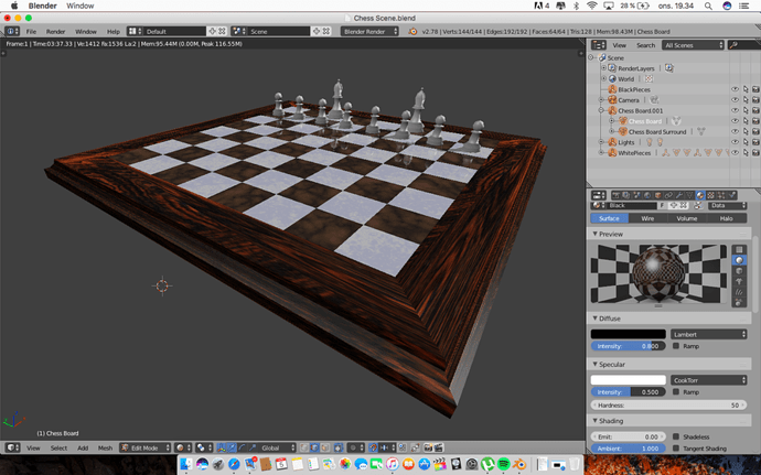
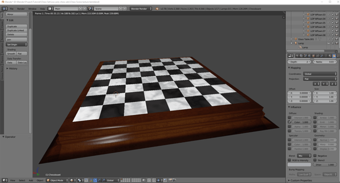
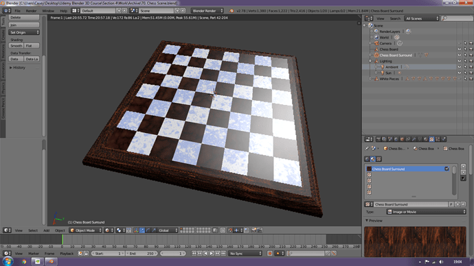
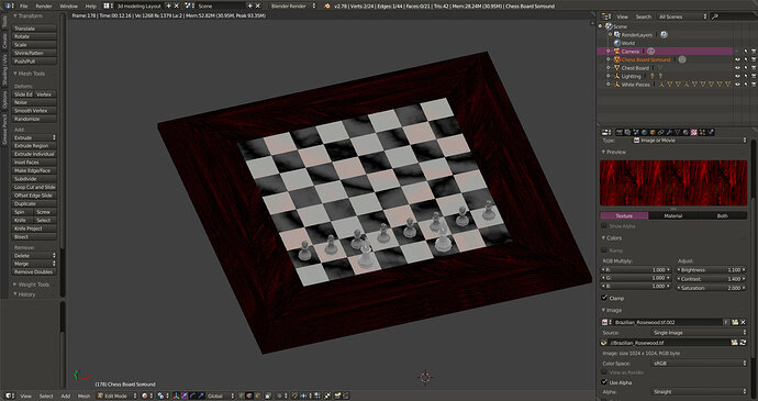
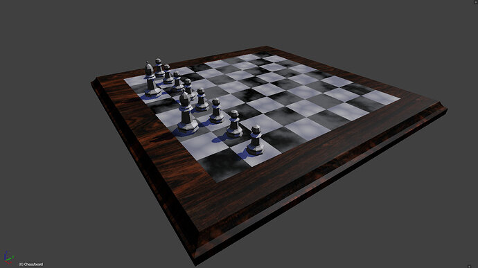
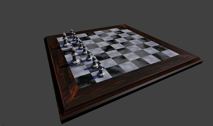
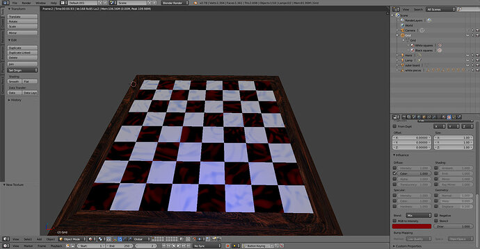
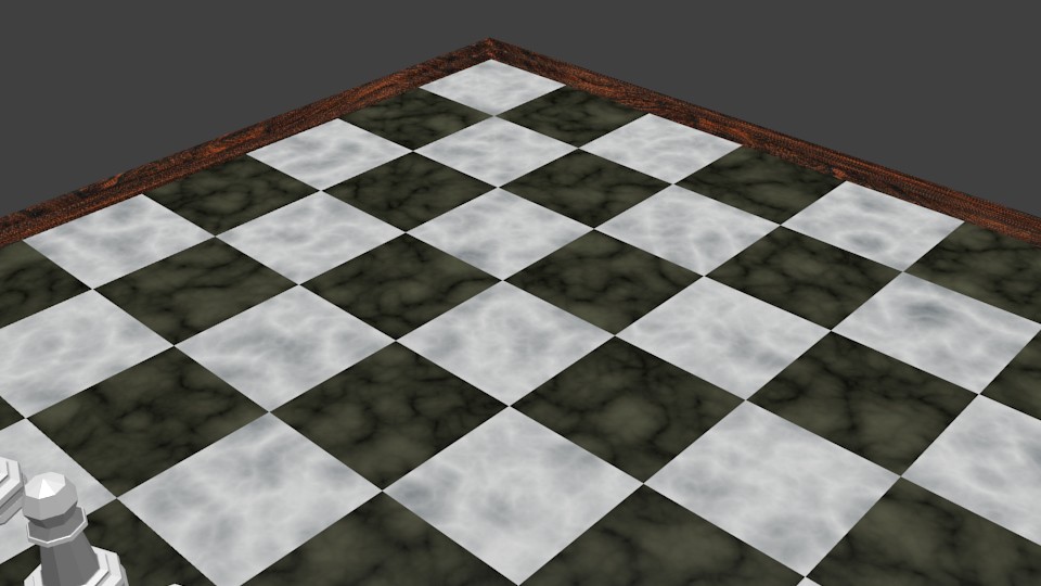
that looks really good!
Thank you!
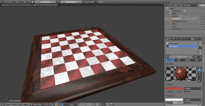
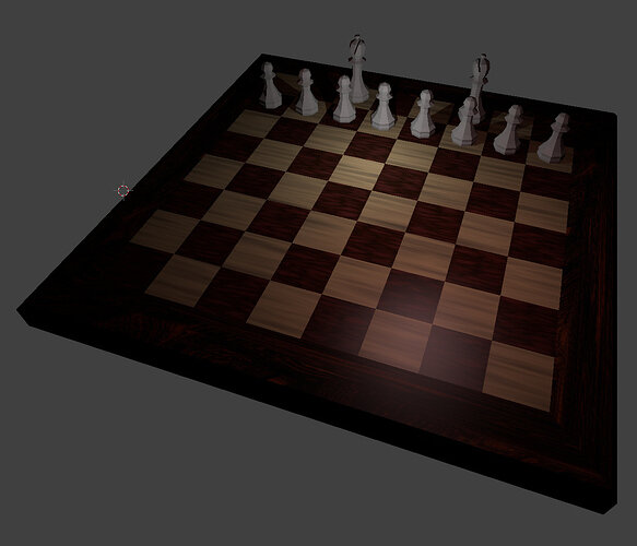
I tried playing around with differnet colours and textures and am a bit dissapointed that i find the classic version to be the best looking…
I built up my chess board up a lot then I started seeing a lot of slow rendering which probably means I need a new graphics card and cpu huh…
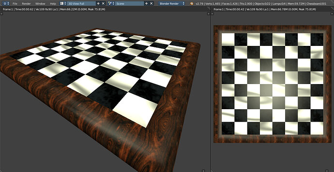
My white tiles were too bright, but I found if I made the diffuse material colour more grey than solid white it took the glare off a bit.
Hi,
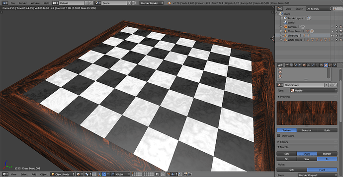
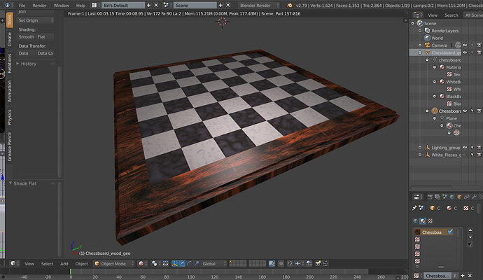
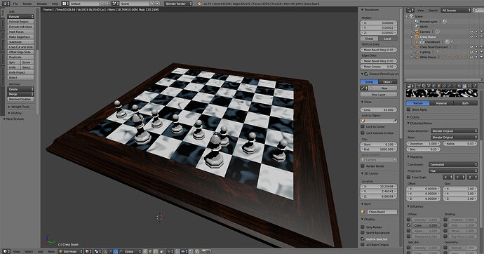
I went with marble (black and dark-blue) and wood (white and light grey), here is the result:
Now I feel like the wood surrounding don’t fit with the rest, I might change it for the final scene  .
.
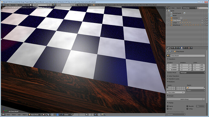
Also I didn’t have that “line issue” with the UV coordinates like in the video (around 1:46). Is it because I’m in Blender v2.79 ? Can someone confirm ?
Cheers !
That’s a great bevel on the wood!
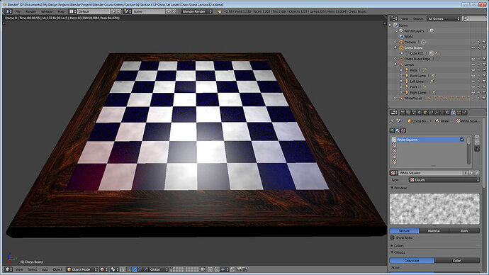
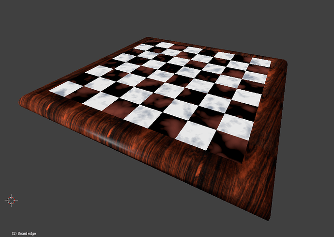
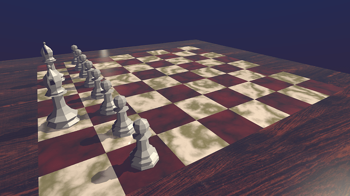
 Here’s mine! I chose distorted noise for the white squares, and clouds for the black-purplish squares! I feel like I may still play around with it…


