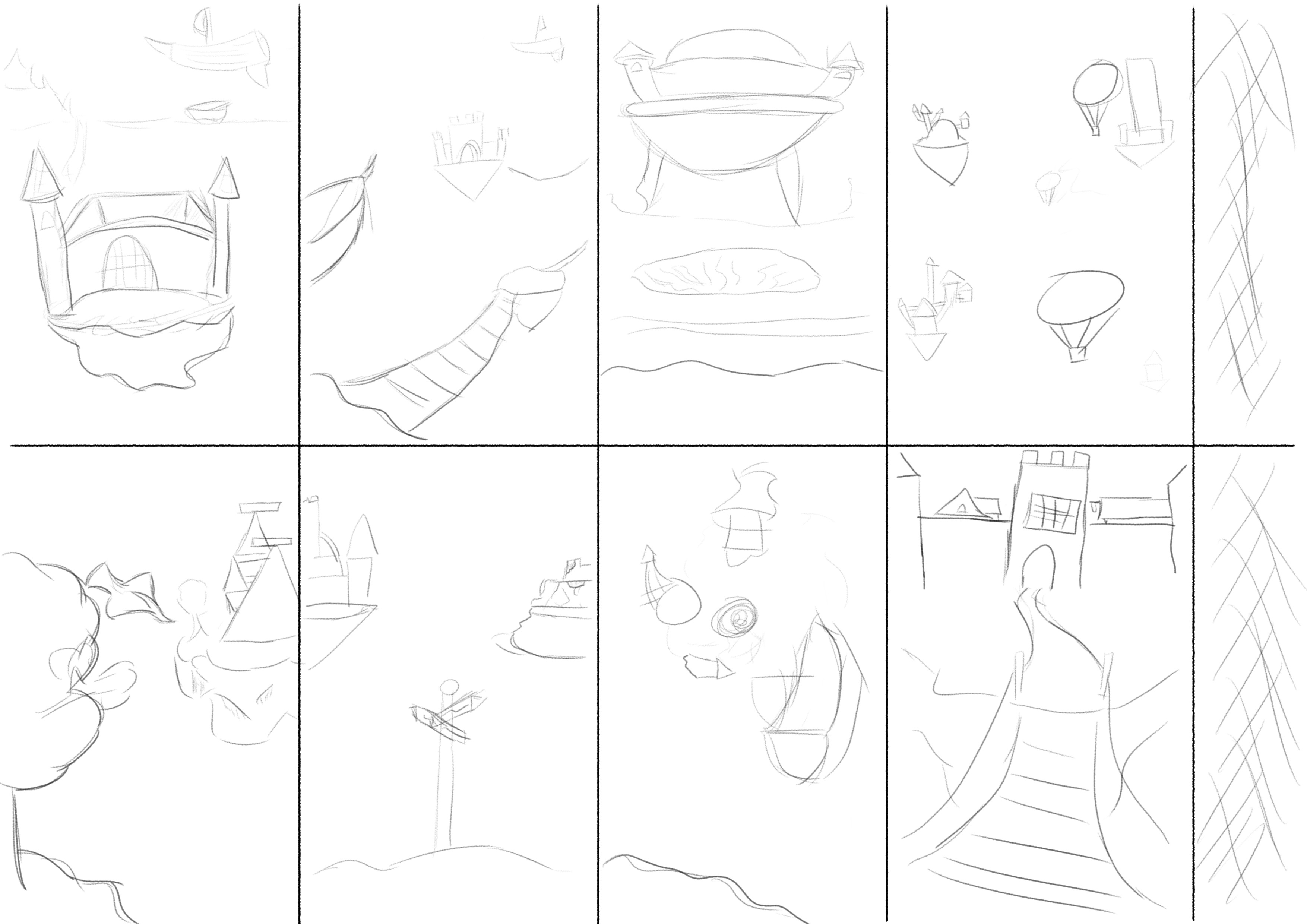
Gave a shot at 8 thumbnails.
General Thoughts:
Caught my self “scratching” quite a bit instead of using broad/confident strokes from the shoulder, especially in the first few pieces and when I started thinking of finer details.
I really liked adding a place for the viewpoint to “rest” on. It gives a greater feel of depth to me.
I should probably look at the reference images much longer. I feel that I couldn’t experiment too much with the castle style because I wasn’t that comfortable the mental image of castles I had from my search.
The Ideas for the thumbnails:
- I wanted to try and have a look inside what the castle walls are protecting. The scene seemed empty, so I also considered adding ground/mountains in the distance.
- I really wanted to play with depth here, while trying to limit difficult perspective work. The ship approaching the castle felt empty, but adding the islands connected by bridges helped. Having the foreground island connect to the background castle in frame would have been better I believe.
- Castle rising out of the ground. Wasn’t sure what to put inside the castle walls, but the bulging effect looks to me like it’s containing something. Wanted some sort of hanging earth from the chunk of land.
- The idea for this one is a commute from work to home or vice versa. However, adding a third location made the composition too busy. Whoops

- I wanted to invoke a sort of wonder. I really like the composition of this one. As for the “castle”, I was trying to think of how to invert the basic blocks of the castle (triangle → rectangle vs rectangle → triangle).
- The crossroads(?) is supposed to depict two castles, one new vs one decrepit. I feel that the composition of this image is a bit bland, possibly from a lack of depth? Also had difficulty depicting a rundown castle (needed to see some references!).
- I wanted to mess with a sort of vortex/golden ratio sort of thing here, with all sorts of items being sucked in. I think it could be interesting if there was a denser castle on the island. I was maybe too focused on the concept for this one?
- A lot of the scale on the previous thumbnails made the space felt large. In this one, I wanted the castle to feel large, and a bit intimidating. It’s supposed to keep you out after all! Perhaps having the view look to the left or right a bit to show distant islands would help with the “wonder” of the image.
Hope someone can get some ideas and learn something from this!