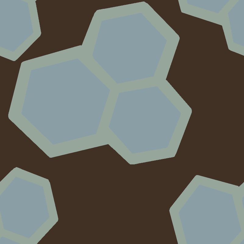
I thought this might be good for on the floor. I don’t know if I like it though! After rendering I think it looks too, busy.

5 Likes
You could try to make the pattern smaller (i.e. more texture repeats), which sometimes will make it look less busy. Although, having said that, sometimes making it larger (i.e. less texture repeats) will make it looks less busy as well. All depends on your texture and your personal tastes. Maybe some subtle shadowing around the edges of each of the pattern pieces on your texture to subtly blend or transition between the patterns and the background color of the floor?
1 Like
Yeah, I’m not happy with the carpet. Oh well… Ill experiment with making it a bit smaller. But, I have this feeling that it Ill have to do a different one in the end.
Thanks for your reply Morgaine!
1 Like
This is just a quickie version and I seriously doubt the colors are right but, mocked this up quickly in Photoshop to sort of give you an idea what I was nattering about.

2 Likes
Thank you Morgaine! So kind, to help me out!
I Added a normal map and imported in to my scene:

It seems as though it’s lost some of its seamless-ness goodness on the way though. But I still like it.
Cant guarantee that it will make it to the end renders though, as I still feel is is pretty busy.
On the other hand I dont wanna be a perfectionist about it all…

3 Likes
You are most welcome! I think that is what our community is all about…sharing and trying to assist one another. If we don’t do it, who will?
Pffttt…I have no expectations of what I posted being a part of your render. I don’t always explain myself well; thus, I thought about it and thought I should offer an example. When I went to check the seamlessness of the texture, it didn’t tile well for me so gave up on that idea and just worked on the original you posted above. I like you added the grout lines; I think it really adds something to the flooring. To be honest, I personally am not fond of that particular pattern  but, is not my building either.
Keep up the good work! I can’t wait till you post the final results!
2 Likes
Try having a bit less contrast between the different colours. Since the shapes are pretty strong as well as the colours, they naturally all stand out to the eye.
1 Like