My Building Escape is based on the Bull Cow game from Section 2, using colored statues instead of letters of the alphabet.
I’ve been watching videos on game design, and was inspired by this one in particular to produce a tutorial experience that doesn’t feel like a tutorial.
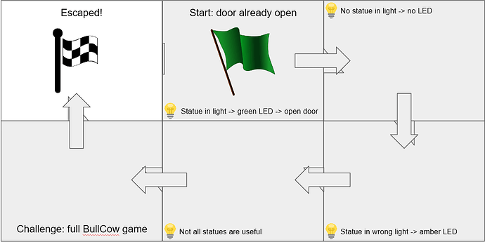
There are 4 tutorial rooms to introduce the player to the rules of the game. The 5th room is a full Bull Cow game.
I used feedback from my wife and kids to change the mechanics:
- Support E and left-click as grab keys.
- Press to grab, press again to release.
- Highlight items when they are within grab range.
- Slow down movement speed and constrain to XY plane.
- Limit physics on statues.
The highlight was done with a Fresnel material node.
Something that really helped me was to decide what lesson each tutorial room was trying to teach before doing any work in Unreal. I used Google Slides. This is the first slide:
I had real trouble with lighting, texture alignment and intermittent, ugly white artifacts. Looking at some of the other work people have shared, I see I have a long way to go with environment design. But it’s time to move on to the next section.


