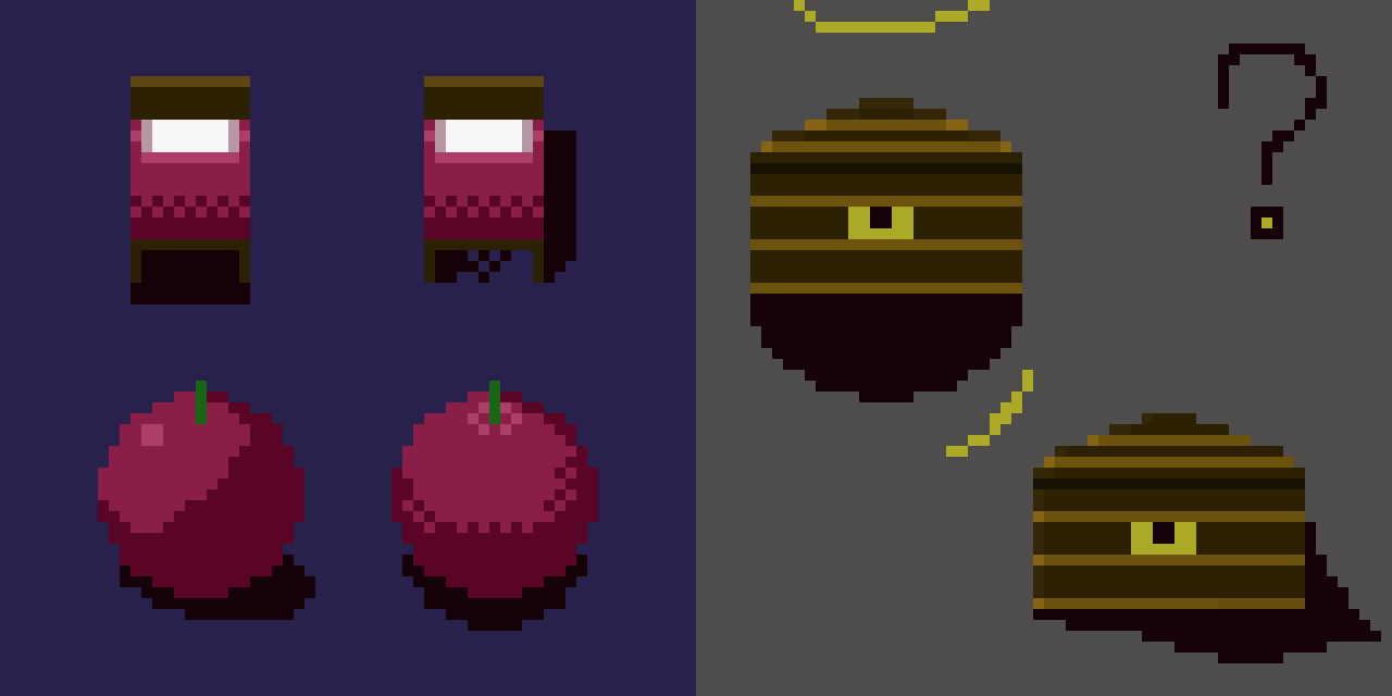
My first go at pixel art.
I’m using Piskel in the browser.
![]()
(ok… use your telescope to check it out!)

My first go at pixel art.
I’m using Piskel in the browser.
![]()
(ok… use your telescope to check it out!)
What about this?


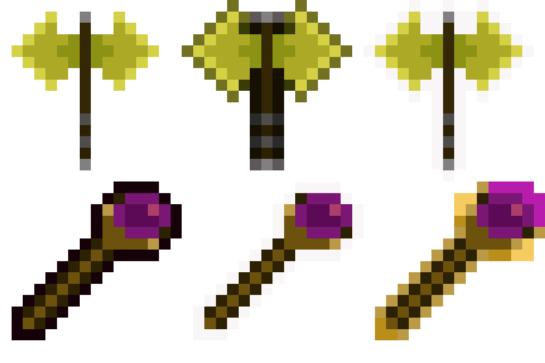


Do you think the blue/red colours are turning correctly?
What do you mean?
Maybe that the white part is the same…
In the middle it should full size, but at the sides smaller
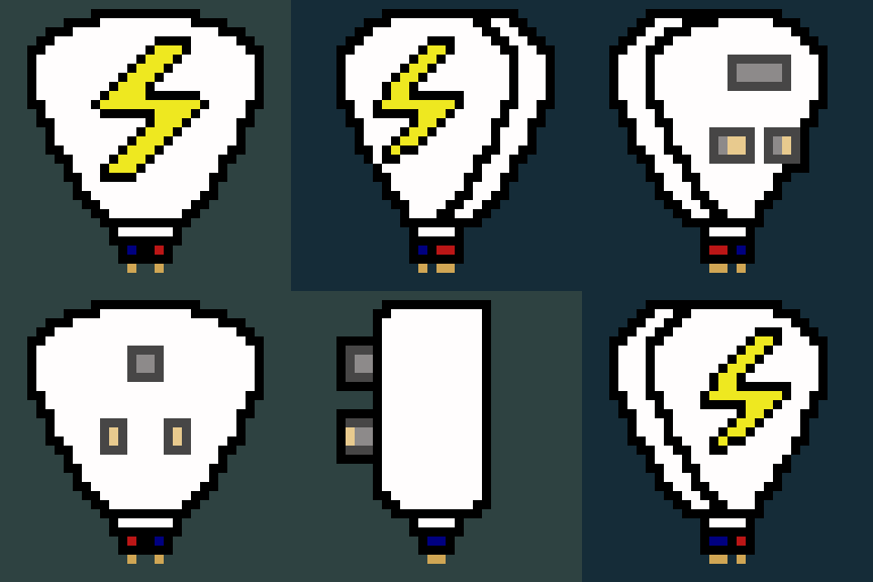
I changed the design instead as it was giving me toothpaste vibes.
It was whether it looked like the colours were rotating or there was a jump.
The longer I looked at it, the harder it was for me to be able to tell.
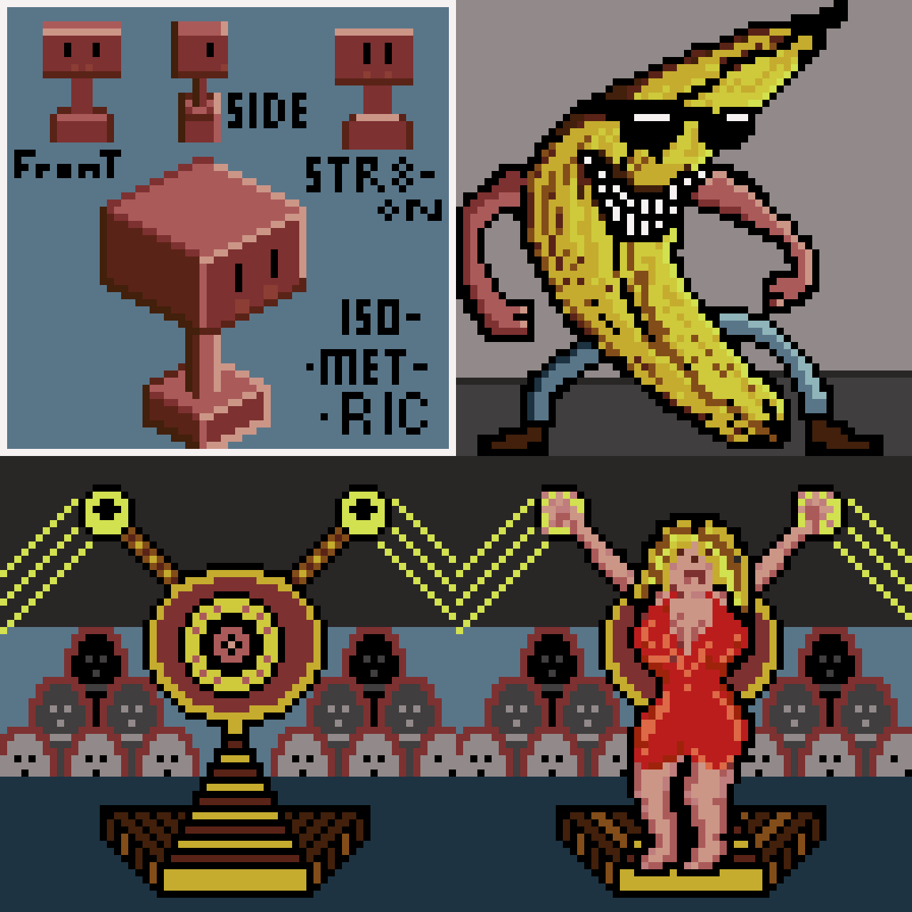
Got distracted


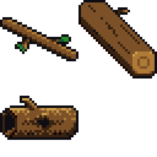


Realised I altered the angle of light to one direction to highlight my designs, thinking it would add depth and be more recognisable. But the examples stuck to direct lighting, which makes me question, is it typical or important to keep your lighting of inventory items consistent?
