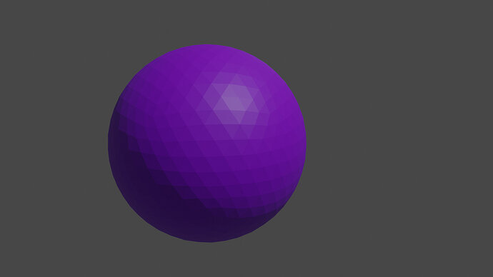
I decided to go with the ico sphere set to a 4 on the subdivisions. I liked the idea of the quad sphere, but when I look at it it just doesn’t look spherical, even after applying To Sphere. And if it’s between UV and ico, the ico just looks cooler IMO.
4 Likes
IMO you’re right. Haha I really like how the light on the ball looks like a star.


