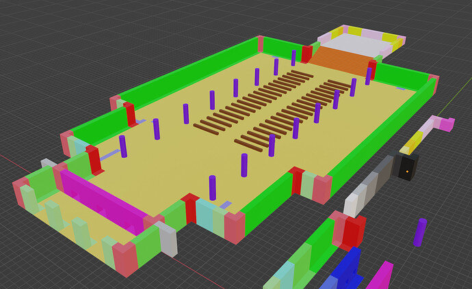
Blocked out Gothic Church

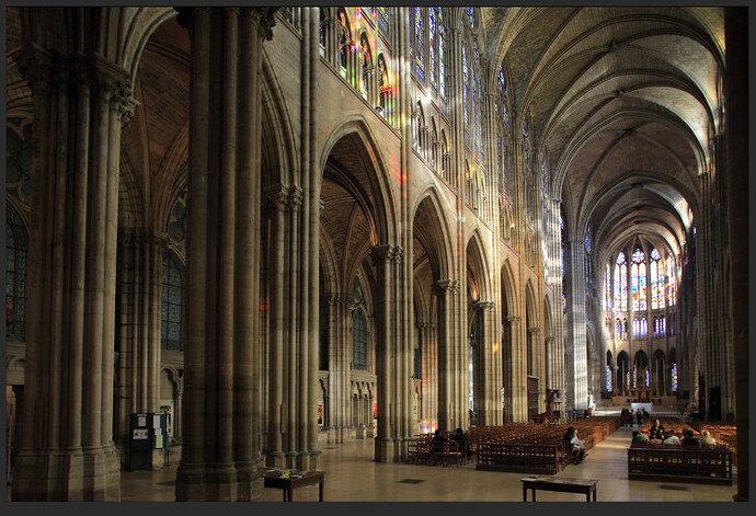
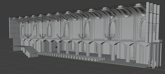
Sharing my idea for a gothic church. I’m planning the shot to be from the inside near the entrance, pointing at the stand at an angle that shows off the columns, which will join up top in an arch into those fancy church windows.


This one is where I’m taking a lot of inspiration from

9 Likes

Great ambition!

Have you done any sort of calculation of where your vertical layers will be? Will they vary in height? I just see all sorts of complications ahead. :grinning_face_with_smiling_eyes:
Then that is probably my realism bias.

1 Like

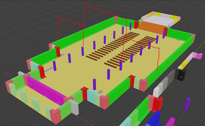
I’ve been thinking of something like this :smiley:


Sorry for the crude screenshot drawing :smiley:

1 Like

Yes I thought it would be different heights to fit the arches etc. I just wondered if for example that second layer might be split into two, and still maintain the ‘cube’ size basis of the base floor. But it would be more trouble. So it will be modular but not rotatable 90 degrees.

Good idea to mock up the block sizes and fits before making the actual meshes.

I look forward to seeing it progress!

I was thinking about making the column arches first and seeing how it goes, and then putting the roof on top, with basically the same tiles as the corner pieces but rotated so that they are horizontal. Reason in my mind being I figured it would be easy to block out a simple roof shape when i already know exactly where it’s supposed to go opposed to blocking it out earlier and having to adjust it later to fit with whatever columns I put in there later.

I’ll be sure to post updates! I hit some kind of a mental roadblock lately and have been struggling to get into the rhytm of making stuff, still seems like an unbelievable goal to actually become a good 3d artist, and I just can’t stop wishing i started learning this 10 years earlier.

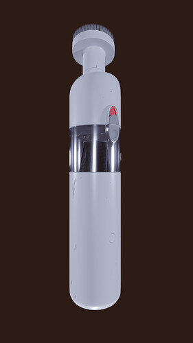
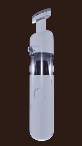
Completely out of topic, but check out my (totally non brand) mini vacuum that’s been sitting on my desk for a year and just begging to be modeled :slight_smile:


2 Likes

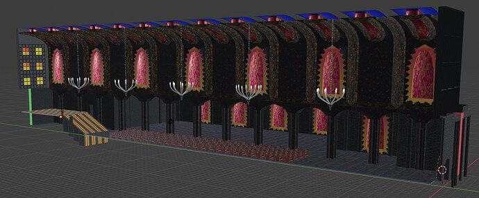
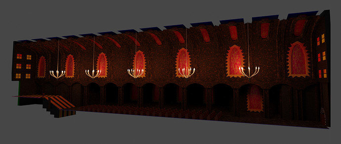
Took me a long time but here is the update of my work so far, as promised :slight_smile: The goal with the scene is for it to be seen from the inside, for a game idea, It could be like a boss room level, with some kind of crazy priest at the rostrum you have to fight.


5 Likes

Looking very impressive! By the time it is mirrored and a full building it will look massive to walk through.

2 Likes

Extremely well done. I can’t wait to see it when you have it completed. :slight_smile:

1 Like

really coming together, great stuff

1 Like

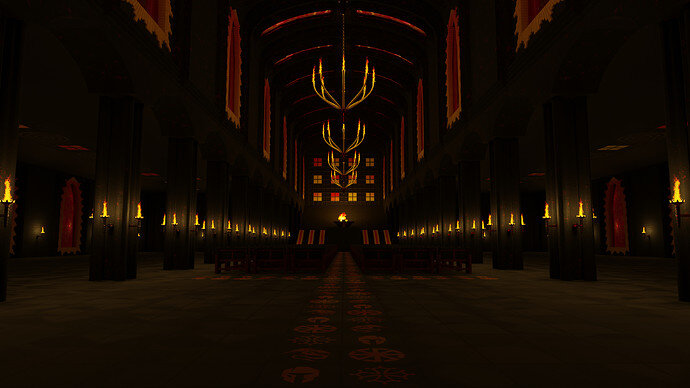
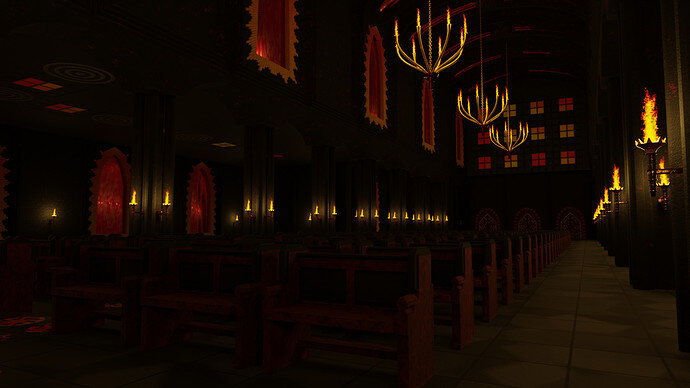
Here’s a first, simple render of the “finished” scene, tell me what you think :slight_smile: It took about 4 hours to render out!


Update: Another angle, using different denoiser and in 1080p instead of 4k

5 Likes

Looks great!
A fraction dark perhaps, but in a game that may not matter.

Being picky, the chandeliers probably would not stay that way up, held at the bottom.
Also would they not have candles rather than flaming torches? Torches on the walls might well be possible but I suspect unlikely. But perhaps I think more historically, this may be fantasy or modern gas lit!

1 Like

I had the exact same thoughts while making it, I usually try and create things in a way that “makes sense” so there is no “mcguffin” answers as to why things work. I was planning to add more chains to the suspension of the chandeliers, so it staying “in place” and not tilting/moving would be more believable, with the fire I was definitely going for a fantasy look, plan was to make the animation of a character entering, moving through the darkness and suddenly - boom - fire everywhere - but my computer with only 16gb of ram decided otherwise, when crashing blender for the milionth time.

I agree with you on it being too dark, It’s probably more of an issue with my textures, as I did them early on in the process before adding the lights, tried to export, it was way too bright, so I quickly dimmed it and let it render for the night hoping for the best. There will be more updates here if anyone cares to look, I plan to polish this one out, mostly retexturing various things, and adding more detailed elements to make it look less empty.

2 Likes

Privacy & Terms