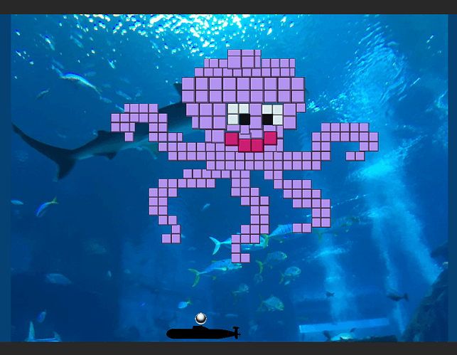
I tried to create a cute design by having a pixel art layered behind my blocks as I traced over the image. But the curves are a little tricky and my different size blocks looked overlapping as Rick’s block had shadows. (I think that’s the reason.)
For the paddle, I took the image of a submarine and used Edge Collider and traced around the odd shape. The sub is roughly the same size as Rick’s paddle.
Maybe as the lesson progress, I will make the lips and eyes harder to break. 
PS. The background is a picture I took with a phone in an aquarium. It had the monotonic quality useful for the block game so that the blocks can stand out. Plus it lends well to an aquatic theme.
Constructed blocks for level 2:


