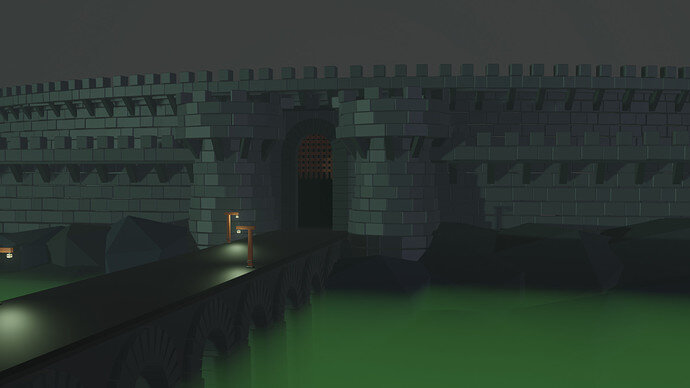
I like the picture and the green misty moat. It has a monolithic foreboding atmosphere, with a tinge of Lord of the Rings Movies depiction of Minus Morgal (the Nazgul castle). The scene is pretty balanced and not cluttered. It is also easy enough to see what you are conveying.
You mentioned that you should have centered the gates more. Strangely enough, most good art, be it portrait or concept, does not have their point of interest directly in the middle of the picture. It is usually off center. With regards to your gaps, I would have purposefully added them in. Rare is the castle without the gap. Just add some filler, like mortar.
I agree with NP5, 4 hours is really a decent amount. It probably would have taken me more in order to end up with the same quality. Efficient use of time on your part.
You mentioned that you were not comfortable with the colouring. It seems to me that it might be a matter of contrast. Our eyes tend to be attracted to the most complex thing in a scene, where the greatest contrast of Hightlights (lightest colour/ value, like lights) and core shadows (darkest colour/value: dark shadow) are.
Right now my own eye is drawn to your lights on the bridge, this is where the most interplay of colour and contrast is happening. If you added some lamps or torches at the gate this would bring the center of attention right onto the castle. Our eyes would then walk across the bridge right up to your castle gate, and then look around at the castle itself.
If you are referring to the castle colouring, one trick you could try in order to break it up is by randomly choosing some of your stone bricks and changing their shade. Having a three shade variance can be useful: one mid-tone as your primary shade, one lighter shade, and one darker. Whether in pencil, painting, or 3d modelling art, rarely is there one solid colour or shade to a given texture: like a brick wall. Variance and randomness within unity and order is pleasing to the eye.


