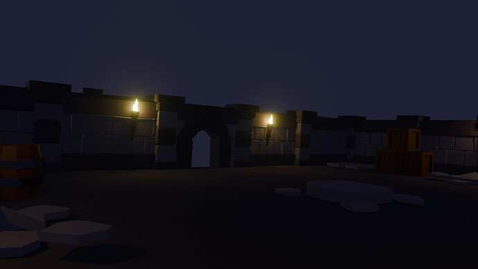
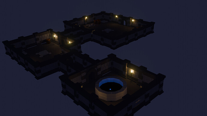
my final dungeon design
still have bits to work on and make bits line up better but i am pretty impressed on what i have learnt from Grant Abbitt so far Thank you
7 Likes
Looks good if a little dark to make out well.
2 Likes
Fun!
The well looks like a portal … very mysterious.
1 Like
Very nice!
Maybe my monitor does not show too much the dark parts, but I would consider placing a couple of additional torches. Even if they are all less intense than the ones you used (or a bit less white), just to give a hint as to what’s in the shadows or the open paths.
3 Likes

