If you’re reading this, there probably aren’t very many posts yet. But don’t worry, you can be the first! Either create a new post or just reply to this one to say ‘hi’.
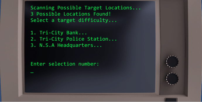
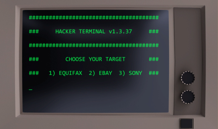
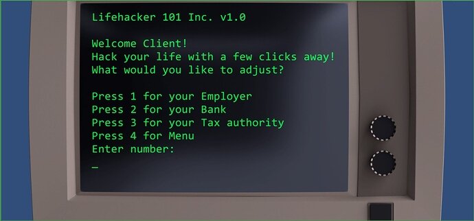
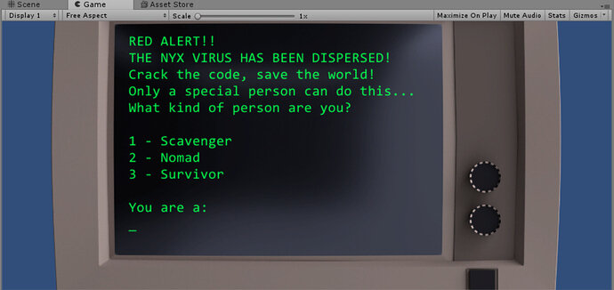
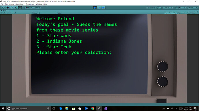
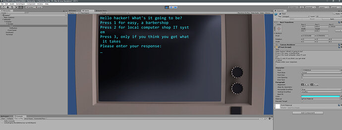
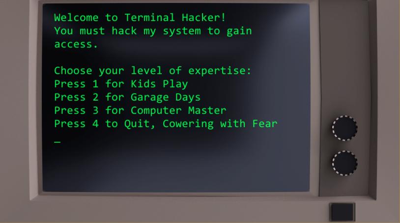
This is my start screen for the terminal hacker game. Just trying to share progress here and keep myself motivated.
Here is my start Screen for the hacker game.
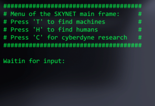
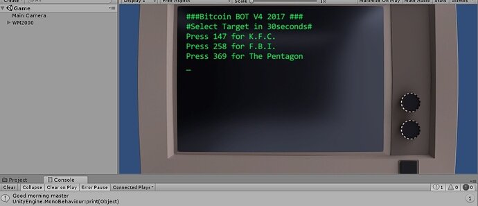
Looking good everyone! Love the skynet reference @ms81dev lol
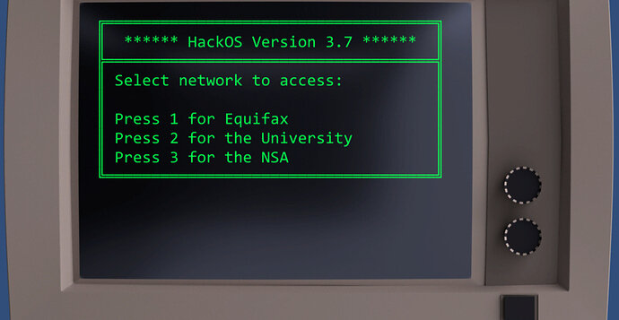
Nice Old School Menu box!
Keep motivated! I went through the first version of this course and had a blast. I created a version of brick breaker for my son when he was in middle school. I used his head for the ball, school books for bricks, and pictures of his school and teachers for background. I called it “Hit the books” and the kid loved it. Lots of fun projects.
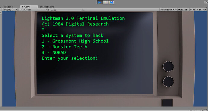
Here is my menu. Not as cool as the others here, but I do give a shout out to Digital Research. That’s pretty old school!
Here is mine, reminds me of MS DOS and Visual Basic that I used back in late 80s and early 90s
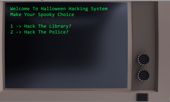
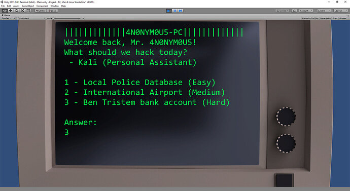
A lot of you have some nice screens! Mine was a bit too wordy so I had to cut a lot out  but I like how mine came out in the end.
Is there a way to reduce the text size and make sure that word wrap is further to the right of the text area?
That looks awesome! Like the shadow effect. How you managed that?
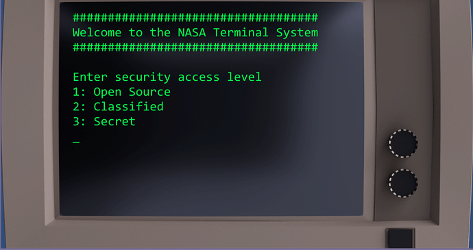
There are some great Terminals above me. Some of them remind me of my Linux terminal ! Here is my Contribution.
@matachan , If you look at the character map for the font that’s used, there are a lot of special characters. In the “old days” people would use them for drawing crude text based interfaces. If you google “code page 437” you can see the character map.
