If you’re reading this, there probably aren’t very many posts yet. But don’t worry, you can be the first! Either create a new post or just reply to this one to say ‘hi’.
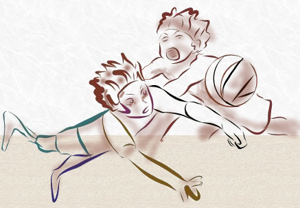
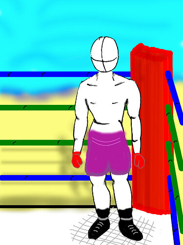
Basketball game. Line art was done on my phone and imported to Gimp.
nice one 
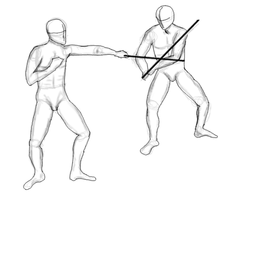
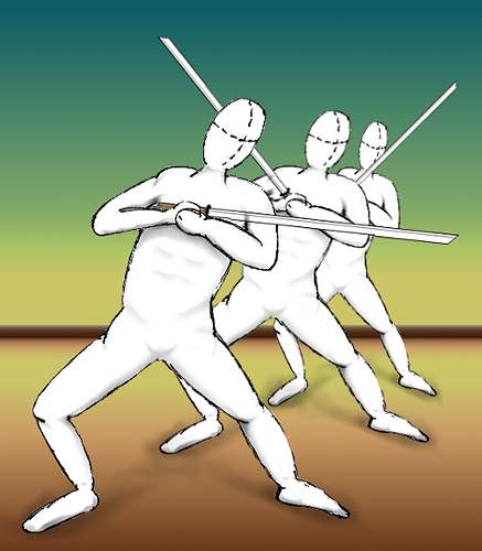
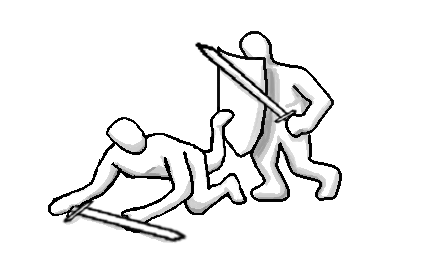
Found some fantastic “sword stance” reference images to use for this one. I imported some reference images into gimp and used them to draw proportion lines before I started sketching. Did the right fighter using only proportion lines, but I got a little lazy on the left one and traced the shapes of my reference fighter.
Positioned the left fighter lower on the page and scaled him to be very slightly larger than the right one. In addition to the sword overlap, this added depth to my sketch.
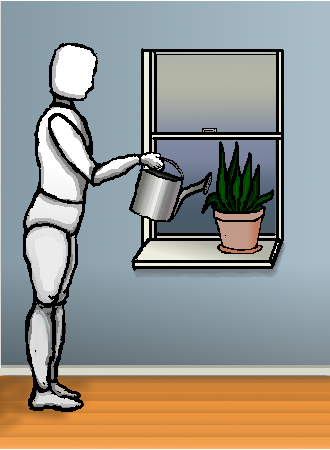
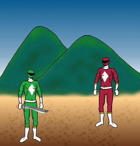
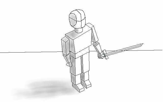
I de-constructed my ninja, into body, arms, sword and head. So I could create several alternatives.
I kept the heads on the same high as the viewer would be. Added a background horizon to add more depth.
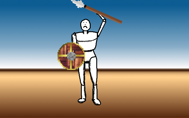
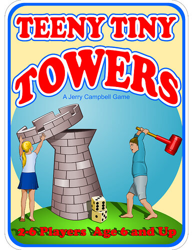
This is the cover art for a light strategy dice game I came up with. It’s a vector graphic made in inkscape, not gimp, but I thought it fit the topic nicely.
I took the mock-up scene from a few lessons ago, and used the perspective tool on the door. Then I put darkness behind the door, extended the floor a bit, and used a gradient to turn the floor gradually to total darkness. Then I drew the wizard (using the proportions from the recent lessons) and put him in front of the door but behind the wall and doorframe.


