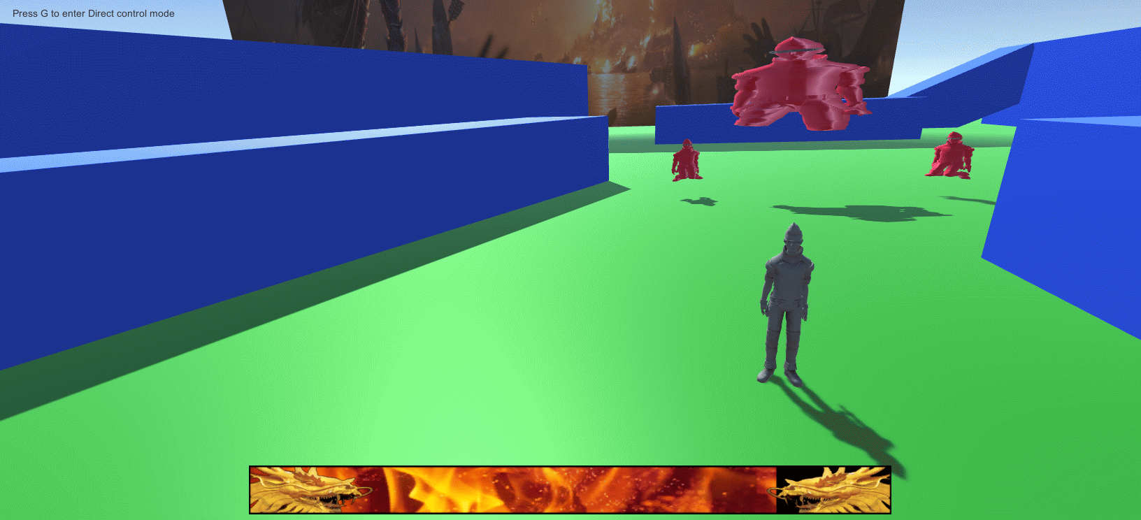
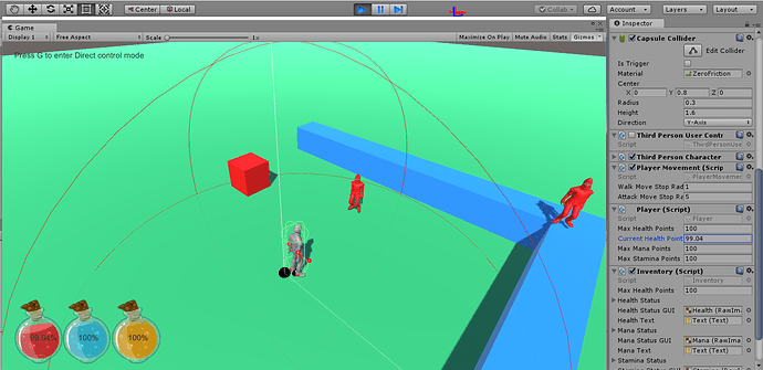
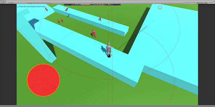
Jenn - Great work. The block fading script is awesome!
Oh my, that GIMP editing was loooong ago 
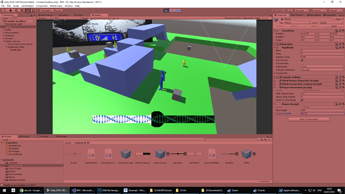
(and there was no intention to mimic a French Flag over here, pure coincidence… just trying to make it a bit more cyberpunky :))
I use a different more simple way (i think) for health bars I did not see this method here so wanted to share.
|nstead of using a RawImage I use a Pannel (UI) set to “Image Type : filled”. There are some options here, in this case “Fill Method: Horizontal” the rest by default. You can add an image to the pannel and then use this code:
public float health;
private float startingHealth;
public Image healthBar;

// Use this for initialization
void Start () {
	startingHealth = health; // so the 100% health is the health you start with
}

void Update () { //
	healthBar.fillAmount = health / startingHealth; // fills in the bar in % from 0 to 100 with startingHealth being the 100%

}This helped me set a design style that is different than I was first going to do, only problem I have is getting the fill to work from the players health, manually moving it is no problem but I am getting lost on the coding side.
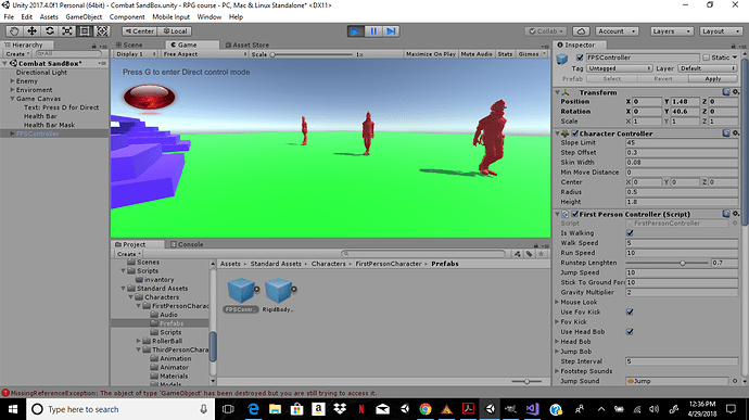
I’m not sure what i did wrong but when I change the max health on the player the health orb does not change
The design is not mine, I was just looking for some inspiration and in the end I traced something with Illustrator. I’ll get back to it later when the style is more defined. But yeah. I like the bubble at the center (though I misinterpreted the original), I think I could do some mechanic based on having half health as in Garou Densetsu 4, where you get some boost while on a specific health range or something. Anyway, just throwing some thoughts around.
Hey Peoples,
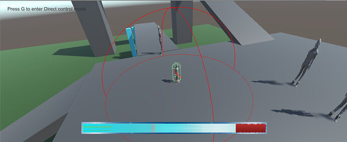
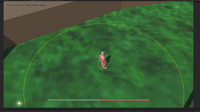
I played around with a mask as I wanted ‘sections’ on the health bar as I have ideas for abilities that are only possible in different health ‘zones’. So just as a quick and dirty placed holder I have a center orb which indicates the 50% ± a bit range.
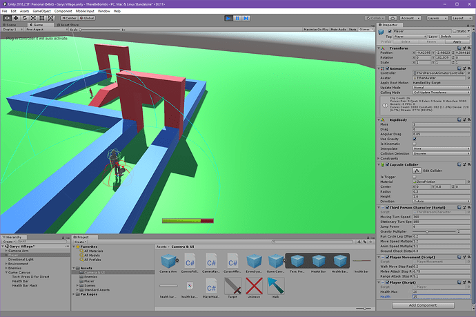
I decided to make sure I understood delegate and event and I do. I made it so mine uses them for health since it only needs to change on change.  I’m so happy. I learned a new thing for C#.
This is my player class.
public class Player : MonoBehaviour
{
	[SerializeField] public int HealthMax = 20; //For testing.
	[SerializeField] public int Health = 20; // For testing.

	public delegate void OnHealthChange(float healthChange);
	public event OnHealthChange HealthChange;

	public float HealthAsPercentage
	{
		get
		{
			float healthPercent = CurrentHealth / (float)MaxHealth;
			return healthPercent;
		}
	}

	int LastHealth;
	int CurrentHealth = 20;
	int MaxHealth = 20;

	void Start ()
	{

	}

	void Update ()
	{
		CurrentHealth = Health; //For testing.
		MaxHealth = HealthMax; //For testing.

        if (LastHealth != CurrentHealth)
        {
            HealthChange(CurrentHealth);
            LastHealth = CurrentHealth;
        }
    }
}
This is my Healthbar class.
[RequireComponent(typeof(RawImage))]
public class PlayerHealthBar : MonoBehaviour
{
    RawImage healthBarRawImage;
    Player ThePlayer;

    // Use this for initialization
    void Start()
    {
        ThePlayer = FindObjectOfType<Player>();
        healthBarRawImage = GetComponent<RawImage>();
        ThePlayer.HealthChange += OnHealthChange;
    }

    // Update is called once per frame
    void Update()
    {

    }

    void OnHealthChange(float currentHealth)
    {
        float xValue = -(ThePlayer.HealthAsPercentage / 2.0f) - 0.5f;
        healthBarRawImage.uvRect = new Rect(xValue, 0.0f, 0.5f, 1.0f);
    }
}
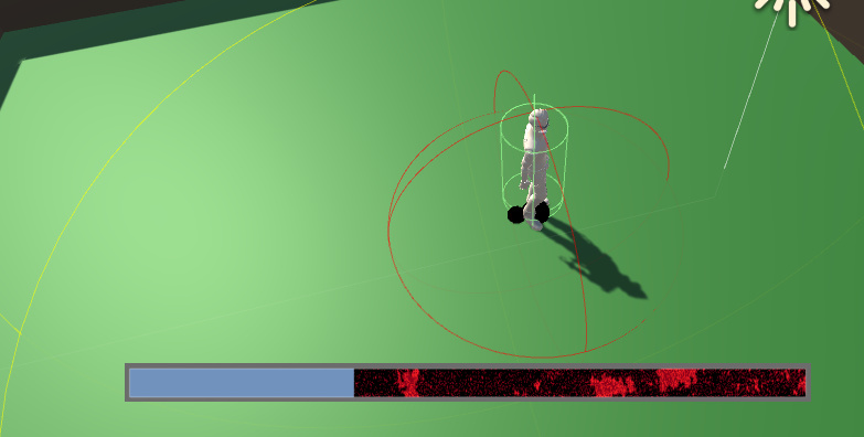
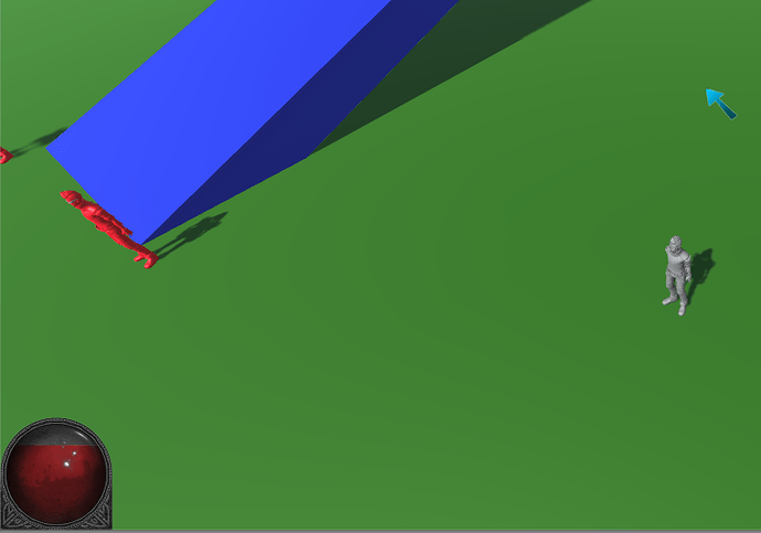
I made my health bar smaller and changed the mood to more gritty. I did not want to spend to much time on it. I’m going to have my artist (My mate Jenni) do the real one.
Just a simple health bar. Not committed to any artwork yet.
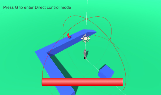
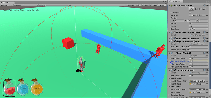
Here is a screen capture of my Health and Manna bars. I’ve still got a bit of tweaking to do For example, I want the size of the bars to reflect the Max Health/Manna for the player. I will save that for a rainy day. At least it is up and running.
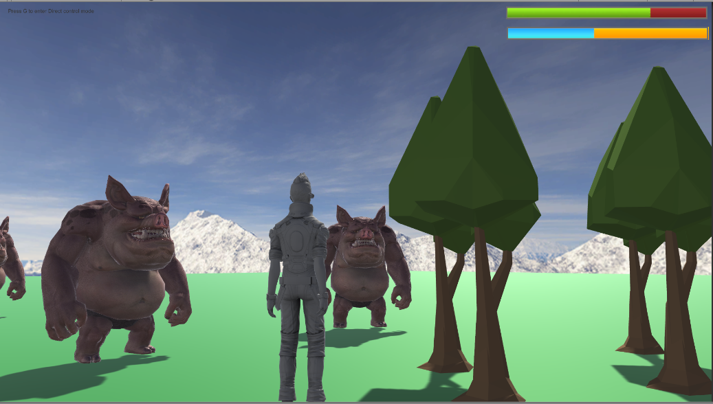
Here’s my contribution. I’m nothing even approaching an artist, but I’m liking it for the time being.
edit: re-upping because for some reason the relevant part got cropped out a couple minutes after I posted?
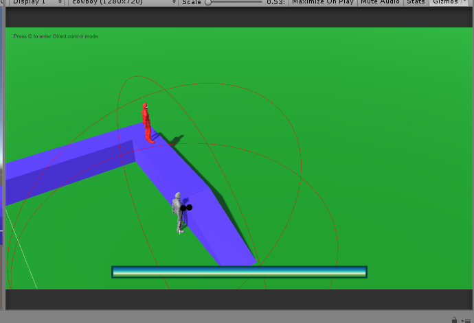
Basically I used the same idea but made a new health bar image and mask in photoshop. Similar colors with a small white bar in the middle to give it the illusion that the health is actually going up or down. I also adjusted the height of the images in their respective inspector height property fields. It took me a few saves, of my images to figure out about the height attributes in the inspector.

Something pretty simple for a samurai Healthbar 
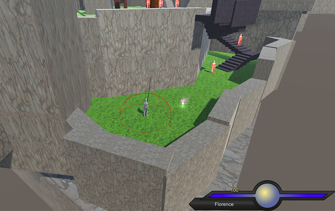
I, too, went with the “orb-style”. Not what I necessarily want, but just wanted to see how it’s done. I’ll revisit the UI once the game feels more like a game.
I used this tutorial: https://www.youtube.com/watch?v=-bU0lesUai0
I will definitely need some extra lessons on UI though…
Edit:
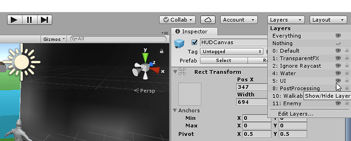
I find the canvas to be a bit annoying in the scene view when I want to focus on game elements. I looked up how to hide it without deactivating the object itself:
Here goes!