If you’re reading this, there probably aren’t very many posts yet. But don’t worry, you can be the first! Either create a new post or just reply to this one to say ‘hi’.
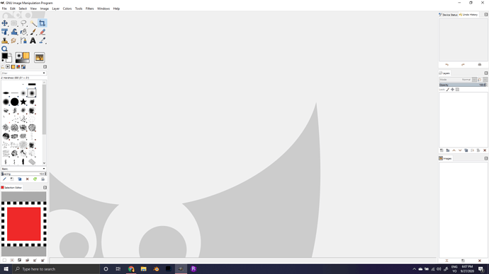
This lecture is good. ‘Single window mode’ is a life-saver. Don’t know how I didn’t know about it till now.
One thing that did not make me comfortable in Gimp is the glaring whiteness and normall i dont recommend a theme but this i had to.
I had the issue with permissions not copying images but prudence dark of the ones provided in the link seems quite nice.
Use at your own risk as it may diverse from the course as i have not tested the theme out at this point
I had gimp installed already so my first challenge was to unbreak my interface and add the theme.
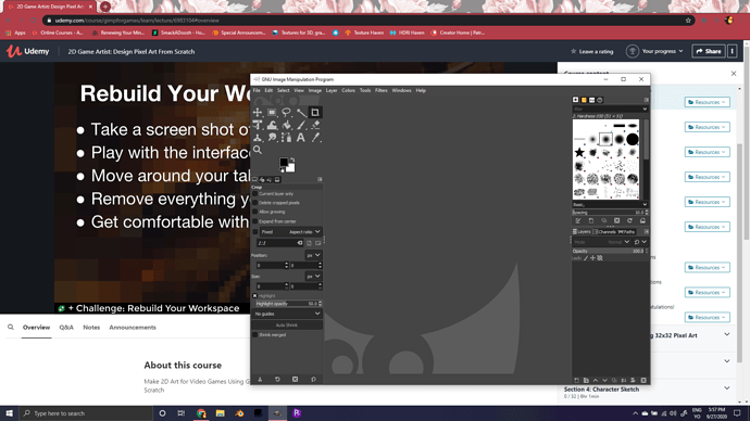
One thing that did bug me a little is Udemy asking for a review at this stage of the course. Not sure if you have any control over that but that seems far too early to get a request for a review, @Michael_Bridges
Hi irresistiblejelly,
to answer that review question instead of micheal, it’s an annoying feature Udemy uses recently. It’s out of the Course Producers control to stop that from happening. Maybe if you contact udemy, they will stop it, as it is really too early to ask. Even you answer it early, later on you still will be asked several times ^^. The only thing you can do at the moment, is click on the “give a review later” button.
Hey Manu,
Its one of those things i should be thinking with my student head on and not a teaching assistant 
You are right though its probably going to carry more weight to get things done if it comes from the students like the closed captions on the courses.
I may be in middle ground with Udemy that i am on both sides of the fence so to speak and if it irritates both sides of that fence well then the fence needs to be made better 
Thanks again
I cant seem to be able to drag the tabs into the side of the other tabs. Once i drag them out i cant put them back where they were. any fix for this?
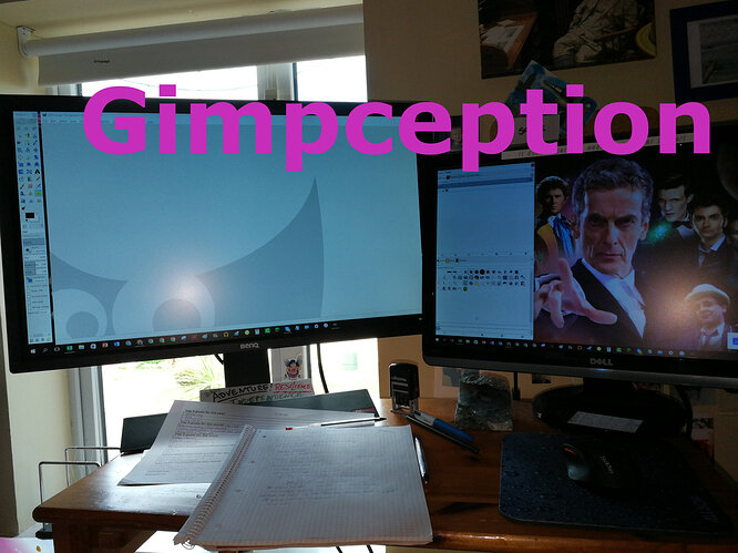
Hmm, Gimp isn’t as easy as I thought at first, but hey, step-by-step will work, and I couldn’t resist creating my first picture-in-picture thing either, so here’s my very first GIMP effort.
All of time and all of space awaits!


Thank you. I learned something new today and had fun dragging my docks around 
The default theme for GIMP 2.10 looks pretty cool. Photoshopesque.
Note I’ve enabled Single Window Mode.
I had to change to the classic icon theme. I could not handle black and white 


