Attempted Photorealism

One of these is a render I made, and the rest are pictures from the internet. Please vote on the one you think is the render. If you can, please tell me what made you choose the one you did.

I’ll close this after a while, I don’t know how long, and say which one is a render.

Edit: I don’t think the poll was working, I think I’ve fixed it now.

3 Likes

I voted the first one, this is very hard, at least for me

2 Likes

The poll is working, you can give it an end time, the next time you make a new poll!
(use cogwheel when in poll mode).

1 Like

I will tell later, not to influence people now!

1 Like

Dark image of the diving bird. Reason - perfect symmetry.

3 Likes

Please vote, see original message

@BlenderCollab

1 Like

I voted for this :grin:

2 Likes

Same :grimacing:

1 Like

hello there. was wondering when can we come to finalization of this topic.

1 Like

Hi, I can finish this now. Thanks for voting, and sorry for the lack of attention I’ve given this thread recently. I am on holiday this week, so I haven’t had much opportunity to respond.

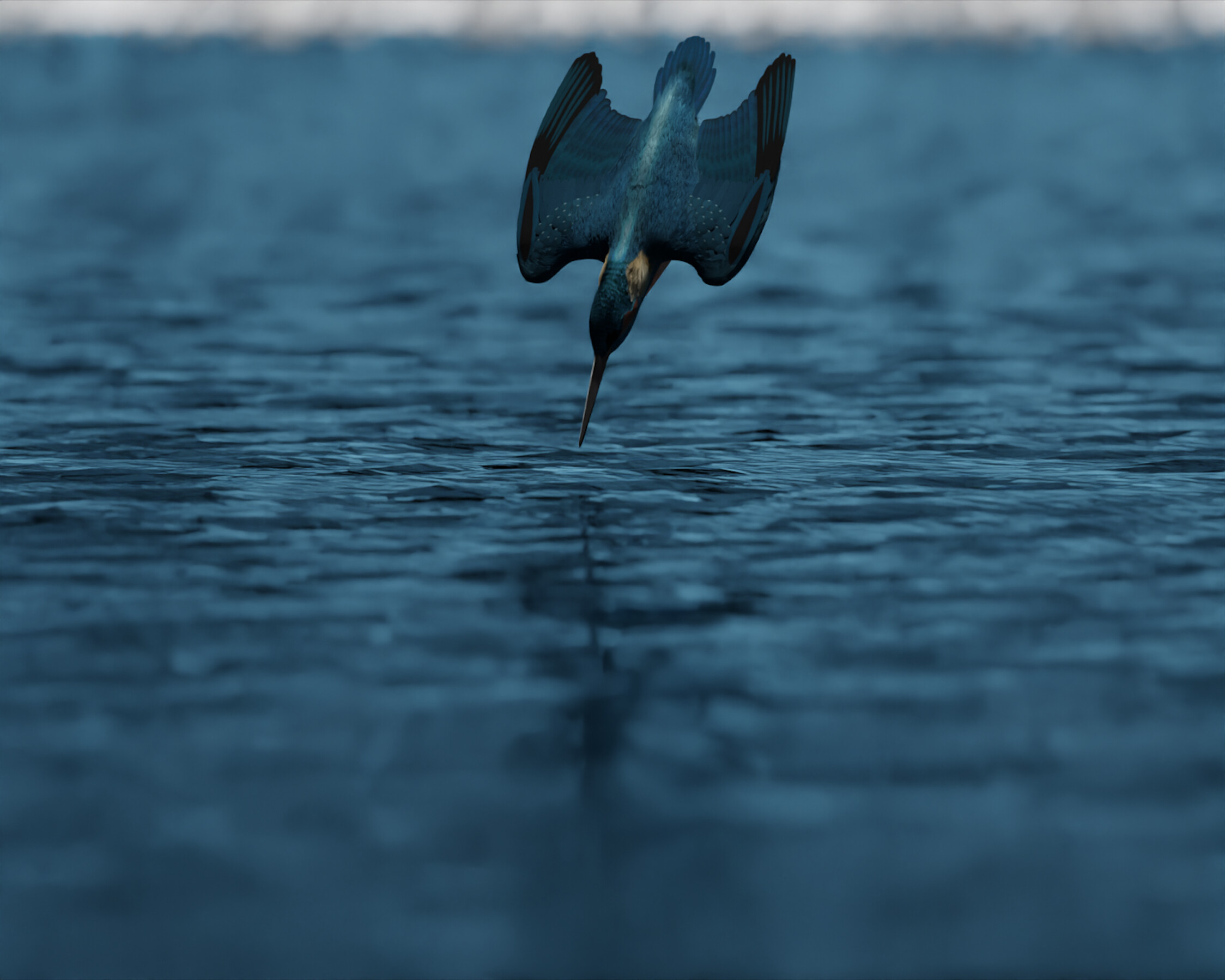
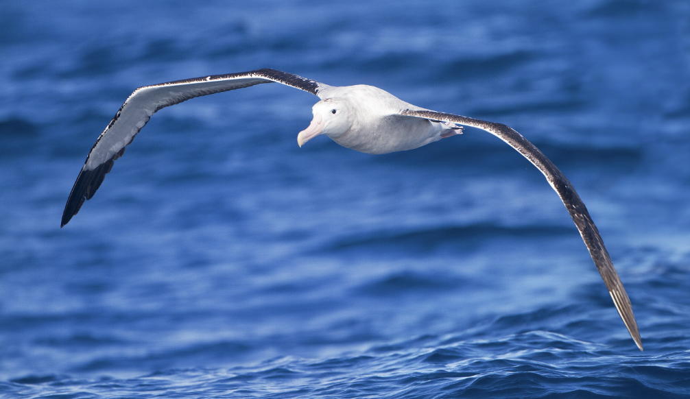
It looks like the majority of you got it right, it was the dark picture of the diving bird.

Things I’ve realized
As @VVruba mentioned, I think the perfect symmetry was a mistake.

I think the posing is rather boring and lackluster, I should have made it a bit more dynamic and again, less symmetrical.

I think the line between the different types of feathers are too sharp, and I thinks that looks unnatural.

The darkness makes it hard to see much, so I blotted out a lot of details on the head.

I feel like the angle is also not great, but I’m not entirely sure what would be better.

I think I put too many photos in, it probably took a long time just to look through them, so sorry about that.

If there is anything else you think I should have done differently, please feel free to tell me.

1 Like

To be honest, if I saw that image in the void I’m not convinced that I’d be able to tell it’s CG. What really gave it away was that there was another very similar image right next to it for comparison, which made picking out all the missing details much easier. Most things in nature aren’t perfectly symmetrical, just very close, but I didn’t know that this bird in particular wasn’t meant to look like that until I scrolled over to the next picture.

I think the darkness in the image worked out to your advantage here actually, since it hid some of the details that would give it away at a glance. I’d say it was a smart choice if intentional. Then again if your long-term goal is to make photorealistic renders then hiding details instead of replicating/refining them might not be the best way for developing your skills.

I think one thing that you could do that is fairly simple would be to add noise and possibly some fringing. Even in the higher quality photos there is always some noise, but your render is completely free of it. It’s something easy to do and can go a long way in making your render look more like a photo.
You could even add compression artefacts, as silly as that sounds, if you want to go that route.


Side note - Yeah, you did put a little too many options in imo. I think like 5 photos + the render would have been enough. Also maybe having photos that only show the “same” subject as in your render could be better for comparison. I know it kinda contradicts what I wrote earlier, but really what’s the point of having people choose between unrelated pictures?

2 Likes

Privacy & Terms