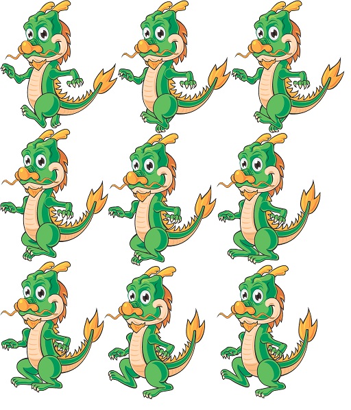
Animation looks very pixelated

Hello, I added a new attacker Dragon using bone-based animation. Even though all images are looking fine, including combine image, animation looks pixelated compare to Fox and Lizard.
I also tried to create Dragon animation using sprite sheet, but animation quality didn’t improve.
Can some one help?

Here is the link to the post that has a video where you can see the issue.

Thanks

Have you tried altering the pixels per unit on the sprite in the assets folder itself as well as the max size and compression. I vaguely remember it coming up in one of the lectures to help improve how certain sprites look.

Yes. I did set these same as for Lizard.

Try adjusting them though. The image size for your lizard is possibly different from your Dragon so the same settings won’t work well.

Size of the image for Dragon us 512 X 598. I tried different settings and no improvements.

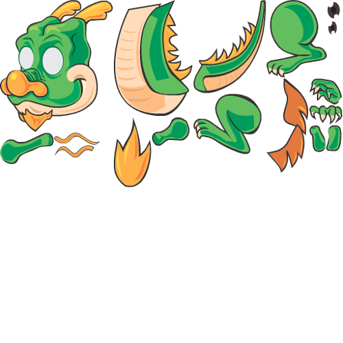
Here is how it looks like. I made it transparent, but didn’t change the size.

I also used this image for bone-based animation:

Let me know, if you have any ideas.
Thanks

I’ve created characters from both(opened in gimp and I alpha’d the non character areas then saved as a PNG). They appear to render fine for me (I got a bit lazy and only used 3 segments of the bones to test)

Mode was set to multiple on both and auto slicing was done
Pixel per unit on both was set to: 133.3333
For the bone based I initially turned off mip maps but didn’t notice any difference when toggling it back on.

Other than that everything was set to default

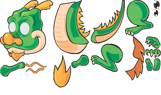
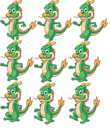
Here are the exact PNGs I created and used

Bones PNG

I didn’t make any changes, but when I built it to my android tablet all animations looked OK.
I think I am good. Thanks a lot.

Privacy & Terms