Informative read, just a small article, but explains that Android took out a similar abstract unit for basing pixel density.
so heres the result of what ive read in that. i tried to get a similar thing to IOS where i have a top camera notch, but cant use the ios only screen scale.
heres the code snipped from the script i have in the HUD script, to rescale to adjust for the camera notch.
now to sort out the screen scaling issues
		if os_name == "iOS":
			var screen_scale = DisplayServer.screen_get_scale()
			safe_area_top /= screen_scale
			MyUtility.add_log_msg("IOS Screen Scale : " + str(screen_scale))

		# try and get the android equivalent of the scale for IOS
		if os_name == "Android":
			var android_DPI = DisplayServer.screen_get_dpi()
			var android_screen_size = DisplayServer.screen_get_size()
			# if we get the screen size in pixels, then the DPI we can get a rough scale similar to IOS
			var android_scale = android_screen_size.x / android_DPI

			MyUtility.add_log_msg("Android DPI : " + str(android_DPI))
			MyUtility.add_log_msg("Android Screen Size : " + str(android_screen_size))
			MyUtility.add_log_msg("Android Scale : " + str(android_scale))

			safe_area_top /= android_scale
hope that helps some other android users out a bit 
feel free to add or change things in it via a reply, see if we can get a solution that works for all cases 
Since all the numbers in this equation are coming straight from DisplayServer and your Android logic is pretty much identical to what iOS does (neat! ![]() ), it seems like this is as much as you could possibly do on your end, short of letting the user add an extra offset via an options menu or something.
), it seems like this is as much as you could possibly do on your end, short of letting the user add an extra offset via an options menu or something.
In what cases would this not create the correct safe area? I’m just interested to see what the thorn in people’s sides is =)
basically, the scale or the relationship of logical pixels to actual pixels can be got by the IOS command easily.
but the same cant be said for android that just has the pixel resolution.
so with the IOS were scaling as Kaan did, to get it looking nice.
but on Android I still have the original issue we got in the video.
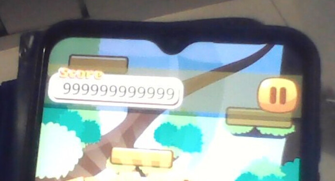
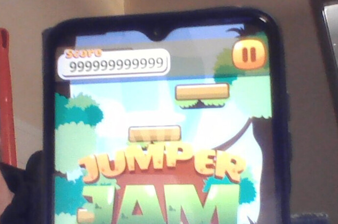
youll have to excuse the image, as i only have my laptop camera to use at work 
ive added a quick color rect to the top_bar and full rect, just so i can see exactly where its sitting with relation to the notch.
so as you can see with android, its taken the spacing as total size in pixels. so its too far down.
so rather than the logical pixel size, we have to scale that size down, as we done in the course for ios.
but theres no straight forward method for the android equivalent.
androids equivalent logical size in abstract units is pixel density.
so that weee snippit of code, i get my scale at just about 2.
so if i apply that scale, the temporary color rect, looks like its almost bang on just below the cutout.
there is another issue im working on just now, in that the bottom of the screen has a corner as opossed to sharp corners, so the debug button is slightly off screen.
but thats a challenge for tomorrow to find a generic way of dealing with the bottom of the screen 
Sorry, I probably should’ve been clearer in what I was asking - I learned about this part beforehand so you wouldn’t have to spell it out. Ah well ><
Basically, your solution looks like a solid Android alternative to the built-in DisplayServer.screen_get_scale() for iOS; it’s just that you made it sound like there were situations in which this still would not get an accurate result, that’s all =)
Looks great! Since the chart Kaan shows in the lecture indicates that these physical-to-logical pixel scale coefficients are all integers (I’m assuming it’s the same for Android because floats are just needlessly complicated for that), maybe it’s worth rounding android_scale in your definition, just to be sure. Probably makes no difference, but might avoid any kind of border fuzziness if something weird happens. Future-proofing, lol!
Regarding both this issue and the rounded corners, it feels like this is something that DisplayServer.screen_get_usable_rect() or similar should be handling, rather than leaving it up to each dev to muddle through on their own. What I’m seeing is that essentially there are 2 “usable rects” that the game can use - a naive one that gets cut off by the phone curves, and a proper one that essentially treats those curves as margins. Backgrounds and whatnot can exist on the former, but UI needs to fit neatly in the latter to avoid getting cut off.
My first thought was that if top notches never run lower than the top corners, you could just assume the bottom safe area is the same as the top (never seen an asymmetrical phone!), but that doesn’t appear to be the case. Instead, maybe a combination of DisplayServer.screen_get_display_cutouts() and a little min-maxing can get you what you need. If it does what I think, it shouldn’t take too much to fix that =)
I’ll give that a go later , cheers. Quite enjoying getting my teeth into a problem. But I wouldn’t have got this far without Kaans explanations to point me in the right direction.
It’s a new topic for me and I’m enjoying the learning then poking around myself on what I’ve learned.
I bet once I suss it out, I’ll end up finding the one liner solution, but I guess it’s about the journey lol
Thanks a lot for sharing! You absolutely nailed it!
You need to cast to float here because you are losing precision which can be significant;
e.g. DPI 420, screen size x 1080; integer division will give you 2.0, float division will give you 2.57. The difference in the safe_area_top calculation is noticeable.

