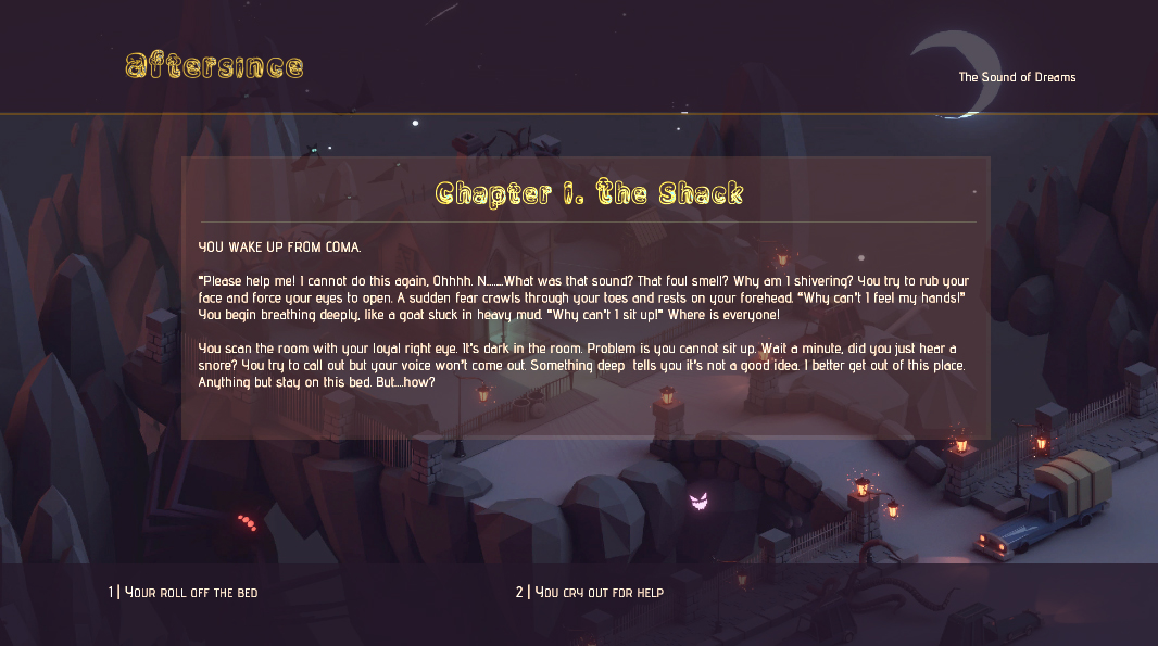
Aftersince: Sound of Dreams UI.
The Intro UI Space.

Love this theme. Colors are beautiful and the touch of art makes it really attractive. Honestly probably one of the best in the collection. My only suggestion might be to give the story text area a light fine drop shadow to help it stand out against the art in the center. Even without that, this makes a really attractive display. Good job!
Now that’s really a cool look Castelli. It looks to me like you took inspiration from your background art to make the colors work together. It’s not overly busy (which I feel mine is) and makes the whole display attractive and highly visible. Well done. 
So I’m going to present this first with out my own comments on how I feel. Overall I’m happy with some bits and not with others. I’m of course delighted to get any comments you might want to give me for feedback. Thanks in advance. Have a great day!
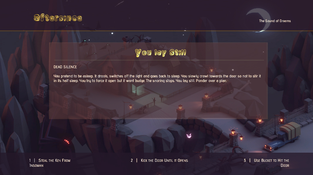
Thank you Jenn. Oh you’re too kind. I wanted to give it a flat look as much as I could without shadows. But since you pointed out visibility  , I will test out the drop shadow on the story text and see how it goes. Will keep you posted. Again thank you for that feed back. Appreciated.
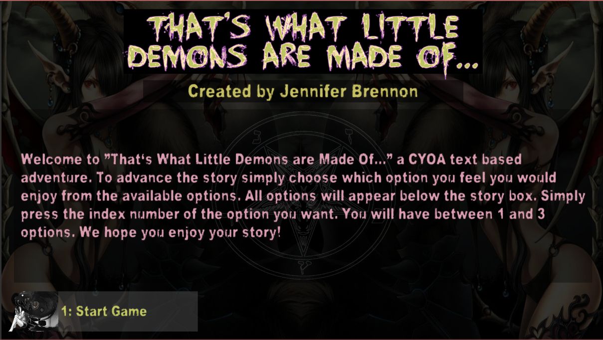
Jenn I like the darkness the of design and the font of the title. Very on point to the theme.
Given the space between the Author text and Story, the title could use more room at the top to balance it. I also think on the welcome note, having the title of the game, which is already prominent just above is quiet a repetition. Plus speaking of demons, I think the glow on the title would be much scarier if it was reddish, instead of blueish, like in the movies  . But I don’t know demons maybe.
Overrole, I love this already. Cannot wait to try it out.
Played your game oh my it so detailed. You so quite good at story telling.
Hey Castelli, Thank you for taking the time to give me some very quality feedback. I would agree that the text as it appears in the example does show too much space. I struggled with the placement of the story text in that I had it center vertically the text rather than place at the top. I may change that back as at least it keeps that part of the screen in balance. You make a fair point about repeating the name of the game in the info. As for the glow on the title, the purple was a complementary color rather than the more traditional red blood idea. Purple implies mysticism which is also a theme here so on that I’m still pretty happy.
Thanks for the comment on the writing. Again I think it might have been over the top but I’m glad you enjoyed it. I really do appreciate all the feedback.
Thank you Jenn for a lovely comment! I am so happy to hear it 
 I think I will try your suggestion when I come back to this project (which is not now). Thanks again for your time and effort Jenn - you are a great commentator