Hey everyone,
the last days i trained the things i learned in the last courses and hope to get feedback on the projects. At the moment my goal is to get better in doing looped gifs because i want to get into “satisfying” 3D Art. One of my biggest problems is (as i see now), that i really need to work on small file sizes at the end of the pipeline. I don´t really know how to achieve it. Is there a way to make brilliant gifs with a playtime of about 5 to 10 seconds, so they aren´t bigger than 4 MB? Maybe a width of 700 px is still to large?
My pipeline goes like this
(i´m happy to have one, but i guess theres room to optimize):
Blender → setting up and constructing everything in the scene (with hdri but background rendered transparent); Setting up the animation with keyframes, so it moves and loops
→ Rendering Scene/Loop
(Mixamo if needed for rigging or poses)
Blender → Compositing (adding background, applying filters)
→ Rendering Composition
Premiere Pro → Tweaking colors, applying effekts (make it look more brilliant, smooth, athmospherical)
→ Render as gif, original 1920px proportional downscale to 700px width.
→ gif-Compression (iloveimg.com) so i can post it here. sadly i had to make number 2 & 3 even smaller, so there´s a loss in quality here) Maybe someone has a better solution for small file sizes.
Rule for myself:
I try my best at each step, but when one step is completed, i don´t go back to it when i realise in the next step that i could´ve done better. Instead of going back i make notes and apply my learning in the next project since i want to focus on productivity and training, not spending too much time on trying to be a perfectionist.
The gifs are in the right order, so i hope there is some progress to be seen. I´ll throw some info and questions to each project below. Thanks for your advice 

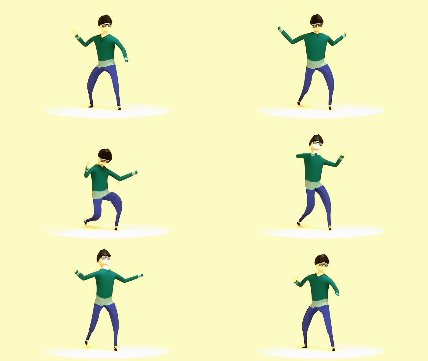
The first i did after the lp character course. Tried to do a motivation-figurine of myself in low poly. Applied subdivision modifier in the end, because i like a smoother look a bit better.
My Error: I forgot to modify the legs, so the sub-mod can work on them properly. The sharp edges don´t flow with the rest. Also screwed up the grey ends of the shirt. They got much larger after applying the sub-mod and i had my eyes and mind on other things atm. And it doesn´t loop so good. But it´s close.
Positives: You can definetely identify me despite the lack of many details. It´s an okay model and i´m happy with the outcome.

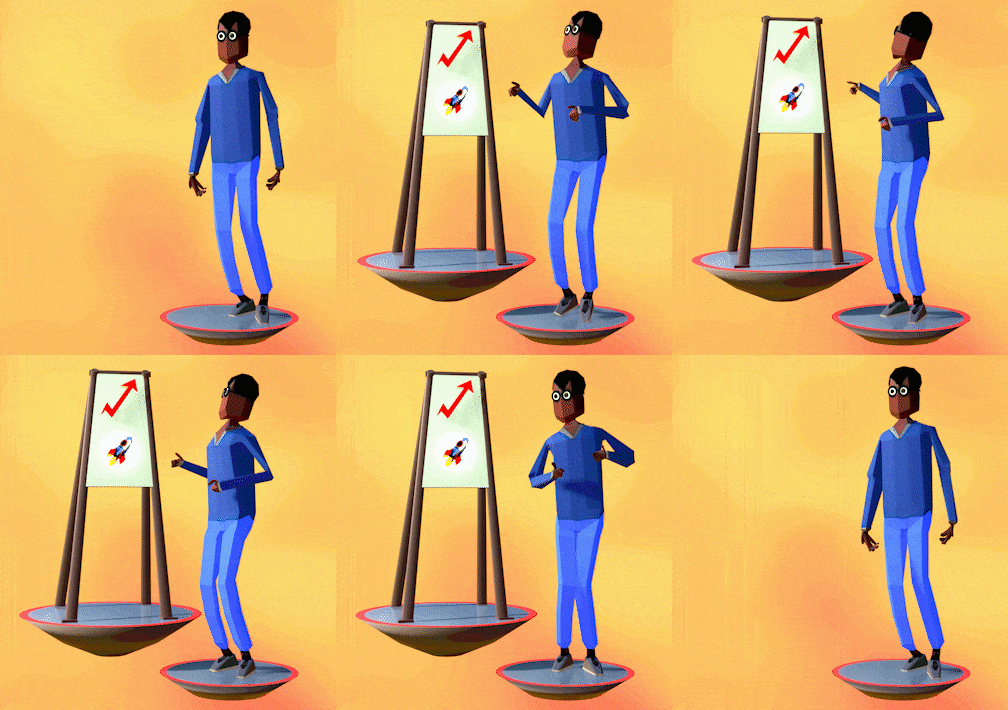
My Error: Messed up the background in the compositing. Colours should be smoother, without edges to another. It also plays much faster than anticipated (eyes got used to slower blender-render-view). Skin color got much too dark (should depict a very pale caucasian). Hands look a bit crippled. Icons on the flipcharts aren´t placed very mindful.
Positive: I had a person i know in mind and the depiction really comes across as him (even with much too dark tan). It´s a bit satirical but in a positive, playful way in my eyes. And that´s where i want to be. Also the loop runs really smooth.

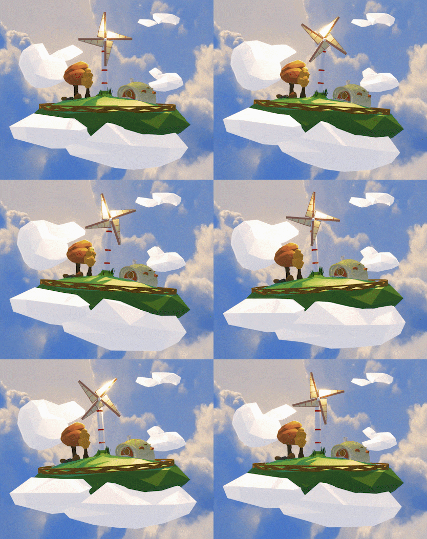
My Error: Messed up the cloud-animation (while wobbling, parts clip out of view-distance because i totally lost track of my overall scale - didn´t notice until i was done with everything.) Overall the animation plays much too fast and theres a little “hickup” when it loops. Blender clouds don´t really fit with with the ones in the background. Should´ve taken more time with the blender clouds, they look a bit too blank for the composition.
Positive: Besides the errors, i think i nailed the atmosphere i was going for. I get a positive, sunny, fresh vibe from the animation. I can feel the breeze. And i was able to upgrade the whole thing a lot through lighting, especially on the windmill.
Thanks for reading and contributing. I hope others can learn from my experiences and errors, too.
Have a great day! 
Kasi
