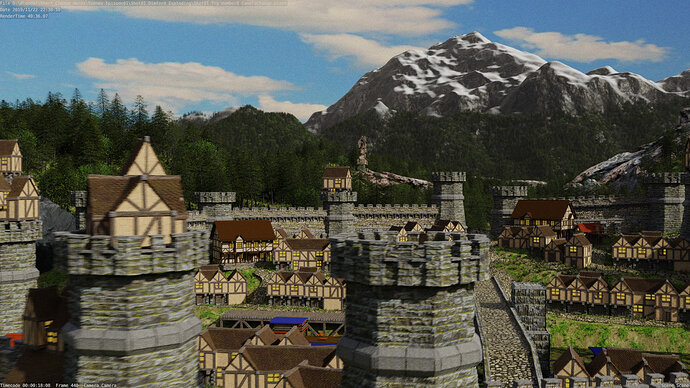
A DnD animation Trailer (Adventures of Adendaria)

One time I examined render farms, they can be cheap. But then you will be put on a waiting list. If you pay more, you get more priority. NP5 already explained the techniques for keeping render times low. Low poly, baking, textures etc.

I think you need also switch over to Eevee. Or get more understanding of Eevee. Because Eevee is based on gaming render technology. And game software is capable of outputting high quality 3D video output.

So, maybe Eevee in combination with Unreal can be an alternative to render farms.

I have the same problem, I like to make animations as a next step in 3D. So I decided to put more effort in understanding Eevee.

1 Like


A rending of the houses I’ve done. Now that I look at them again. I can see that I’ve pushed the normal and height maps to much. But for this project I’m sure it will be fine as we are not getting to close to them.
I will have to remember this for the next scene that includes houses and remodel things better.

2 Likes

So I’ve examined Eevee’s potential and found it to be astoundingly good. My only problem is that when I use it for my scene, it has a hard time.

I hear what your saying with height and normal maps , and I do use them with the extra geometry in order to push things even farther.

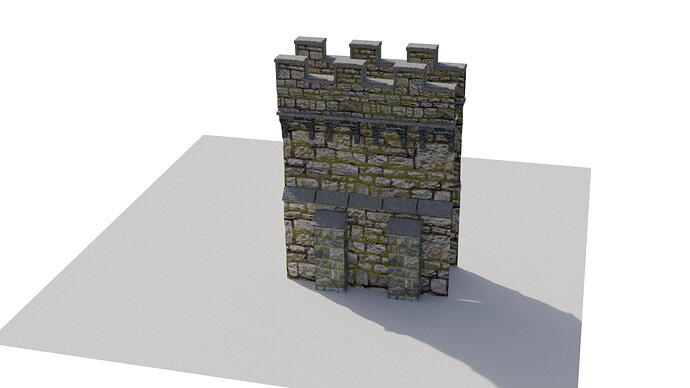
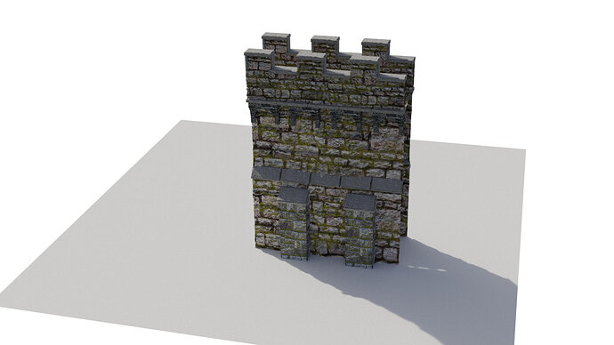
For experimental sake here is a quick image of my modular wall with only Normal and Height maps applied(done in cycles)


Same model, but I bumped up my Resolution on Subsurface Mod only in the render.

It gets darker and while from this angle it doesn’t really look all that different. But to me the feeling of that bottom one is more alive with cracks notches and junk. The top just feels flat. Maybe its just me? But I want that feeling to register when you look at the image. Even just on a wall lol.

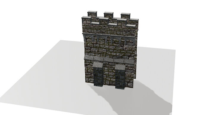
I also did this in Eevee The first image is with the details. Eevee seem to pick up on it a lot more and since I didn’t want to tamper with my scene to much I kinda just left it. But here it is.


and without all that extra geometry

HAHAHA you can see the seam line WAY more in the Eevee one.

I went threw all this to see if there was a huge difference in style and render and i’m happy to see that there is. But i still lean towards cycles as personal preference for this project. It may bump up the render times but I feel like it is worth the wait.

1 Like

Cycles is for accuracy, Eevee is for speed.
Don’t forget, when you animate the details fall off.
Do a test run high details photorealistic and the Eevee way (mimicking details).
Video compression, filters out all those grainy things.

I have seen a video tutorial, about zooming in from space onto a planet in high detail.
He used a trick to switch over to higher form of details (more and more vertices). But it was very technical.

1 Like

I am following this course " Creating 3D environments in Blender", from Rob Tuytel.

1 Like

Dude that looks like a GREAT read. I’ve got it on my christmas wish list now thanks :wink:

Also I’ve been wanting these video turorials on Cycles Materials

And i’ve really wanted this tips and tricks book too

1 Like

New updated render of Shot 2 as we sore over the city.

2 Likes

Looking good. I just wondered if all the windows should be yellow? If lanterns, candles, were alight, a) it would be night. b) it would be some windows not all.

If not night, then can they be just dark, and reflective?

Now that has made me wonder if the paintwork on the houses should vary really? Even if only a little. Just different ages of the prescribed town ordinance colour lol.

Oh now, lol sorry, there are no chimnies! Do they only eat cold food and live in a no winter cold land?

Ah also its very tidy. Could or should there be ‘stuff’ alongside the roads and houses? Barrels, boxes, A cat or dog or two. Empty of people too.

As an animation I suspect the motion would mean very simple people would do fine, just images on planes, even animated to move along a street. A standing guard or two in those towers?

My perspective for all this is wanting to make it look more ‘real’. If that is also your objective. Otherwise ignore me its looking great.

1 Like

Dude, love this comment. Nail on the head with the yellow house lights in EVERY HOUSE LOL! I made me think too and I might opt out for something to see if I can’t make it a little better. I might get rid of it and just make an empty box for the inside and put a light in side.

The paint isn’t really paint on the house. It’s more like a spackle placed over top of stones. I was going to have some that reviled the stone. But my lack luster texturing job is making it difficult.

Chimines… Nail on the head ROFL! going to be fixing that.

I’ve also started to incorperate boxes, barrels, skids of stuff although they didn’t make it into this update render.

Dude animation for characters is something I was going to put at the end but it’s so hard to get myself to pull that off. I know where to get some free animations and characters. But This shot has taken so long to get this far (2months) that I’m having a hard time not moving on to the next shot. I know I shouldn’t and that I should take my time with each piece and bring it to it’s perfection. BUT ITS SO HARD!

1 Like

Oh and I REAALLLY want to add smoke effect into the scene with the few chimneys that I have. Wasn’t going to add it on every chimney. mainly just the “shop and black smith chimneys in the town” and the most important one which is the chimney in the back on the tower that explodes. to help pull attention to it.

Hmmm might do shutters on the windows too.

:rofl: I did not dare add the idea of animated smoke. I suspect it could be done just as changing images on planes on each frame.

You could test out people without any walk cycle complexity too, just an image moving along the street. As you fly over rather than get to study one frame as we are here, it may well be all that is needed to give the impression.

2 Likes

that will work for the shot after this one but the camera movement that I’m using in this shot pretty much requires me to make everything in this town 3D. Same with any smoke. However, the Smoke and effects around the tower in the back… I might be able to get away with

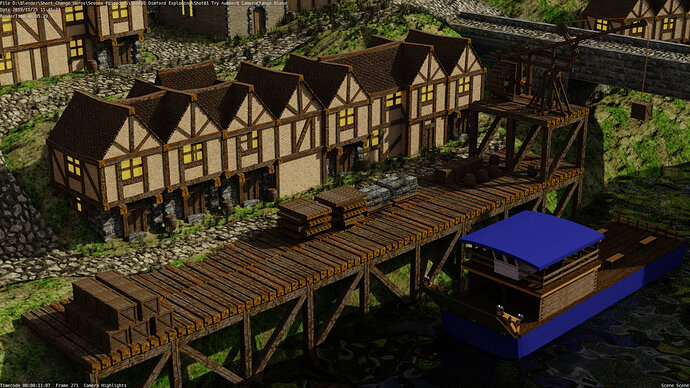
Been working on my harbor and trying to improve my houses.

3 Likes

The crane looks good! Barrels a nice feature.

I think you need to decide how much detail is going to be visible in your animation.
That is assuming the only purpose of the work is for the animation.

If it is relevant to the detail worth doing. These are my thoughts.

The slopes in the paths I think need to be flattened side to side, across their width. Thinking in front of the second row of houses.
The steeper sections going down the slopes to the wharf-side and on up the hill from the bridge probably should be stepped, they are too steep to be usable slopes.

All your beams are square.
The dock wharf. I have tried looking for images and can find nothing much at all that has the diagonals. If at all they are used inwards. They just look wrong to me. Like the same issue with the crane base. Where if anything there are not enough, bracing would need to be Xs all round? All the wooden wharf images I saw had solid planking, not your huge square beams edge to edge. The crates, I would jiggle about, a bit less perfectly stacked up.

An alternative wharf, brick/stone built.

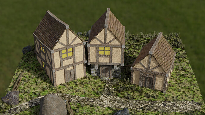
The houses have no ground floor windows, and the doors have an odd central protruding plank. I would replace the doors with a single flat object and of a different wood effect, making then stand out a little better. Plus the doors are too wide, nearly square. If you narrowed the frame, moved then left or right, there would be space for a (non square) window at the ground floor level. Personally I do not like the lots of the same square ends to main beams showing. The roof ridge could be shaped more like a row of ridge tiles? The beams supporting the middle house upper story overhang could be narrowed vertically, even a couple more added then.
There is grass in the cobbled/stone paths and in from of some hose doors where people would be continually walking. You could weight paint it off such areas.
Just wondering now if there is too big a drop from the wharf to the waterline.

These are my feelings were it my ‘world’, not necessarily right or better. It’s your world and how it is meant to be, not mine.

1 Like

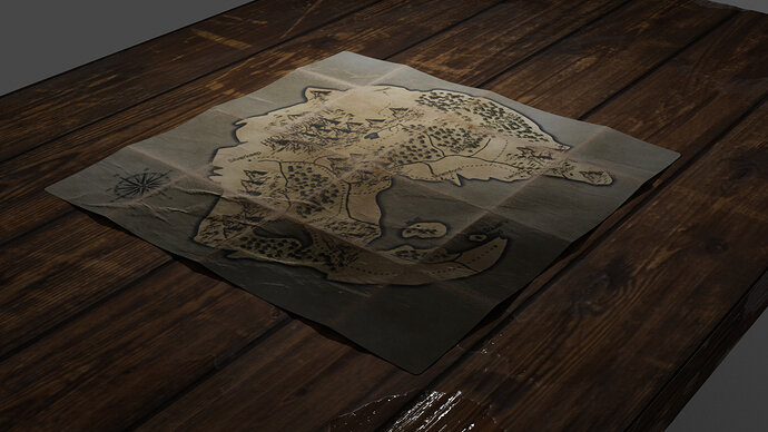
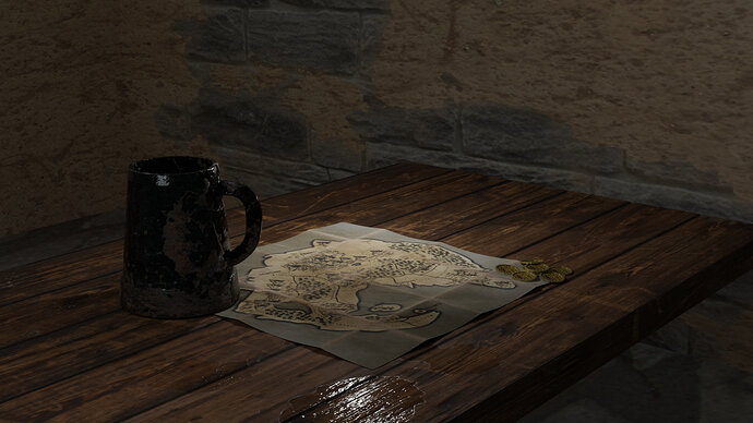
Taking a small break on Damford’s establishing shot. And taking what I’ve learned so far into my first shot with the Map.
I’m thinking of how I can make this shot a little more exciting with out adding characters to animate right now. So far I can think of maybe
Gold purse
Food (vegtables, small amount of meat, potatoes, soup?)
Ale mugs


I will also create a background with lighting.

2 Likes

Much to take in here, and LOVING all the small details your suggesting. I have much work to do on this shot especially attaining to uvs and textures however. I am slowly getting better and better, and will apply all these things to my second shot.
once I finish both Shots 1,2 and 3 (shot 3 basically being the same thing as 2 just at a different time). I think I might do a recording of shot 4 to post on this project.

With the map is there some story related time and place we are seeing it in?
A tavern table? A aristocrats map room? Fallen from the back of a monastery library book? A dusty abandoned forgotten hovel with this lost map to a secret forgotten realm?

Some idea of that would help you choose what might build up the scene, and control the amount you then need to do!

A night or dark setting would enable a candle or lantern to light the map. Or day time light streaming in through a window, broken one?
Some movement could be by adding a spider, or mouse, bug, scurrying over the table. To have movement in a rolling fruit or similar, would sort of need the complication of humans in some form. But a gloved hand wiping the dust away might be possible.
Books, scrolls, wooden bowls, a quill pen, and inkpot to have been used drawing the map or adding details by the last person there. Knife or dagger may have sharpened the quill. Some jewelry item, an amulet, ring. Workmen tools, nails a hammer, someone may have been repairing the place if it is a run down abandoned look. Some form of ‘counter’ as though marking army positions and movements on the map. Could just be couple of pebbles to chess pieces. Coins.

You might want to ‘tear’ the map here and there. Depending on its ‘story’.

2 Likes

Did a little bit of work today. So SICK! but I got on here for a bit.

2 Likes

Alright today is the day. Going to focus on giving my houses that fresh coat of paint on them… or fresh coat of textures lol. also going to mix it up with some new log models to see if I can’t get some better results.

Privacy & Terms