A DnD animation Trailer (Adventures of Adendaria)

Hey guys. So I have this WIP piece that I want to show you guys. It’s an animation that has to do with a DnD group I use to play with. So far I only have 2 shots that I’ve put real effort into and the rest is still in a story board format, and even then I haven’t story boarded the whole thing.

I’ve decided to put everything here as a way to “blog” my progress and maybe ask questions as problems arise.

Journal entry 02

Here is just the 2 shots put together with the music.

9 Likes

Wow, much work in this piece of art. The music makes it more dramatic. It follows a little story (script). As a trailer I like it. Keeps me wondering, if you have time to play DnD. :wink:

Don’t give up! And have fun!

1 Like

A great start I look forward to seeing it fleshed out.

1 Like

A question on my mind is that I’m looking into getting a subscription to a render farm. Any suggestions? Even at a SUPER low setting for me to render out my first shot takes about 7min per frame, and at 610 frames that a little over 71hrs. I would rather spend that time working on my project then sitting and watching images getting pumped out.

Oh one more thing. I realized for this to look good and for me to get better I will need people who know what there doing to give me some advice and critiques. So please do, it’s the only way I can truly get better.

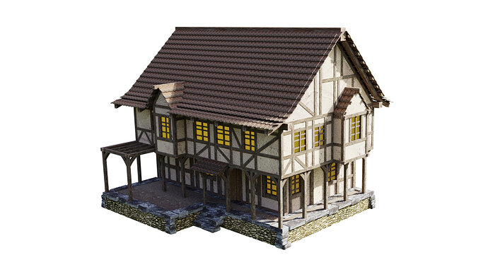
So here are a couple of the building assets that I made for this short so far.
This here is the tavern Boiling Bard. I’ve got a couple in the scene to make it look busy but there was only 1 in the DnD play threw, oh well. Got to do what you go to do I guess lol.


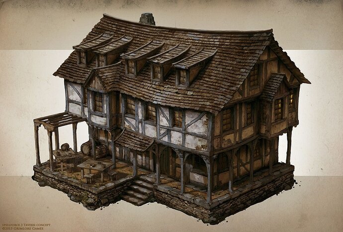
It’s not as dirty as the reference I used mainly due to my lack of understanding in blender as well as being new-ish to modeling, but I think I could do better now that I’ve put in so much time into this project. and made so many more buildings.

I believe it’s a piece of concept art from Spell Force 3 done by Raphael Lübke. If you enjoy this style I would highly recommend you check him out or simply take this image throw it onto googles image search. When I did that, it was like stumbling into a treasure trove of amazingly good reference.

3 Likes

Render times for anything of remotely good quality are in days per frame on my machine. So I guess if you can afford to pay a render farm it will help enormously. However, you need to know everything is right first. The whole ‘lean’ workflow thing the course goes on about.

Have you done all the original course?

To get the more realistic dirtier effects like the last image you need to see more tutorials on texturing I suspect. Plus yours is ‘perfect’ straight lines like brand new made by machines. But whatever style you want in the end so long as it is consistent It should be fine.

A lot of things can be faked rather than modeled, textures with normal maps etc. saves a heap of geometry to render. That should help render times I believe.

I am no expert though best hope for other’s detailed advice.

2 Likes

Your absolutely right NP5. Admittedly this is an older image of this object and I haven’t added anything yet to this particular object. No Moss no Mold, not even a AO map lol. But I’m working on it. I’ve started on the houses first unfortunately so it doesn’t show up on this one. My next image I post will hopefully show that off more.

An Outstanding work here.Good luck :+1:

1 Like

One time I examined render farms, they can be cheap. But then you will be put on a waiting list. If you pay more, you get more priority. NP5 already explained the techniques for keeping render times low. Low poly, baking, textures etc.

I think you need also switch over to Eevee. Or get more understanding of Eevee. Because Eevee is based on gaming render technology. And game software is capable of outputting high quality 3D video output.

So, maybe Eevee in combination with Unreal can be an alternative to render farms.

I have the same problem, I like to make animations as a next step in 3D. So I decided to put more effort in understanding Eevee.

1 Like


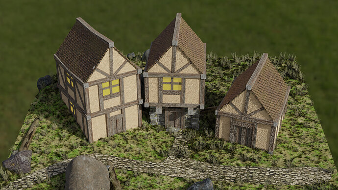
A rending of the houses I’ve done. Now that I look at them again. I can see that I’ve pushed the normal and height maps to much. But for this project I’m sure it will be fine as we are not getting to close to them.
I will have to remember this for the next scene that includes houses and remodel things better.

2 Likes

So I’ve examined Eevee’s potential and found it to be astoundingly good. My only problem is that when I use it for my scene, it has a hard time.

I hear what your saying with height and normal maps , and I do use them with the extra geometry in order to push things even farther.

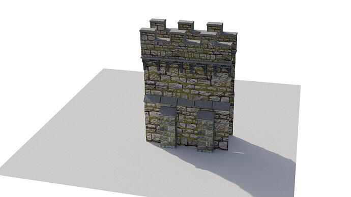
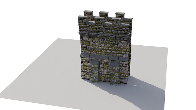
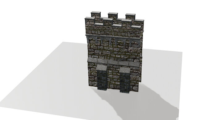
For experimental sake here is a quick image of my modular wall with only Normal and Height maps applied(done in cycles)


Same model, but I bumped up my Resolution on Subsurface Mod only in the render.

It gets darker and while from this angle it doesn’t really look all that different. But to me the feeling of that bottom one is more alive with cracks notches and junk. The top just feels flat. Maybe its just me? But I want that feeling to register when you look at the image. Even just on a wall lol.

I also did this in Eevee The first image is with the details. Eevee seem to pick up on it a lot more and since I didn’t want to tamper with my scene to much I kinda just left it. But here it is.


and without all that extra geometry

HAHAHA you can see the seam line WAY more in the Eevee one.

I went threw all this to see if there was a huge difference in style and render and i’m happy to see that there is. But i still lean towards cycles as personal preference for this project. It may bump up the render times but I feel like it is worth the wait.

1 Like

Cycles is for accuracy, Eevee is for speed.
Don’t forget, when you animate the details fall off.
Do a test run high details photorealistic and the Eevee way (mimicking details).
Video compression, filters out all those grainy things.

I have seen a video tutorial, about zooming in from space onto a planet in high detail.
He used a trick to switch over to higher form of details (more and more vertices). But it was very technical.

1 Like

I am following this course " Creating 3D environments in Blender", from Rob Tuytel.

1 Like

Dude that looks like a GREAT read. I’ve got it on my christmas wish list now thanks :wink:

Also I’ve been wanting these video turorials on Cycles Materials

And i’ve really wanted this tips and tricks book too

1 Like

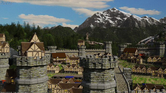
New updated render of Shot 2 as we sore over the city.

2 Likes

Looking good. I just wondered if all the windows should be yellow? If lanterns, candles, were alight, a) it would be night. b) it would be some windows not all.

If not night, then can they be just dark, and reflective?

Now that has made me wonder if the paintwork on the houses should vary really? Even if only a little. Just different ages of the prescribed town ordinance colour lol.

Oh now, lol sorry, there are no chimnies! Do they only eat cold food and live in a no winter cold land?

Ah also its very tidy. Could or should there be ‘stuff’ alongside the roads and houses? Barrels, boxes, A cat or dog or two. Empty of people too.

As an animation I suspect the motion would mean very simple people would do fine, just images on planes, even animated to move along a street. A standing guard or two in those towers?

My perspective for all this is wanting to make it look more ‘real’. If that is also your objective. Otherwise ignore me its looking great.

1 Like

Dude, love this comment. Nail on the head with the yellow house lights in EVERY HOUSE LOL! I made me think too and I might opt out for something to see if I can’t make it a little better. I might get rid of it and just make an empty box for the inside and put a light in side.

The paint isn’t really paint on the house. It’s more like a spackle placed over top of stones. I was going to have some that reviled the stone. But my lack luster texturing job is making it difficult.

Chimines… Nail on the head ROFL! going to be fixing that.

I’ve also started to incorperate boxes, barrels, skids of stuff although they didn’t make it into this update render.

Dude animation for characters is something I was going to put at the end but it’s so hard to get myself to pull that off. I know where to get some free animations and characters. But This shot has taken so long to get this far (2months) that I’m having a hard time not moving on to the next shot. I know I shouldn’t and that I should take my time with each piece and bring it to it’s perfection. BUT ITS SO HARD!

1 Like

Oh and I REAALLLY want to add smoke effect into the scene with the few chimneys that I have. Wasn’t going to add it on every chimney. mainly just the “shop and black smith chimneys in the town” and the most important one which is the chimney in the back on the tower that explodes. to help pull attention to it.

Hmmm might do shutters on the windows too.

:rofl: I did not dare add the idea of animated smoke. I suspect it could be done just as changing images on planes on each frame.

You could test out people without any walk cycle complexity too, just an image moving along the street. As you fly over rather than get to study one frame as we are here, it may well be all that is needed to give the impression.

2 Likes

that will work for the shot after this one but the camera movement that I’m using in this shot pretty much requires me to make everything in this town 3D. Same with any smoke. However, the Smoke and effects around the tower in the back… I might be able to get away with

Privacy & Terms