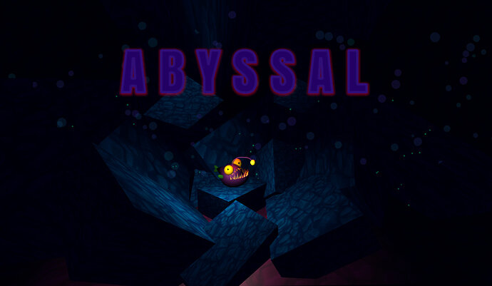
A B Y S S A L - Angler fish adventure

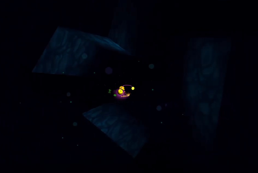
There it goes my first version of the project boost! You have to guide Lily the angler fish through the dark and dangerous waters from the abyssal zone. The further you go, the darker it gets…

The angler-fish was made by me (first time making 3D art). Music was taken from OpenGameArt.org and made by Señor Moreno 2020.

It is a first version, I will try to come back to it and improve it after I continue with the course. I would very much appreciate your feedback!

https://sharemygame.com/@AnnaZ/abyssal (adjust screen brightness if necessary)


9 Likes

Good idea, good graphics and excellent choice of music! I like the blood when Lily hits the rocks. Overall, a very good game! Congratulations!! The only thing I would say, it is that, for me, it began too dark (for level one).

And I have a suggestion: as the angler-fish was made by you, perhaps it would be a good idea to modify it to a “dead” fish for when it dies. Something like closing eyes or changing its color to some dark one.

1 Like

Thanks a lot for your feedback Munsa!! It may be indeed too dark on the first level already, you are right. I can easily change that :). I also thought about making a dead version of Lily, but it was very hard for me to even make a fish, as I’ve never done 3D art before. But your idea of changing its color is brilliant!! I will try to implement it.

1 Like

This is one of the most beautiful things I’ve ever seen, and I love it.

Thoughts:

  1. Fish don’t move this way. Please don’t change it, I think this is much better. The movement of this fish communicates a whimsical sense that really helps set the tone for the game.

  2. Consider not starting the audio over on player death. This way, the player won’t be in a situation where they die over and over again in the same place, and hear the soundtrack do the same thing. In other situations, I think it’s good to stop the audio on player death, as it is done now, but for the moment, having the background music continue feels like it helps prevent the feeling of experiencing the exact same content over and over again

  3. I think the lighting is okay. For me, the lighting is too dark, but since angler fish live in the depths of the ocean (and since I have a preexisting knowledge of that fact), I think the darkness helps the experience. It gives the game kind of a groping, feeling-around tone. Mapping the level your attempting to traverse, is itself one of the gameplay mechanics. Overall, I think it works in this situation, and I would encourage you to keep following whatever intuition which led you in this direction

  4. I love your particle effects. I especially like the death effect. It’s a good splat sound, and the associated VFX help me know something happened. I think it would be improved by also making some change to the player character. Maybe set the Y scale of the model to 1/3rd of what it is normally, to make it look squished or something. Alternatively, just create some kind of “dead” model, and instantiate that on player death, while hiding the regular model.

  5. On level 4, after the moving block, there is a static block, which is just barely over the “line” that the player traverses. The edge of the block is a hazard, but it’s not a clear hazard. Consider making hazards a bit more clearly hazardous. I know several time, I’ve been unclear about what is a hazard and what isn’t. I think you should consider level geometry, not merely as “place setting”, but also as the way you communicate the player’s goals to them. If the player can’t tell that a thing is hazardous, then they don’t necessarily understand that a goal of theirs is to avoid this thing. Then, when the player fails to avoid the thing, it’s possible they will feel like they weren’t clearly told what was expected of them, by the level.

I think a geometry pass would be worth considering, mostly to make sure that none of the geometry ends near the Z-axis where the player traverses the level. Depth is very difficult to judge in general, and it is more difficult to judge when actual 3d perspective is not available.

That’s all I’ve got for now, but you did great. I’m gonna keep playing. Well done!

1 Like

I couldn’t beat level 5. It felt like a large jump in difficulty. One thing I noticed, is that it was difficult for me to tell when an obstacle was part of a moving set, or when it was not moving. I got close enough to see the end of this map, but there were like, 4 moving holes to slip through.

My thought for this level specifically is:

  1. make the holes wider

  2. or: throughout the game, change the look of moving sets of obstacles, so they’re easier to recognize (maybe have moving obstacles give off a small amount of light or something?)

  3. or: provide an alternative path, if you’re going to include a difficult path. For example, if you have a skill path, where the player needs to skillfully pilot through a series of obstacles, maybe pair it with a longer, but lower skilled path. That’s a little bit beyond the scope of the project, as we’ve been developing it

But yeah, well done! I look forward to seeing more of your work!

1 Like

Dear Ellie,

This is by far the best and most detailed review I have ever received from anyone, and I am so incredibly happy you took the time to write it :))! I cannot thank you enough, truly. Regarding your great comments:
1- I’m glad you like the movement despite it is not the way an angler fish is supposed to move.
2- I agree regarding the audio, but at the moment I am not sure how I can do that. I’ll come back to it with more knowledge.
3- After the first comment from Munsa I increased the light a bit, so it is already better now. The idea of mapping the level as you go is exactly what I went for, I’m glad you like it. By the way, I am happy you have some knowledge about angler fish, I am a Biologist and I adore these creatures :D!
4- Glad you liked the particles! I made them specially for adorable-Lily’s death haha. I totally agree with doing something with the model when Lily dies, it is something I will be working on when I learn a bit more.
5- You are right. I actually want to change the hazard design to make it more clear, but I am not sure how and first I wanted to get some impressions from players. I tried to make them red, but that changed the aesthetics of the game and I did not like it. I’ll think of something! Regarding the geometry pass… I have no idea what it is haha. I am sorry, I’m really new to this.
Last level (5)- Yeah, probably too difficult haha. I will change it a bit following your comments! Changing the look of moving obstacles is a brilliant idea, I’ll do that!

Again, thanks sooo so much for your detailed review! I am so glad you liked the idea of the game :)!! I hope you like my future projects as well. I will always be looking forward to hearing your comments on them!

1 Like

I made an update trying to include some of your suggestions, guys! Thanks a lot for your help :)! There are some things I am unable to change with my current level, but let’s see if I can do it later on. Now cute Lily turns black when she dies :heart:

You’re doing a great job, and I would be interested in playing an updated version, for sure!

When I say “Geometry pass”, what I mean specifically is to play through the game (probably in-editor), and focus on the things you can run into, rather than the lighting, or movement speed, or the audio. It’s a bit harder to do, if you know where everything is, but something you might consider is:

  1. in the OnCollision method
    1.a. add something so you can prevent the level from restarting
    1.b. then add something to notify you of when the collision happens. (You could just print it out, but another option is to do something like: Change Lily’s MeshRenderer.Material to a new color when there’s a collision, and make sure you can just press a key to change the material back.

  2. then, you play the game, you run into some walls, it doesn’t restart the level, but it’s visually obvious that you’ve touched a wall.

2.a. If you think that’s okay, then just press your reset key and keep going.
2.b. If you think the shapes you can collide with project into the player’s movement area too much, then you’re already in the editor, so you can try tweaking it
2.b.i. but remember: changes made during gameplay aren’t saved, so you’ll have to manually do that

  1. Then you just kinda do that for all the levels, or until you get bored.

RE: Lighting and visuals

Some ideas which could make the objects in this level more clear:

a. put lights behind them. This will offer a “rim light”, that can help characterize a border between the object, and the background it sits in front of. This is a common technique for portrait photography. Sometimes, it is reasonable to add a dim light, in order to psychologically suggest the concept of darkness to an observer.

b. Make the objects darker, if the player could not actually run into them, and leave the other objects unchanged. This would provide an increased contrast between the hazard objects, and the background objects.

b.i. if something is part of the level design, and the player traverses the level in 2 dimensions, you can also take “background” objects, and make them farther away, but bigger. Doing so will decrease the reflected light they can give off, and this may help increase the contrast of the hazard objects, which the play can actually run into.

I think you’re doing a great job though. Thank you for sharing this project!

1 Like

This game is beautiful, I really like the atmosphere that was made in this, the music and audio design too was pretty good, In dark parts it gives you almost just the right amount of time to stop before you hit an object when you see it, and the difficulty curve feels pretty natural, although I didn’t get past level 5. The only thing I didn’t exactly like was that the fish’s collision and the depth perception of the levels didn’t always match well and certain spots where I thought I’d make it I’d hit the object instead. But otherwise pretty good

1 Like

Your game is fantastic, amazing job, you should be really proud.

First of all I want to say, I had no problems navigating your world and that was thanks to the amazing use of lights, how you pointed the way was so subtle but perfectly placed to let the player know where to go. That’s some high level detail there, truly amazing.

I did found some other issues that you could improve to make your game better but Ellie already pointed almost everything out. My only suggestions would be to generate the light map of each scene, this will dramatically improve how the light behaves, I think Rick did this in one of the sections but there’s how to do it:

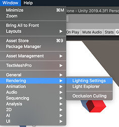
Open the Light Settings tab, here’s how:

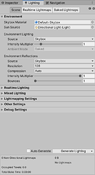
Then you just have to press the Generate Lighting button:

You’ll have to do this for each level, and you’ll probably need to make some adjustments, but the difference is night and day.

1 Like

Hello there! Thanks so much for the positive feedback!! I changed the lighting and the difficulty level following the advice from other comments, so I am very glad you feel it is natural!! I agree with the depth perception, and tried to improve it to make it the best I could without changing the feeling of the game so much. But I reckon there is still room for improvement :D. I will try to follow Ellie’s last advice on that.
Thanks a lot for your feedback once more!!

Hello Yee :D! I am so happy about your feedback, you made me feel really proud of my game! I am glad you had no problems navigating the world. I already tried to improve it following Ellie’s advice, so it feels great to know it is better now. The idea of the light map is great! I will try it out. And it is so nice of you to give me the detailed instructions for me to follow, thanks a lot :heart:! Anyway, maaany thanks again for your positive feedback, it motivates me a lot :D!!

Privacy & Terms