6 Toned Landscapes

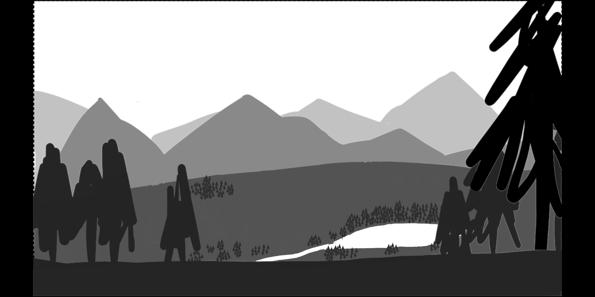
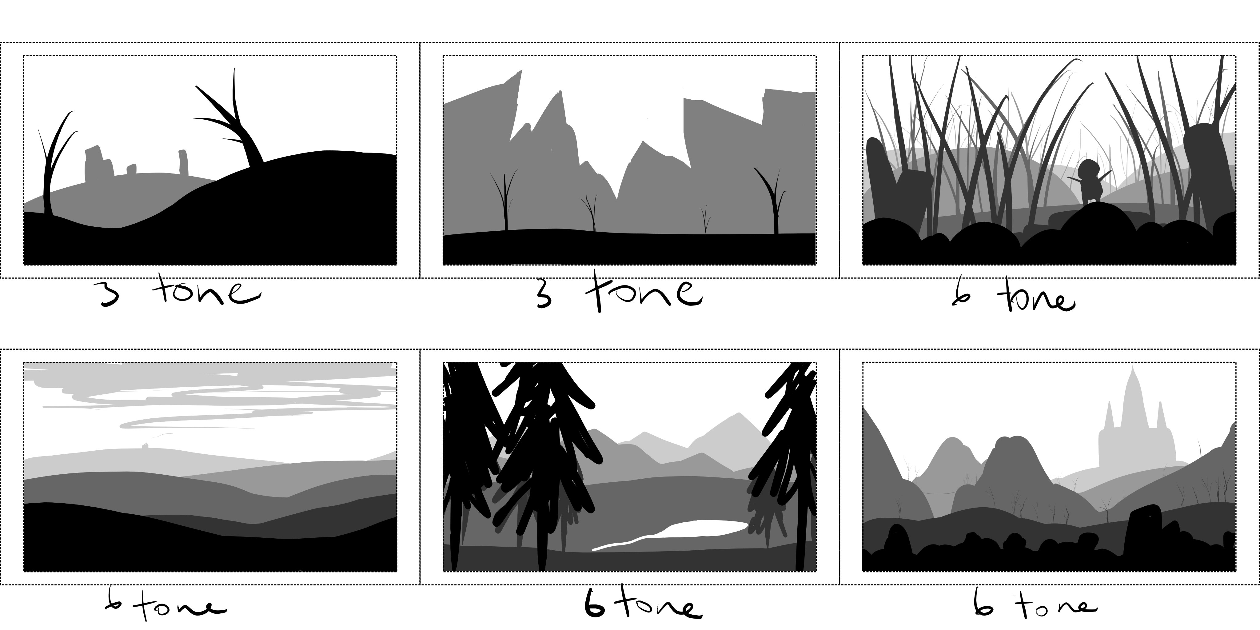
I’m especially happy with the two images on the far right. Something about the scale of both scenes is what stands out the most.

Let me know what you think. Anything at all.

Edit:

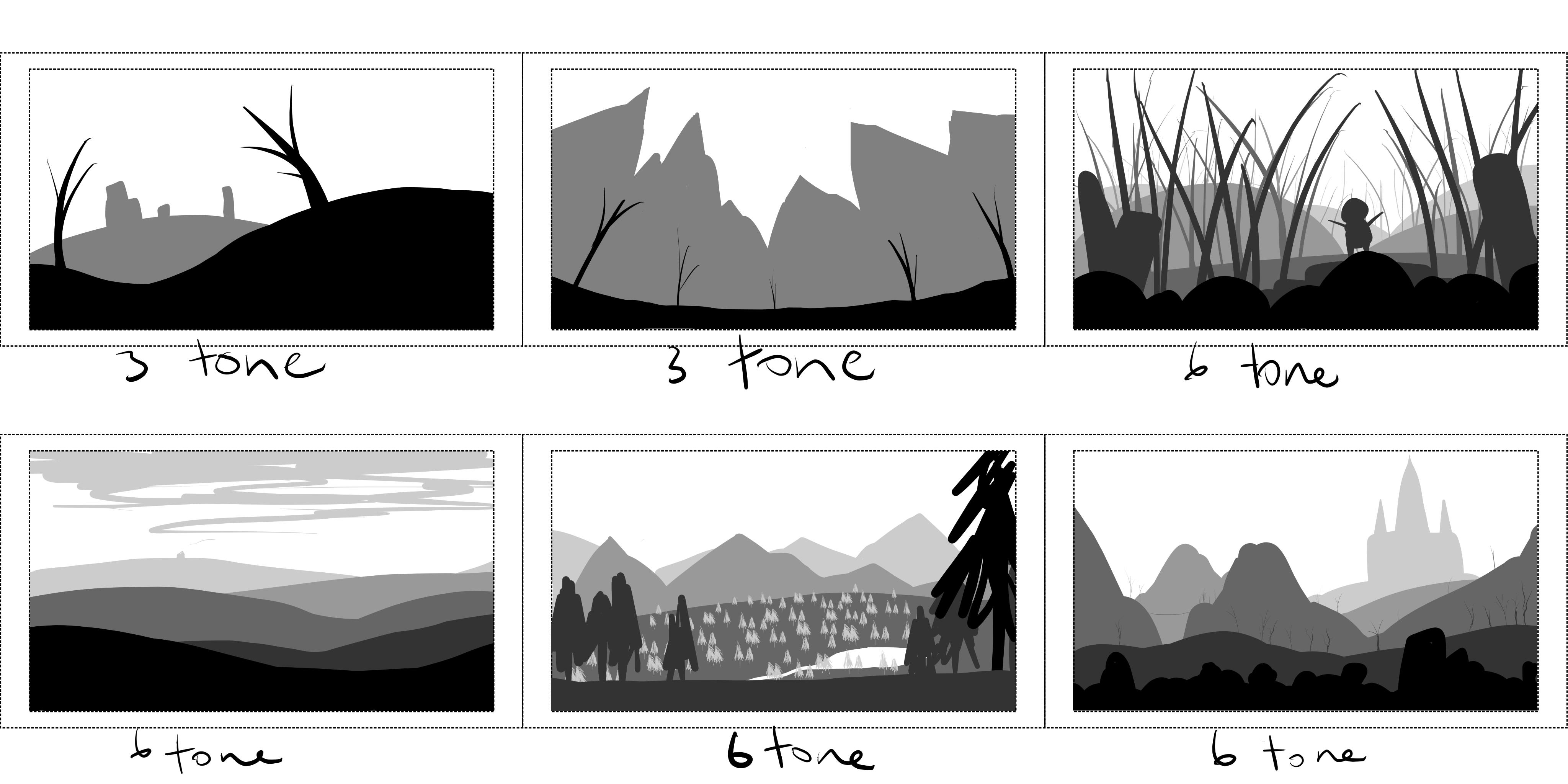
I Changed up images 2 and 5 based on @VVruba suggestions. I can definitely see a difference in number 2 in the way the image draws the eyes into the center and how it has an almost fish-eye lens effect to it.

I’m still not too sure on number 5. Maybe I added too much to it, now it looks too busy, but I think removing the trees in the foreground helped to open up the scene a little more.

4 Likes

Good job on the exercise. :+1:
2nd scene - Perhaps some rocks in the foreground would work to better build up for the massive cliffs at the back. I would also consider “bending” the ground down near the center.
3rd scene gives me heavy Grounded vibes :wink:
5th scene - Good framing with the trees but it feels a little too suffocating, I would consider moving the “middle” foreground tree one layer further back, closer to the left, or just removing it entirely. Replacing it with a shrub could also work. Also, you could use the 2nd lightest gray to plant some trees on the plane where the lake is, it would give a better sense of scale and communicate the size of the lake.

3 Likes

I’m not much of an artist, so I unfortunately won’t be able to provide improvements like @VVruba , my improvement suggestions would prolly make the scenes bad, however I’m really liking the 6th scene, seems as if there’s a lot of details with all the shades, would make for a nice 2D platformer.

2 Likes

Thank you for the advice. I will definitely be trying out your suggestions.

2 Likes

Thanks @Christopher_Powell. I can see what you mean about number 6, it has the beginnings of a 2D platformer, with the castle being the main focus and destination for the player.

2 Likes

For the trees in scene 5 it’d be better to keep them in clusters rather than this sort of even spread. It will look more natural and less busy even if the overall density is kept the same (ground-to-tree ratio).

2 Likes

Does something like this work a little better? (Ignoring the black framing)

2 Likes

I was thinking something more like this:


If you wanted to you could add more clusters, but I was kinda lazy :stuck_out_tongue: 
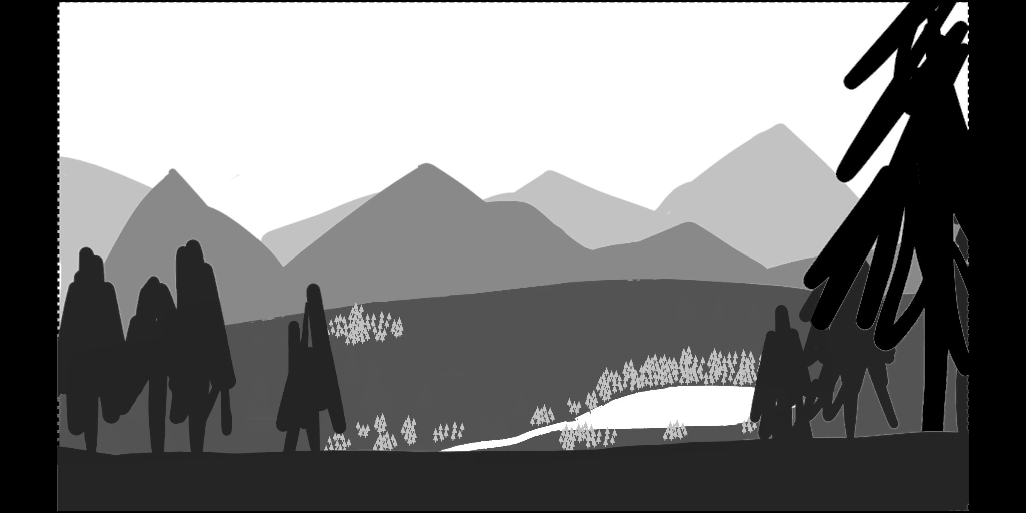
plus it makes sense for there to be more near the water.

As a side note, and this is kinda my mistake, but you could also use the foreground gray to map out the trees and this is potentially better:

Summary

The reason for this is that trees are usually darker than grass and would “generate” shadows so this is a closer representation to the kind of values you’d have in a final piece.

2 Likes

That makes much more sense now. Thank you for the detailed explanation, it was very helpful.

Privacy & Terms