3D Shapes

I’m extremely happy with how the shading turned out with the trees in the top right of the image.
They’re simple without any wobbly lines like some of the other trees have to define highlights and shadows.

Even up close, I still think they look like trees. Some work with shading will help to separate the leaves some more but overall, I’m happy with it.


With highlights


Without highlights

I’m happy with my second image as well, though it could still do with some work in the background. I just thought I was spending too much time on the rest of it.
I did think that adding highlights to all the rocks was starting to make the image a bit busy. Let me know what you think.

4 Likes

Good job, I can see you making progress by the day. :+1:
Personally, I prefer your 2nd drawing with the highlights. Especially on the darker rocks upfront it gives more contrast and makes the shapes feel more three-dimensional. Also, the trees did turn out nicely.


One thing I’m not sure about is if the rocks closer to us are meant to have a shadow cast over them.
If not then assuming they’re the same type of rock as the ones further back the bright part of them that catches the sun should be no less bright than on the rocks behind.

Air perspective makes objects further away appear brighter but that only applies to the shadows, the highlights will punch through and be the same brightness as in foreground elements. In some cases where the highlights are already weak, air perspective can actually make them darker instead because the light gets scattered before it gets to us and takes in more of the sky color.
Take a look at this image for example:

Canyon

So unless there is something casting a shadow over the rocks in the foreground in your scene, like a cloud or some other thing off-screen, the highlights should probably be even sharper:

Rock Scene

I’d have to change the values on all the rocks tbh for it to look properly in place and at that point I’d basically be redrawing the whole thing so I’m not gonna do that but hopefully this combined with the photo before serves as a “good enough” example.


For your first scene, I think you need to pay a bit more attention to the light direction. Your shadows all have different angles…

Figure 1

You need to keep in mind where the light is coming from and draw the shadows based on that:

Figure 2


I hope I’m not being a nuisance, just trying to give you feedback.

2 Likes

You’re not a nuisance at all, I really appreciate the feedback.

Do you think using perspective lines would help with lining up shadows?

This is the vanishing point tool in Krita. It seems to line up with your example very well.

With the second image, I want to say that the style of the foreground rocks was deliberate, but I think I was just being lazy and too focused on the rocks in the distance. It definitely shows in the way the rocks lack any sense of depth.
I do like your touch ups with the rocks where you have added the gradient. Is that to try and show the ambient occlusion of the rocks closer to the ground?
Because if it is, I might need to consider using the gradient tools in Krita to speed up my workflow. At the moment, I tend to slow down when it comes to detail but something as simple as a gradient to give the sense of ambient occlusion could be all that is needed.

Thanks again for the advice, it is extremely helpful.

2 Likes

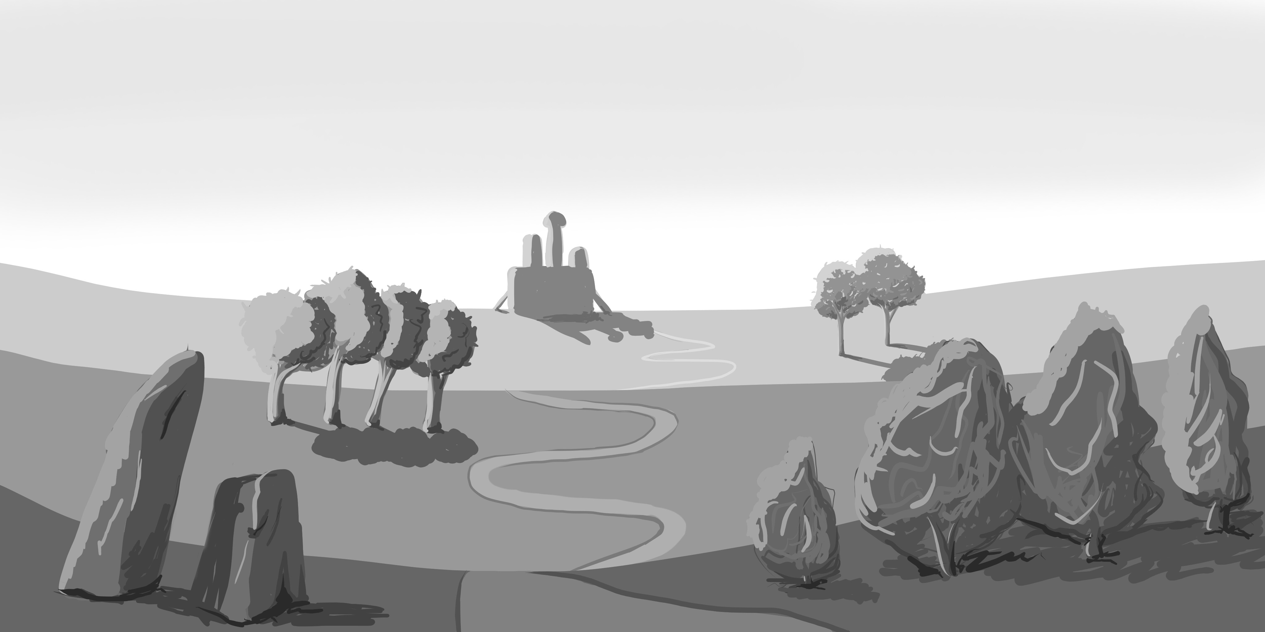
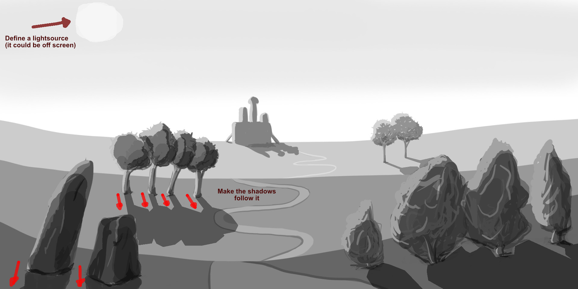
Using the perspective tool for shadows in OK for some scenes, but don’t get too caught up on it. After all, it’s meant to be used for perspective, not shadows.

In this case, it works fine because we are low to the ground and the perspective works in tandem with the sun, but how would you tackle shadows if you were looking at a scene from top up, or if there were multiple light sources in it?

The reason shadows spread out like this is because of our perspective here but the sun is actually quite far away so physically the shadows it casts are actually basically parallel.
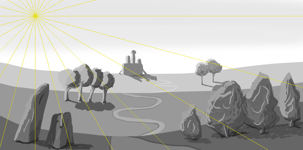
For example, the shadows in your scene from the top down would look something like this:


Assuming it’s being lit by the sun in the position from my example before.

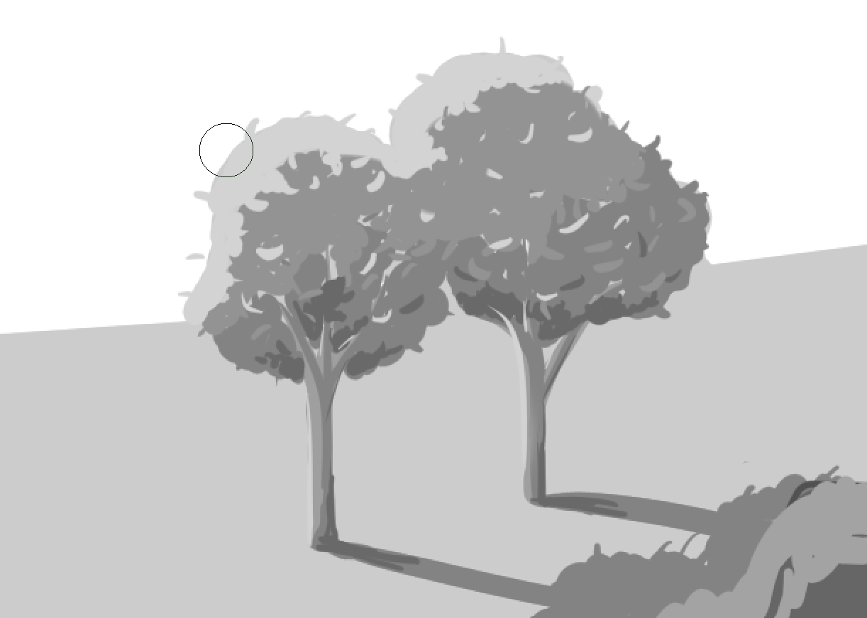
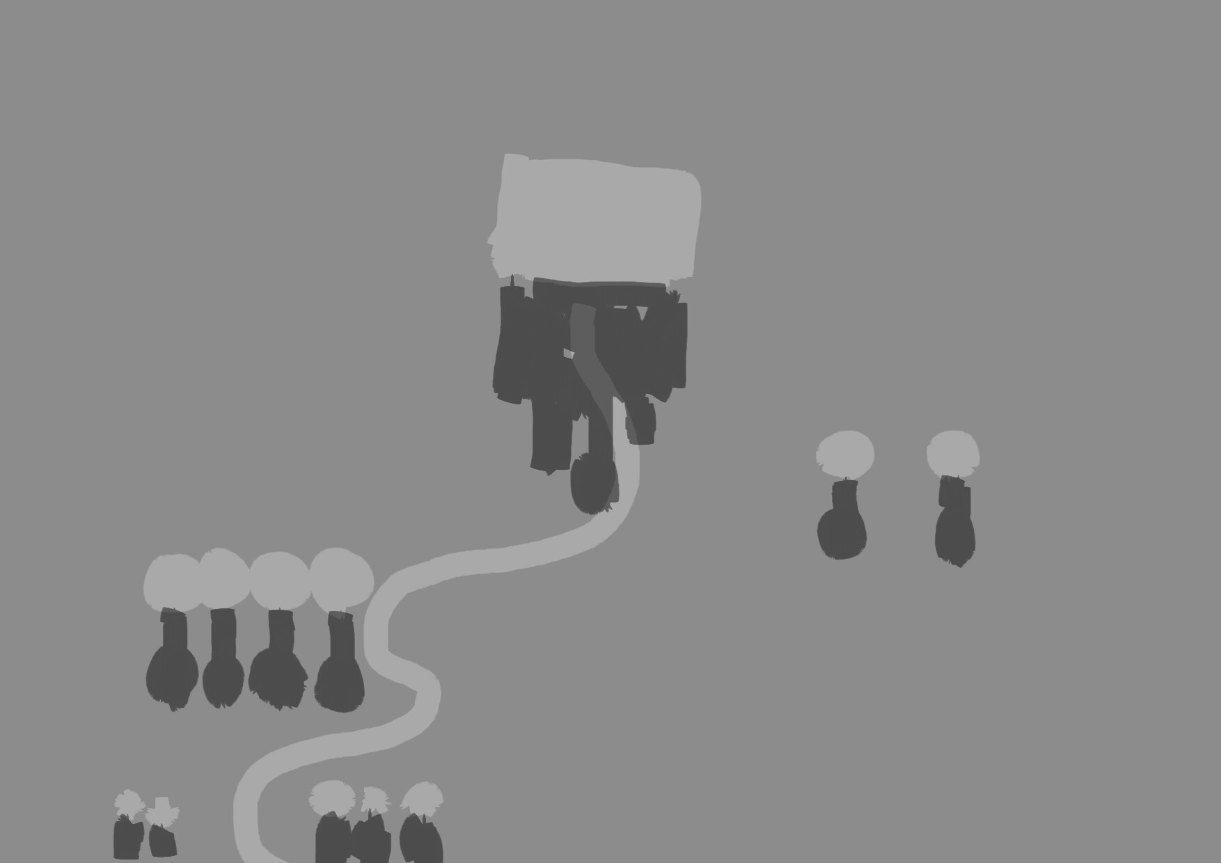
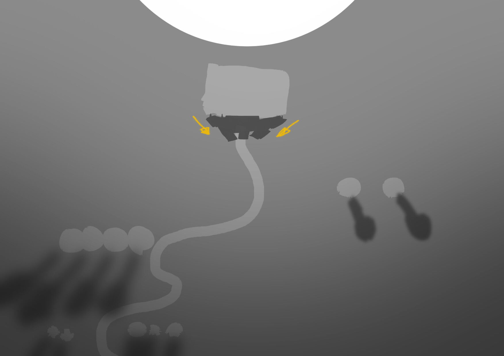
But what if it was lit by a big magic orb right behind the building with an oddly phallic shape on top? (this scene assumes no sun or other lighting):


Notice how the shadows close to the orb are very short and cut inwards, but as you get further away they start to spread out and become softer. The whole scene also loses brightness as it gets further away from the orb.

Perspective guides would be useless to depict that from our original point of view.
Maybe I’m getting too advanced here but I don’t want you to think scenePerspective==lightDirection.


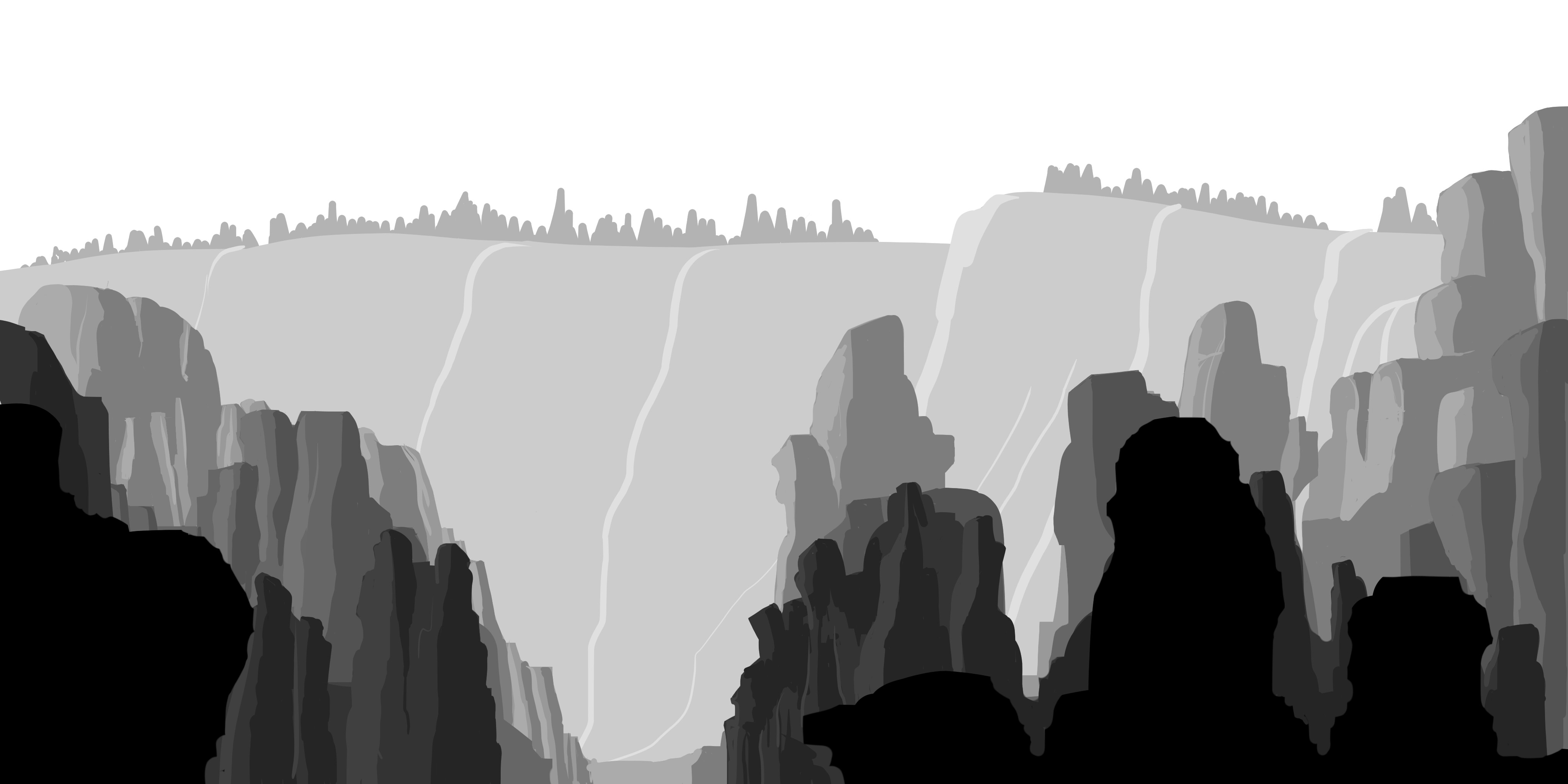
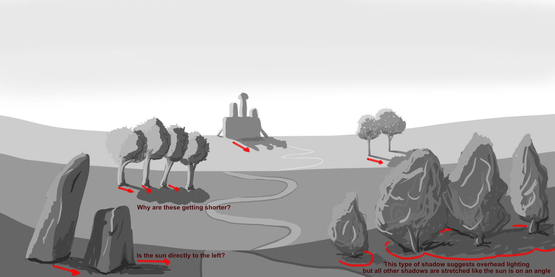
I don’t think your rocks lack the sense of depth, especially in your second image “with highlights”. You are still limiting yourself in terms of the tones you use and that restricts what you can do, which is fine by the way it’s a good exercise.

What’s happening here is that you’re taking what you learned from the previous exercise, the 3 and 6 tone landscapes, and applying it here with shading. The exercise with mocking up landscapes with different values leans heavily on exaggerated air perspective, it’s a good way to mock up concepts with a sense of depth but it has no bearing on actual light. So when you apply the same thing to the scene where you start to shade and add lighting the values go all wrong.
Like, think about it, do things in real life get darker just because they’re closer to you?

I don’t really know what the contents of your course are since I haven’t taken it (not even sure I own it) but if it’s making you add shading to your scenes without teaching you anything about light I think that’s more of the course problem and can lead to bad habits IMO. Then again, there might also be a method to the madness or things are explained later, like I said I don’t know the contents so I don’t know what and how it’s being thought. I’m just going off what I see and my own knowledge and I’m by no means an expert.

As for why I used the gradient, I just thought it looked nice, I wanted a softer cutoff on the shadow to add just a touch of extra three-dimensionality to the rocks. I cut the highlight off early because I assumed the rocks around would cast shadows over themselves and obscure each other so only the highest parts would actually catch the light.

2 Likes

Thank you again @VVruba for such an in-depth explanation, the lighting example especially. I definitely have a habit of assuming landscape equals greenery but that certainly is not always the case. The floating orb of light could certainly be seen in a sci-fi or fantasy landscape.

I think the course itself uses an exaggerated air effect to depict distance. I think Grant touches on the idea of external lighting in a scene but only briefly. Maybe he will go into it a bit more further into the course but I’m not sure. I’ll try to keep it in mind when I’m drawing more scenes.

Thanks again for the feedback.

The orb was just an easy example for me to quickly fit into the context of your image. Because there is a building I needed a massive light source but the same principle can be applied to smaller subjects with smaller light sources. For example, a person standing in front of a jumbotron display or a well-lit storefront at night would have a similar effect; or an insect in front of a lightbulb; or a miniature city.

1 Like

Privacy & Terms