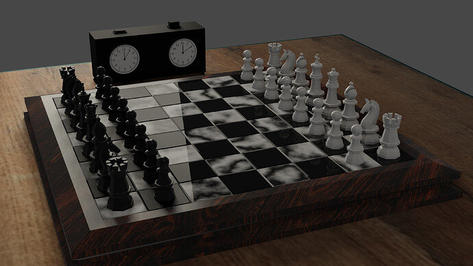
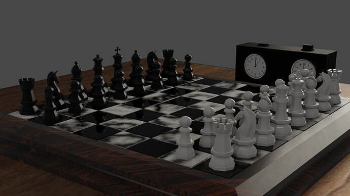
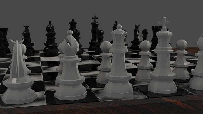
I used an area light to represent a window and added a point light to represent an interior lamp and I like the resulting effect on the board but it does make the shadows less pronounced.
4 Likes
Great board and set well lit. I like the clock addition too.
Time passed on the clocks but no moves were made! 
i know but i thought they were less interesting just pointing up 
1 Like
You could always make a couple of moves on the board.
I’m really liking the lighting on that second render. Nicely done, and I like the clock as well. 


