Nice to see how this came on. Has it sailed yet?
Damn you have really made waves with that model! Smooth sailing to the finish line I think :). Sorry, love it, really is insane!
It was hard to do (to keep so), because for 3D-printing, you need dense mesh on curves. But my laptop isn’t capable of handling many vertices. I did manual cleanup many times.
At the end I had different files with parts. Which lead to project management problems (assets).
Then I wanted to have high details for render projects. But then those details could not be printed, because they where too small. So this project went in all directions 
And on top of it, I lost my project. Not sure what happened I have currently only an old backup.
Would be nice. On Ali-Express you can buy this model (not very detailed and very, very basic) but ready for remote control. My project was more a showcase model, as a present for my brother.
I remember this one as well. This looks lovely!  This is a completed project for sure!
“Let’s go. In and out, 20 minutes adventure.”
I wanted to create a simple art, which, however, threw up a whole bunch of snags. I spent, of course, not six days, but only three hours, but it was fun
And additional art that you don’t need to take part in this week collab (I made this character a long time ago and not for this week)
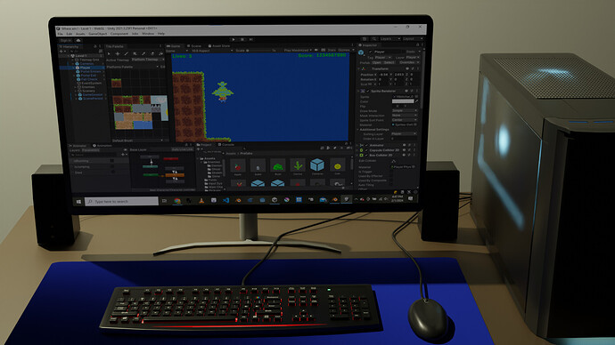
the whole setup looks reallt good. but I think the keys on the keyboard are a bit too small
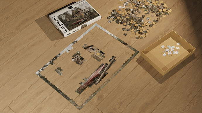
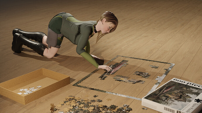
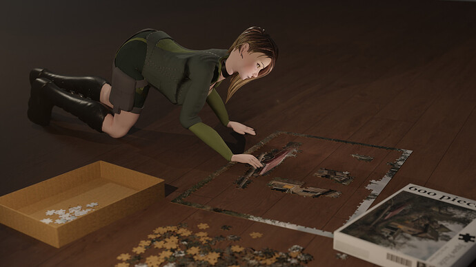
I like your scene. Starting from the corners of the puzzle and going in. Realistic and thought put into it! But for some reason your pretty character seems to be pasted ontop of the picture. There’s something missing. Maybe depth of field. Some focus of the lens

I used a couple different references but changed some stuff up.
Love the emission you gave on the keyboard next to the keys and everything else. Literally just the size of the keys that stood out to me as unusual
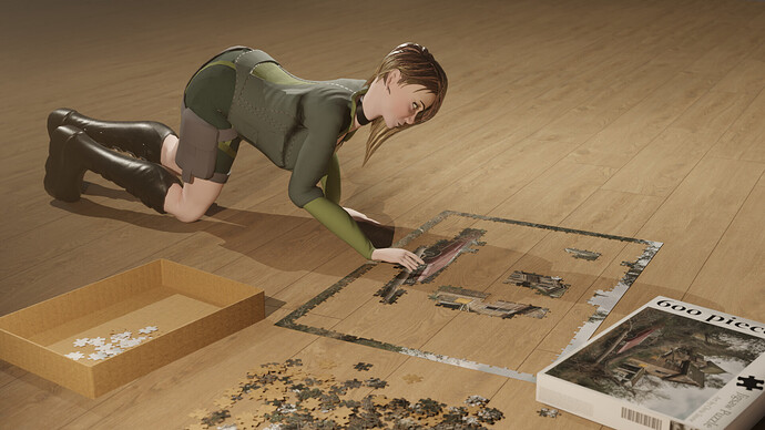
yes like this, but maybe even more. what do you want viewers to look at? I think the character looks really nice and the puzzle on the floor that she’s interacting with. I think you can put everything else way more out of focus. like really blur the reast out
Thanks. I did give the deck a different shape from the original and instead of the keycaps being flat, I made the top of most of them concave and the space bar convex, but not sure.
the shape of the keys are cool. I think theres just too much space inbetween them. But maybe some keyboard designs are like this
Ohhh I do like that light in the face. Everything does feel more focused now. Nice experimentation!
We @BlenderCollab have a few days to vote. You can vote fast but also think slowly about design, colors, technique, difficulty, subject, realism, etc. Choose consciously and not on your entry.
The new subject week 6 “Romance” has already started. The winner of this week’s “Hobbies and Recreation” challenge may select a subject for next week 7 and win a badge.
A little note: I didn’t take part of the collab vote, because this 3D printed model was a huge project that took about three months. I had an other test 3D printing test project that took a couple of days, but I forgot about it.


