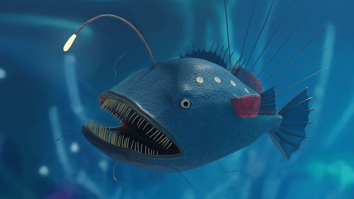
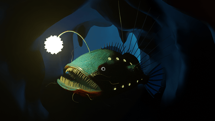
@Megane_Wang that is both terrifying and adorable at the same time!  Looks great!
Alright, I’ve run out of time so I’m calling this done. Hopefully, next time, I’ll have time to create coral and other aquatic flora and more variety of fish.
This is awesome, love the atmosphere!
It’s very beautiful.
Thank you very much!
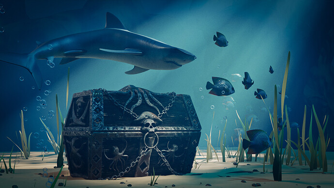
Very nice. Who is blowing bubbles down there?  Good device though to make it more ‘underwatery’.
I think the positioning of the box is too forced, too mechanical. As if it was placed with great precision. If the box was thrown into the water, you would also expect more impact with the ground. It is tilted and partly in the sand.
We @BlenderCollab have a few days to vote. You can vote fast but also think slowly about design, colors, technique, difficulty, subject, realism, etc. Choose consciously and not on your entry.
The new subject week 36 “Vertigo” has already started. The winner of this week’s “Underwater” challenge may select a subject for next week 37 and win a badge.
-
xealstrag (animation)
0 voters
Totally not for points, but I wanted to share what happened to the fish. I am glad that I finally solved how to tell the full story quite as imagined.
It’s like a portmanteau of games: 5 Nights At Freddy Fish! XD
I like how this one turned out; the side lights hint at how dark the surroundings are without the front light, which, to me, brings out the front light even more strongly. Cool effect =)
Edit: And apparently it’s spelled “Freddi,” not Freddy. Well that’s another memory changed forever XD
5 Nights At Freddy Fish!
Thank you, yes, that was the idea!
Yesterday I tried with stronger back light to show the fish that had taken so much effort  , but it did not turn out so well, I needed a bigger cavern and lost the whole effect. Finally I decided to go back to the idea of a narrow, creepy-looking cavern, where the hunter could -Oops!- feel suddenly caught.
I removed all direct lights except for one diffusive block at the entrance which provides light from a flat sky, and the one on the fish, with the valuable help of a sphere of transparent, diffusive material that extends to reach part of the fish, and totally black but smooth walls.
The experimenting paid off! 
That fish is epic! It is like a 5 Nights At Freddy’s fish. Or a glam rock fish! Love it!!!

=)
I totally missed this comment, @FedPete. I agree! I should have placed it so that it was partly sunk into the sand. As if it had been there awhile and over time, as the water shifts the sand, it sunk further in. I like that!
Congratulations to @mfortunato for his atmospheric underwater scene. The composition of the whole is well chosen and balanced. The chest is decorated with details, on which the focus lies. The view is guided by the rays of light. And by using a shark the whole gets a dark undertone.
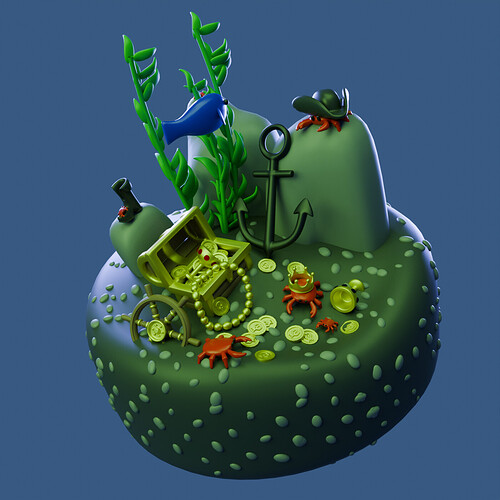
- xealstrag - Your animation did the trick! I do miss the glass effect in the used still. I would have chosen for a different ground color. Now everything is greenish. Now it is difficult to see all the details (gold …)
- CptMirana - I do like your first proposal (some sort of isometric view). I think you could have played more with the shadows. But I must admit this scene is difficult to compose (adding details). Maybe a smaller exploration submarine. With lights, robot arms etc. More details to play and compose with.
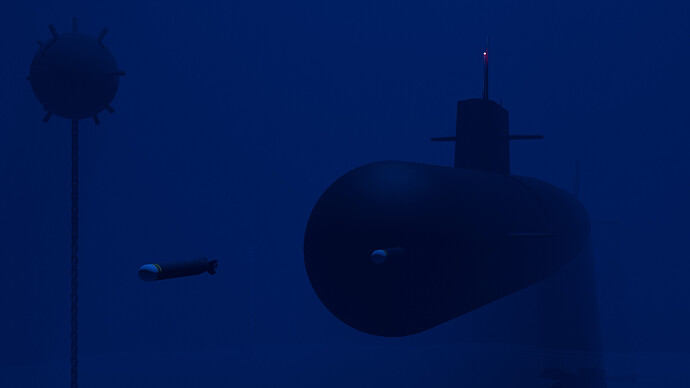
- Megane_Wang - I saw the direction your design would take. But you had some technical problems. Personally, I also find lighting a subject difficult. Because the play of light is so important here, I would have started with that first.
Note: I don’t want to offend anyone. I try to write down positive ideas and visions in my simple use of the English language. I am also sometimes more inspired by a particular subject or solution. I’m also learning from you!
Thank you for your comments, I always appreciate them! 
Yes, I totally agree. Another lesson I am learning by doing it wrong now and then: I should make a proof of concept first, not last! 
Thank you for your comments 

