2024 Collab: Week 23 “Text” - VOTE CLOSED

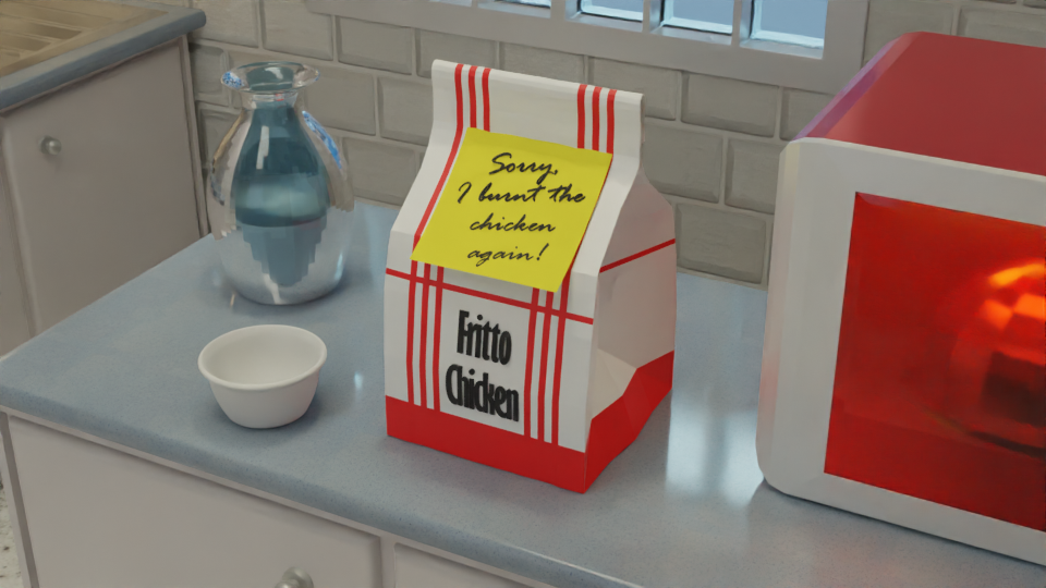
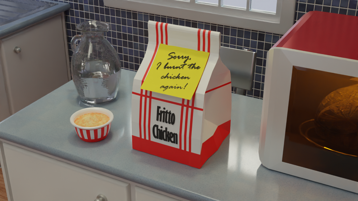
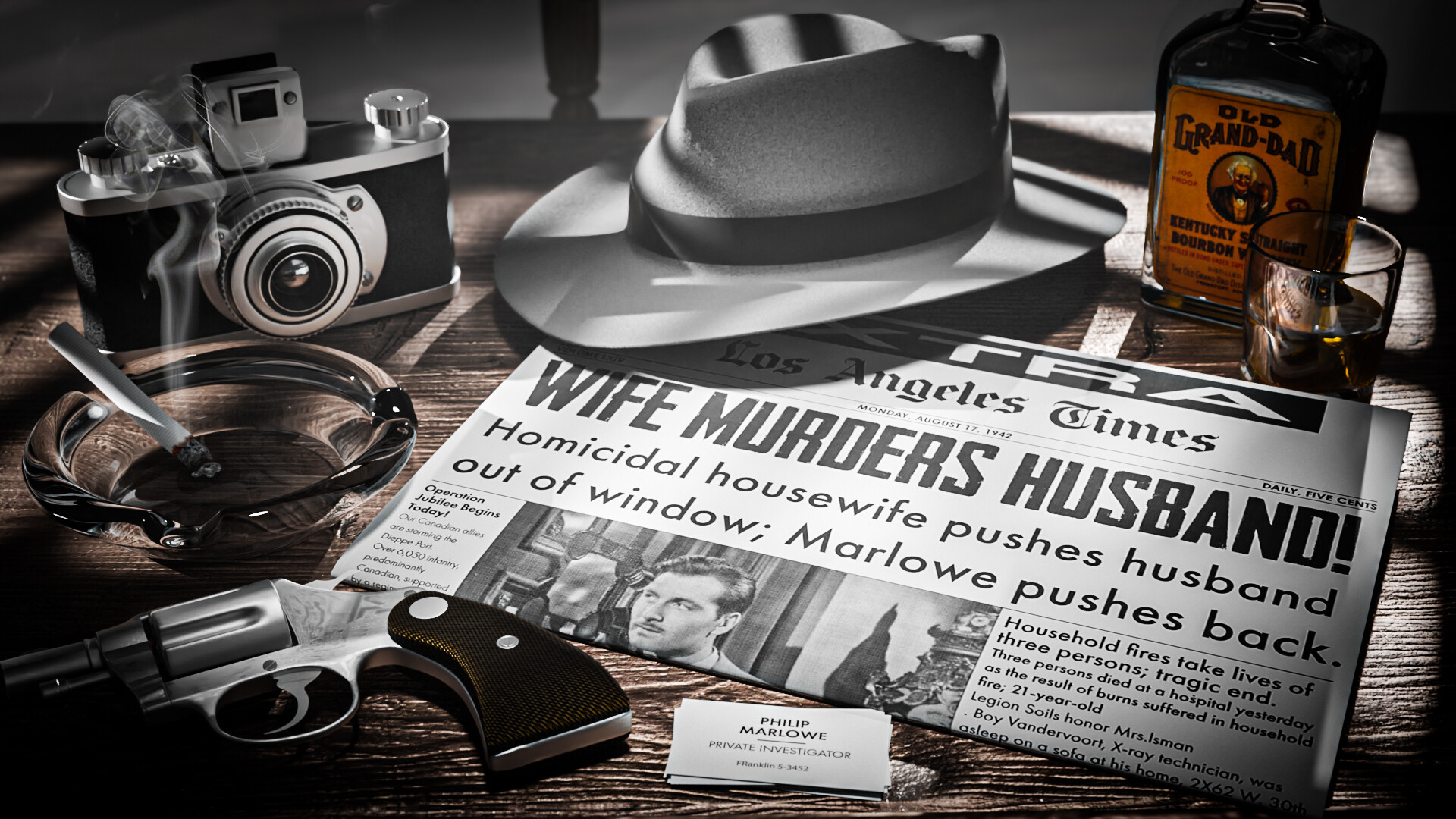
*EDIT - Thank you, BH67. I took your advice and added business cards (I also modeled a Colt .38 detective special - ran out of time to finish adding texture details - but it looks good as-is).

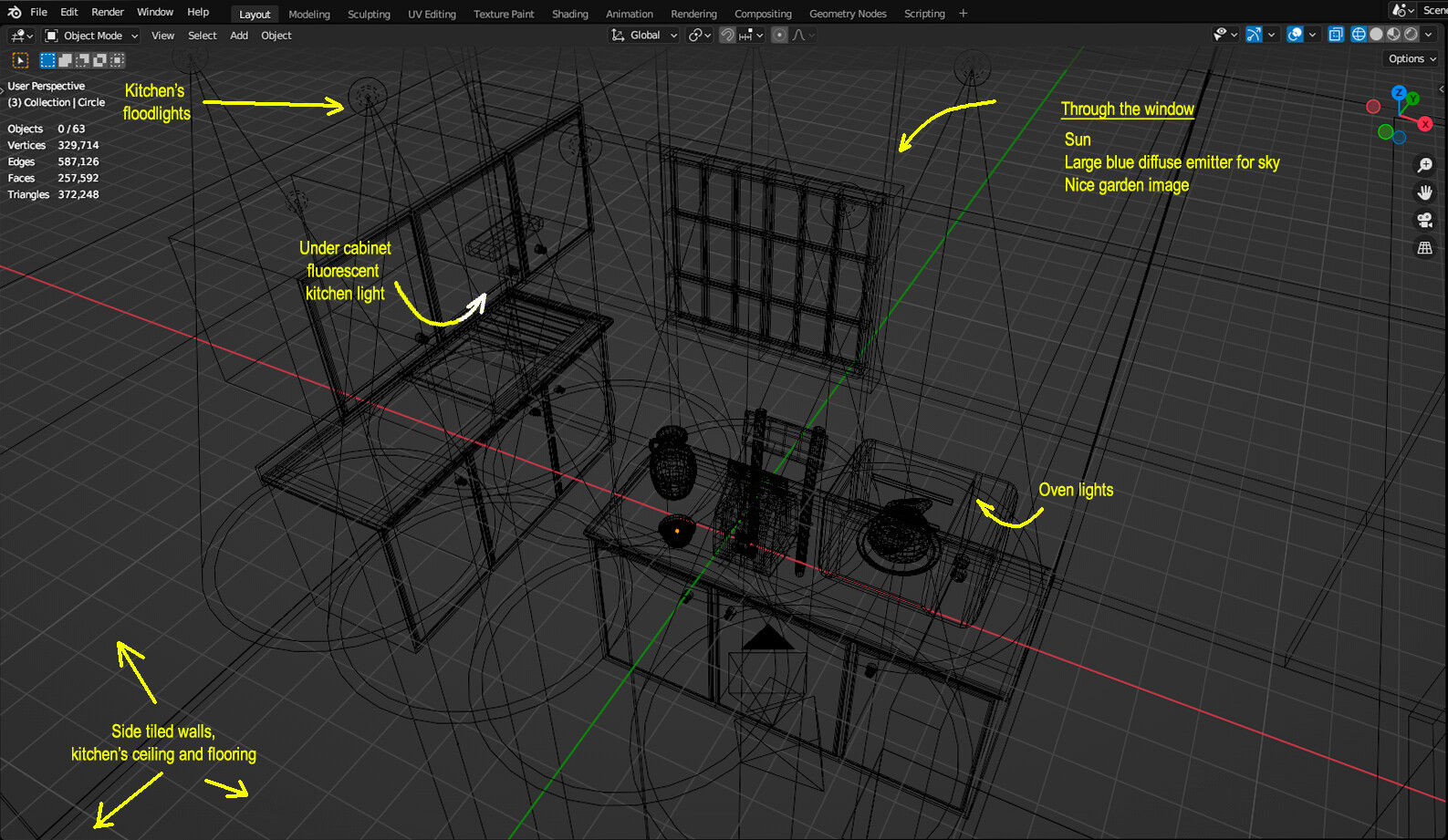
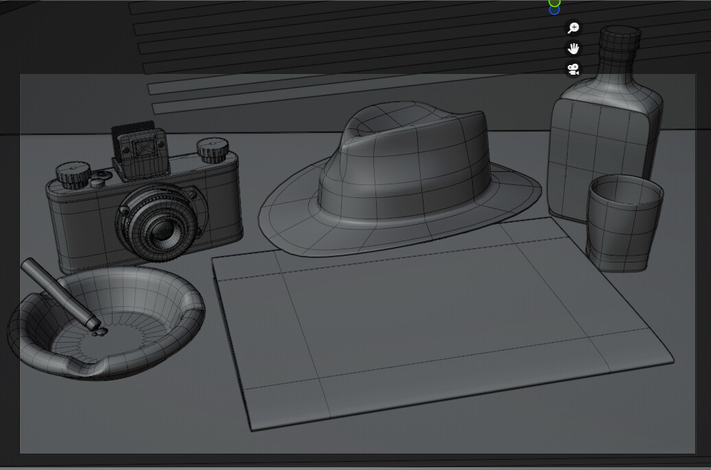
This is my first time entering one of these weekly collab challenges. For some reason, a scene immediately popped into my head: some kind of 1940’s private dick scene, perhaps the name of a PI on a door to the office. Then I started modeling the desk assets and realized I wanted a closeup of the desk instead. I didn’t realize I would spend all day yesterday modeling this scene. But I started and couldn’t stop, I was having so much fun. The newspaper I created in Illustrator and Photoshop as a texture, pulling from Chandler’s The High Window, a Philip Marlowe novel. I used photos of LA Times newspapers from the 40’s as inspiration.
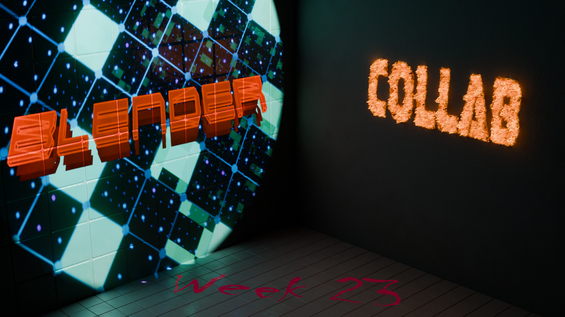
I’m posting


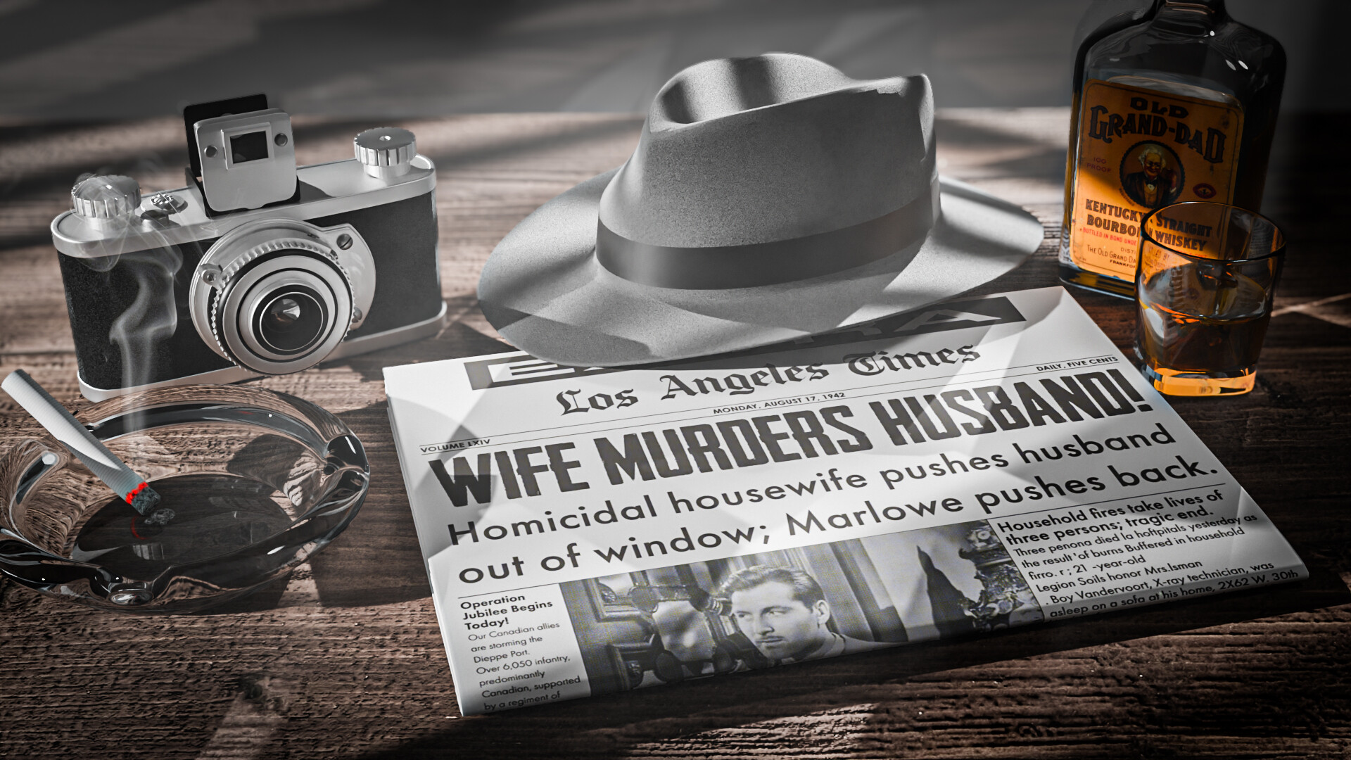
FINAL RENDER FOR THIS WEEK’S COLLAB (cause I have no more time to work on it):

18 Likes

Great idea!

Would a business card feel right? I can see a few places where something like that might add even more story to the scene.

3 Likes

I like that idea a lot. I based this off of Raymond Chandler’s Philip Marlowe. I don’t think he ever used business cards, though, but I’ve never read the books, only seen some of the movies. I could have put a notepad because the character likes to write poetry. But I already had the newspaper for the text portion and didn’t want to detract from that.

3 Likes

My submission is bubbles all the way down 🫧🫧🫧

I made a custom procedural bubble material, and then used that to create bubbly text of the word “bubbles” – spelled out in the “Bubblegum” font face:

16 Likes

I LOVE YOUR BUBBLE MATERIAL! Sorry, for the yelling. It’s wonderful. Great job!

1 Like

Asbtract text:

Retro text:

Please see my instagram reels at the link before to see these animated, as they do move and shift colors.
Reels
I cannot get the files small enough to let me upload them here directly. This was a fun challenge since I’ve never messed with text in blender, and I actually still plan to do a couple of more as well for fun.

I’ll use the Retro text as my submission for this week though.

8 Likes

Thanks! :raised_hands:

1 Like

Apparently I misunderstood that we were supposed to use the text tool in Blender. I thought we were creating a scene that featured something with text on it :rofl:. Oh well, I stand by my scene anyway.

3 Likes

Usually, every week we’re allow to do the prompt however we interpret, I don’t think anything is wrong with yours. The original idea that came to my mind was also a scene where text was featured on it, thought of just seeing a phone screen with a long message on it.

1 Like

I’m a big fan of your piece. It is very much in line with what I had in mind for possibilities for my topic this week. The prompt was intentionally open ended. I just wanted to give people an opportunity to think specifically about how we can use text in a composition :slight_smile:

3 Likes

This time I decided to use some real life experience for a message. There is still a lot to do, but the idea is there… :wink:

Some improvements done here and there, a few final details, added a handy kitchen chair for depth reference, learned a few things more about normals and reflections, and here you are, the final version:

I am still starting at this, but I worked as a photographer in-training for a while and this setup finally looked so familiar that I am going to share it for anyone interested on painting with lights; comments welcome! :grin:

10 Likes

Not Again !!! :laughing:

2 Likes

This week I made an animation

A frame for the vote:

Some details about the design

This week was another opportunity to practice my shading node skills (and my first time using light nodes).

The basic scene looks like this:

I made the tiles for both the left wall and floor from scratch, the “Blender” text animation was made using geometry nodes.


These were then masked into a scene I had made following Ducky 3D’s motion graphics course and projected onto the left wall using light nodes and a spotlight.

The “Collab” text was first made as a flat image using the text tool

Then I used it as a mask over a drywall nodetree, with some noise texturing, displacement, and the ambient occlusion node and some blackbody radiation for the emission. Then I animated the mask with respect to the position of an empty. So the right wall is all one shader, no modeled geometry.


Finally, the right side was finished by making a projector area light and light nodes.

The only lighting in this scene is the projector on the left, the projector on the right (while the text is being written in), and the emission from the ‘Collab,’ no other scene or world lighting.

7 Likes

My submission this week, hope i´m not too late.

7 Likes

same ^^

1 Like

Wow, so much Blender tech. Great entry!

1 Like

No! You’re too late when I’m busy creating the voting. Until then, you’re fine. :wink:

1 Like

We @BlenderCollab have a few days to vote. You can vote fast but also think slowly about design, colors, technique, difficulty, subject, realism, etc. Choose consciously and not on your entry.
The new subject week 24 “Found under the sea” has already started. The winner of this week’s “Text” challenge may select a subject for next week 25 and win a badge.

2 Likes

@mfortunato Congratulations on your ‘Text’ collaboration entry. It has a real Detective Marlowe vibe. Tons of assets that can be used in other projects, and it shows a lot of technical skills. A well-deserved first place!


  • CypherPoet - Soap bubbles are difficult to make in 3D! They’re hard to see in real life, so we need to make them clearer in the scene. Slightly less white border and more colors could improve the realism.
  • Turgul - Great animation. Great job on using Geo-Nodes. The animation is more lively.
  • HobbyPirates - Technically very nice. But also a bit difficult to read. Some characters are not distinctive enough (P, e).
  • Kasimir - Nice label printer kit. It could be more a scene, a story if you placed those labels on books, CD’s, etc… not as plain text. Those lines doesn’t match the look and feel.
  • Megane_Wang - A lot of work to build the complete scene. I think two objects are fighting for attention. I think making the microwave white (more diffuse?) will give the subject more focus.

Note: I don’t want to offend anyone. I try to write down positive ideas and visions in my simple use of the English language. I am also sometimes more inspired by a particular subject or solution. I’m also learning from you!


@mfortunato - I don’t normally comment on the winner’s entry. But I really like your project and maybe you can easily improve it with a few simple things. (Good for your portfolio)

  • It’s the fifties or so. Add grain and noise to the artwork.
  • The Whiskey label is too colorful compared to the rest of the image (it draws your attention)
  • The items around the newspaper are too organized and placed too neatly around the news page. It could be more random and playful. You don’t have to read the entire headline. For example, it may be covered by a glass object.
3 Likes

Great comments, FedPete! Thanks for taking the time to write them. I agree that the scene is too clean. It could really use clutter. I was going for less of a realistic vibe and more.a manicured design so everything got its chance to be seen but also not detract from the newspaper itself. I will be coming back to this scene as I’d like to add all the missing details: scuff marks and the “colt” logo on the gun. The Kodak logo and numbers on the lens of the camera, and dings and dents, etc. As i further iterate the scene, I will mess it up more so it really looks lived in.

3 Likes

Privacy & Terms